I’ve wanted to attend a class or a workshop at the Beverley Street Studio School (BSSS) in Staunton Virginia for a while, but every time I’ve tried to sign up, the things I’ve been interested in have been full. My timing was lucky more recently and I was able to sign up for a two day Traveling with Watercolors class (February 15-16) with Roanoke based artist Robin Poteet. The BSSS prides itself in providing high quality art instruction in a non-degree setting. I am thrilled that they are only about 45 minutes from me and look forward to attending more of their classes and workshops.
This class interested me because I do try to travel with my watercolors, but if find I rarely actually use them while traveling. This is for a variety of reasons, but I thought maybe a class could give me some pointers on how to get the most out of painting while on travel. I also read a book called The Urban Sketcher by Marc Taro Holmes a few years back and I was intrigued by the idea of doing ink and wash sketches on site and thought this would give me more insights into that. I really didn’t have any expectations for the class, but it was great fun and provided me 12 hours of uninterrupted paint time. It allowed me to explore a new approach and mindset for painting and also gave me time to reflect on a recent vacation that I chose as the subject for this class.
Robin is a wonderful watercolor artist. She does beautiful studio work that you can see on her website, but she’s also has been leading travel painting trips for many years and has an awesome collection of travel sketchbooks that she’s developed during her travels.
She makes her own sketchbooks, which allows her to make them from her paper of choice (Arches). Watercolor sketchbooks don’t usually have 100% cotton paper in them, and lesser quality paper can be very frustrating. She gave us each a 12-page sketchbook that she made, and explained how she cuts the pages, makes the mat board covers and has them bound at Staples.
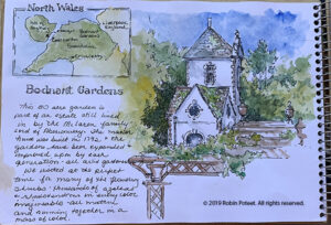
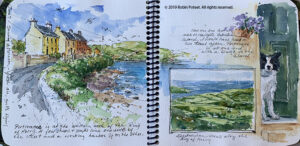
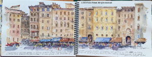
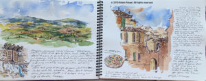
We started the class with her sharing all of her sketchbooks, I would estimate that she had close to 30 of them, and they provided great inspiration. She is a former designer and talked about the importance of the layout of each page, many of which had multiple sketches on a single page along with text. The page layout is my biggest challenge and will be something I need to work on. Below are several pictures of pages from her books.
This first one is painting from a trip to Wales. In addition to her loose and beautiful painting she has included a painting of a map showing where this place is. (Click images to enlarge.)
This next one is a spread from a trip to Ireland. This is a great example of how good she is at layout and design. Note that the image on the left carries over to the right hand page, but she’s included an inset of the countryside and the great dog painting.
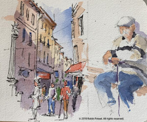
This next one is the main plaza in Siena Italy. I like the two-page spread and the way she’s captured the activity and the people on the street level. This is extremely hard to do.
This last one is of Umbria, where my sister lives. This is another good example of layout with the two main pictures, but I love the window with the laundry and the pizza on the lower parts of the page. You will see that both of these inspired some of my work in my own sketchbook.
Robin provided a lot of roving commentary and critique, which was extremely useful. She did one demo of painting people, which we all said we needed. She emulated a page in a sketchbook (below). I’m sure she would have done more demos, but we were all so wrapped up in our own books we didn’t really ask her to. In hindsight I wish I could have watched her paint more.
I used my trip to Scotland in June of last year as my subject. I completed the cover and 10 of my 12 pages during the class time. I finished the last two pages when I returned home. Some of what I did is good, some not so much. There were times when I ran out of steam and it shows. Still, not too bad for a first effort.
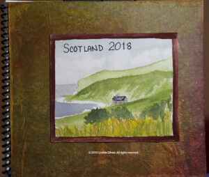
The cover was made from gray mat board, but Robin embellishes hers by gluing hand painted tissue paper to them and then gluing a painted image to that. This part of the class was sort of ‘crafty’ and not really my thing. I think I’d be fine with mat board covers and the image and a title glued to them. She uses scrap mat board, which isn’t always clean, and also pointed out that the covers suffer wear and tear during travels so there is a need to cover them to make them look nice.
Here is my cover. The image is a quick sketch of Scottish countryside.
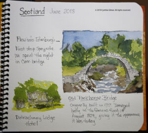
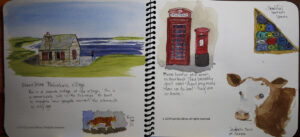
My next page includes a painting of the Old Packhorse Bridge and a bench outside our first hotel. I chose the bridge for this first page because I’ve painted it before and felt comfortable with it. Some of the students in the class said that painting the first page was intimidating because they feared they would mess up their book. Choosing something I was comfortable with was a good idea.
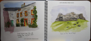
The next spread includes a painting of the first of many distilleries we visited. I included my sister standing in front — people are always hard. It’s something I need to practice more. The right hand page was a landscape, but I didn’t like it. I found it bland so Robin suggested that I could glue something on top of it to give it interest. I sketched a small botanical and did that.
The text was a challenge since I wasn’t prepared to recall details of my trip from eight months ago. Some of my pages have little to say. It would be easier to have more robust commentary if you did the book as you traveled or shortly afterward. It would also be helpful to keep a running journal.
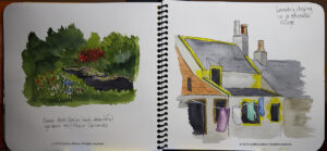
The next spread included a lily pond from a garden we toured and a painting of laundry drying in a seaside village we visited. This was inspired by Robin’s laundry sketch. Laundry hanging to dry is always so colorful.
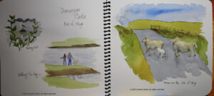
At this point I was realizing that my layouts were kind of boring. Robin suggested that I not include sky or frame these two in boxes, but let them fade out at their edges, which I did. I decided that the next two pages needed to be more interesting. As a result, they have more going on, but I’m clearly missing Robin’s designer’s eye. As I said, this is something I really need to work on.
I was starting to run out of steam and interesting subjects on the next two spreads. The sheep crossing the road was one of the ones I did once I got back home.
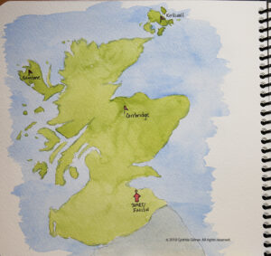
And finally, I tired my hand at a map.
While I have to say, none of this is my best work, I think I learned a lot that I can use to capture things plein air or in the room after a day of traveling. Sketching while traveling provides a new way to savor your vacation because you focus on capturing what you saw in a painting requires so much more reflection than just taking a photograph. I’m looking forward to doing more of this.
Sorry this is such a long post. If you’ve taken the time to read to the end, thank you!


Excellent! Most interesting class. Your teacher certainly excels in the layout of her pages. I can imagine that is very difficult, especially when it’s done on the run as it were. Although I’m a designer, I don’t think I could do that. Thanks for the post!
Cindy – I think you did splendidly! And if I were you I would not shy away from sky and clouds – they are something that seems to come easily to you.
Love the cow and the sheep!
Keep up the good work!
Thank you for your kind words Tess. I don’t think the teacher was discouraging me from skies, just trying to get more variety in my layouts. I’ve been told by several people that I do good skies 🙂