Online Art Sales

At shows, I sometimes have people ask me if they can buy my work online at a later time. I’ve also had distant friends ask if they can buy my art online. For a while I had a link to an Etsy store, but keeping it up to date was a chore. I’ve decided I need to have an online retail store, so I’ve built one. In some ways this terrifies me, because it feels like I’m opening a big can of worms.

When I started doing shows I signed up for a Square account so I could take credit cards. It has many other handy features like calculating and tracking sales tax, which is required at most shows. It’s worked very well for me.

My site is built using WordPress, and there is a plugin suite called WooCommerce that links your Square account with WordPress to allow online sales. I think I’ve got that set up. So, as of today, we are open for business. I have only put a subset of my available paintings in the shop. I will try to keep adding them to keep it fresh. I’ve also indicated that people should ask about availability if there is something that they like that’s not in the shop.

Right now I’ve limited my sales to the US. I may add Canada if it goes well. We shall see!

More Watercolor with Gouache Highlights

When I did my last post on using fluid acrylics I said that I wanted to try the scene with the fog rising off the mountain using transparent watercolor for most of the painting but opaque watercolor, also known as gouache for the highlights.

Watercolor purists would frown on using anything but transparent watercolor, but it’s my art, my choice. I’ve always found that saving the white and lighter colors when it involves small details is difficult. I am almost always disappointed in the results. When I was at Nimrod I did one painting where I used gouache in the foreground and I really liked the result. I said I was going to use that technique more, so here is my second attempt.

The sky, mountain, fog, foliage and field are all transparent watercolor. The dead trees, fence and hay bales are gouache. I like the result. The tree trunks stand out nicely. I would not have been able to do that in watercolor since they are lighter than the foliage. I also couldn’t have done a fence that was that delicate and precise. I may have been able to save the whites for the hay bales, but I like the way the turned out and this was less frustrating.

More of this technique to come, I’m sure…

Experimenting with Fluid Acrylics

I’ve seen paintings done by some watercolorists using acrylic media but watercolor techniques to get that same loose wash feel to the painting. Some time ago I bought some fluid acrylics to do some experimenting. Inspired to paint more by my recent Nimrod experience I finally got around to trying them out.

I did three paintings, the first two with subjects I have painted many times and am comfortable with. The third was a bit more of a stretch. I also learned some things and applied changes with each painting. I will explain these with the discussions of the paintings.

First let me say that when I first started painting back in the mid 1990s, I started with standard acrylics. Acrylic is very forgiving. It dries quickly and you can paint over your mistakes inside of a few minutes. You can also paint back to front without a lot of planning as is required with watercolor because you need to leave the whites and the lights.

Once I started painting in oils I abandoned my acrylics. The downside to acrylics is that that they dry so fast that you can’t really mix colors on the canvas to get those wonderful blends and soft edges. Conversely, oil can be frustrating because it takes so long to dry that hard edges are very difficult.

Then I switched to watercolor which is a lot less forgiving than either, but for the last few years this has been my media of choice.

The fluid acrylic paints that I bought were the Golden brand. Golden specializes in only acrylics and is considered the premier brand of acrylic paints. I bought a set, which wasn’t geared towards landscapes and consisted of very bright primary colors. Mixing for landscape colors proved to be a challenge. Some of my colors are less than realistic, but I tried to stay true to the color values and had a lot of fun.

I used a wet pallet, which was made up of pallet paper over a wet sponge and the top closed and sealed. I had this from my acrylic painting days years ago. It keeps the paints kind of wet over night, but I found that with the fluid acrylics the consistency did change. The got thicker and lumpier.

This first painting was done on a piece of canvas paper taped to a board. The reference photo was a summer season picture of Three Ridges from our local overlook. I’ve painted the view many times. I tried to approach it with light, watercolor like, washes and I succeeded in the mountains and the clouds, but not so much the sky and the foliage. I did learn that I could mix the paint on the canvas and I had a lot of fun blending the dark areas and the lights in the clouds. I used traditional acrylic brushes for this painting and I thought that I might get a better watercolor effect if I used watercolor brushes. I didn’t want to use my expensive watercolor brushes so I ordered an inexpensive but decent set of brushes for my next experiment.

The second painting was done on a canvas board, which is higher quality than the canvas paper. I used another reference photo of Three Ridges but this one was from the trails in the valley. It was in the morning and there was a fog rising. The beautiful turquoise mountain was a result of the color mixing challenges I described earlier, but I actually ended up liking it. The watercolor brushes made a big difference. I think the sky is a little bit more wash-like in this one, but I don’t like the clouds as much. I did have a lot of fun with fog on the mountain. Being able to blend on the canvas was very helpful. I used watercolor techniques for the foliage. It looks like my style for watercolor but the colors are much denser. The field in the foreground is a good loose wash. The hay bales were much easier to paint than they would have been in watercolor, because I could just paint over the green. Those tall dead trees and the fence are my favorite part and they would have been nearly impossible to do well in watercolor because the values are lighter than the surrounding colors. I would have had to save the whites and it is hard to do that and get the same level of precision.

I am inspired to try this one in my new water color and gouache technique, so stay tuned for that.

The thing that stood out as most challenging for me in the second painting was color mixing. The bright Phthalo green was impossible to tone down to a color that appears in nature without having red oxide. The Phthalo blue is lovely but also very bright and not very versatile. So, I ordered some colors to augment the original set before starting a third painting.

This next painting was a scene I’d not painted before. It is from a reference photo of a local historic site called Dodd Cabin. I painted it once before from the other side in the snow, so this was very different. I had my good paint brushes and my new paints. I went with a small (12” x 9”) stretched canvas for this one.

The resulting painting looks like a regular acrylic painting, except for perhaps the foliage. I don’t dislike it, but I ended up getting way into the details of a detailed subject, because I could. Acrylic lets you do that.

The colors were better, except for the sky which is too blue. I had a lot of fun with the trees, especially the pine tree on the left. The cabin was also fun to paint and ended up true to its photo.

So as for the experiment, it was both a success and a failure. The successes were that I had fun, I learned some good techniques for using fluid acrylics, and I may just let acrylics back into my life from time to time. The failure is that I didn’t really learn how to do those watercolor-like paintings with fluid acrylics. I may have to do some research and seek out some YouTube demonstrations to learn more.

This was a long post, and a bit technical. Thank you for reading!

My Sketchbooks

In my last post I mentioned that I was working on something in my sketchbook that I was going to share. One challenge with using sketchbooks is if you do something you really like it’s in a sketchbook and you can’t do anything else with it, because it’s attached to the sketchbook. Also, while you can get watercolor sketchbooks with good 100% cotton paper it’s still different from the paper I’m used to painting on. The way watercolor interacts with the paper, and the way the paper absorbs the watercolor is extremely important to the outcome, so I have become very picky about the paper I use. I always use Arches 140lb. cold press paper. You can’t buy a sketchbook with that paper, unless it’s hand crafted. I’ve gotten them off or Etsy but they are very expensive.

A few years ago, I took a class on Traveling with Watercolors at the Beverly Street Studio School in Staunton, VA. The teacher made her own sketchbooks with Arches paper. She would cut the covers from mat board scraps and she’d cut the paper to fit. Then she’d take the whole thing to Staples to have them punch and bind them. I did a little research and figured out that the binding machines don’t really cost that much, so after about a year of thinking about it I bought one and started making my own sketchbooks. I have done two so far. I just filled up the first and started painting in the second one.

Here they are closed so you can see the covers and how they are bound.

And here they are open so you can see some sketches on 100% cotton Arches 140lb. paper.

Anyway, one advantage to using sketchbooks that have nice paper is if you get really lucky and create a painting that might be suitable for framing, you can detach it and frame it.

I had taken a photo of a small barn in the valley across from Devil’s Backbone Brewery. I didn’t really like the setting, but the barn itself had a lot of character. I thought I would practice Steve Mitchell’s spontaneous watercolor techniques to do the background and then I’d paint the barn from the photo. Masked the barn with tape and then painted the background. The spontaneous method requires a lot of random paint, water, blending, running, dripping and spraying. Then you use the random shapes and create more detailed aspects of a landscape from it. I really liked the outcome.

It is looser than most of my work but the barn is still quite detailed. It also has white space around it, rather than filling up the whole page. That’s actually a function of the sketchbook because I don’t feel compelled to paint to the edges. I don’t have to paint to the edges on other paper either, but I have this engineer’s brain that really wants to fill up the page. I’m going to use this as an inspiration to stop doing that.

It’s small, about 7 x 9 inches. I bought a small frame and I’m going to remove it from my sketchbook and frame it.

My Art Meets Design Thinking!

This is going to be a long post, but it’s something I really want to make sure I capture, for myself and others who might be interested.

During the later half of my career, I spent a lot of my time doing what is known as human centered design, or design thinking. Design thinking is a problem-solving approach with a unique set of qualities: it is human centered, possibility driven, option focused, and iterative. (2017, Liedtka, et al.) It is also known for applying designers’ sensibilities to problem solving.

I often talk about my engineer’s brain and my artist’s brain, and how the two don’t work together. It has always puzzled me that I could not figure how to get my design thinking experience to influence my art. One challenge to this was that I usually paint for myself, making me the human at the center of the design effort. This means that I either like it or I don’t. Yes, I learn from my failures and I move on, but it’s hard to put a formal process around this.

My friend Carlo, who follows my art journey, came to me some months ago and asked me if I could do a painting for him and his wife Mary, of a place they once lived on the Magothy River near Annapolis Maryland. I have never been there. He sent me a couple of photos and I did a quick watercolor sketch and sent it back to him just to get his feedback.

Carlo Sketch 1
Carlo’s original photo. While everything else changed, the sailboat remained.

It was a good thing that I did, because while I duplicated the photo pretty exactly (except for the townhouses), the scene he was remembering was really quite different. I realized at that point that I actually had an opportunity in front of me to use all that I knew about design thinking to explore Carlo’s memories and attempt to develop a scene that would evoke the pleasantness of those memories.

I spent the next few months going back and forth with Carlo. I learned from that first sketch that it was important to show the perspective of the distant shore correctly. He pointed out that the river is over a mile wide from this vantage point. He sent more photos and I did an additional sketch. Each subsequent sketch was a composite of the earlier ones applying what I’d learned.

Carlo’s photo that inspired the final design of the pier.
Carlo’s photo that inspired the coloring of the sky.
Carlo Sketch 2

From discussions about this sketch I learned that the trees in the foreground on the right were not actually there (or should I say, not really in the scene he was recalling). I also learned that the bright yellow sky was overwhelming and made Carlo think sunrise more than sunset. He also mentioned at this point that he liked the pier going straight out of the center of the picture.

Based on what I learned I did two more sketches. Note that I wanted to test giving him multiple options to compare, so I didn’t show these two until later.

Then, I posted all four paintings together on a private page of this web site and this time I asked him a set of pointed questions and ask him to respond for each painting. Here were the questions:

What do you like most about the painting and why?
What do you dislike about the painting and why?
How does the painting make you feel?

This turned out to be an interesting exercise for me and I think also for Carlo. I learned a few key things from his feedback. First, I learned that even though the first painting missed the mark in almost every way, he liked the coloration of the pier most in that painting. I also learned that sketch 4 was his favorite, so I had a target to follow. I learned that he gravitated toward a calmer water appearance. He reiterated that he didn’t like the coloring of the sky in sketch 2. He didn’t like the prominence of the pier in sketch 3.

The other thing that emerged from this discussion was the size of the planned finished product. We were originally targeting a large painting for over their fireplace, but as I did the smaller sketches he was reminded of another print of a water scene he has and decided he’d rather have a smaller painting that he could pair with that painting. He would never have made this connection if we hadn’t gone through the iterative process of doing the “prototype” sketches.

So based on everything that I learned, I painted the final product. The painting is 11.75 x 6, to match the print he wants to pair it with. That print has whitespace between the painting and the mat, so I taped off the frame on a larger piece of paper so he could duplicate that. Finally, I focused on the coloration of the sky, the distance of the land on the far side of the river, the calmness of the water, and the lighter coloration of the pier. Here is the finished product.

Carlo Final Painting

So, back to the original topic of this story, here’s what I took away from this process. Designers are artists, but artists are not necessarily designers. Even trained designers are really just artists when they are creating for themselves. Visual design takes artistic ability, but designing something someone else requires a human-centered process. This is where the connection is, with the act of designing for others, not with the underlying art. The real take-away is that I can use my experience in design thinking when I am painting for others to develop a product that they will be delighted with. If you got this far, thanks for listening.

Two Versions – Nellysford Field

Nellysford is a town that is not far from where I live. It’s a small town, but it includes the neighborhood of Stoney Creek, which is the valley located part of Wintergreen Resort. There is a field just north of Nellysford on the east side of Route 151 that I’ve been driving past for years. I’ve wanted to paint it for a while. It’s very pastoral, which is a feeling I often try to bestow upon the viewers of my art. I recently stopped and photographed it. Here is the photo reference I used for these two paintings.

The first painting is 16 x 12 showing the field horizontally, with two layers of trees in the background, the silo in the mid ground along with three large trees on the right, and finally the stream in the foreground. I did this with my usual Da Vinci watercolor palette, which I confess I’ve been growing a little bit bored with. Here is that painting.

As you might imagine, doing the water and the reflections was one of the more fun and interesting parts of this painting. I enjoyed that very much. I masked the silo with painter’s tape to maintain its white and did that part at the very end.

As a landscape painter, I find very few opportunities to paint in a vertical orientation, which is sometimes nice. When I was done with the horizontal version of this painting I looked at it an realized that just the left side of it had nice composition in it’s own right so I decided to do a smaller version of just that part of the scene in a vertical orientation. This painting is 9×12.

While I was painting the first painting I watched a video from Steve Mitchell on his Mind of Watercolor YouTube channel. He is my favorite online instructor and the source of much of my inspiration. He created a limited edition palette of Daniel Smith watercolors that was being sold on line through a store in Minnesota called Wet Paint. It has some bolder colors than what are on my normal palette, which allow me to mix more variations of green. The second painting was done with this palette. I really enjoyed working with something different and I’m looking forward to doing more with it in the very near future.

Here is a scan of my swatches for this new palette.

The sad news is that two weeks ago would have been my week at Nimrod Hall Summer Arts Program, but they cancelled their full season due to the pandemic. I really missed my week painting. I’m looking forward to next year.

Be well!

My Painting Process

I don’t really think of myself as having a painting process, and if I do, it’s certainly evolving all the time. I’m still too new to this to have a fixed process. I follow a lot of Facebook groups like “World Watercolor Group”, “Watercolour Sketchers”, and “Watercolor Landscapes” to name a few. People post their paintings on these groups, but some also post time-lapse movies of them painting.

I became curious enough to want to try doing a time-lapse of myself painting. I bought an iPhone holder and suspended my iPhone over my painting table and gave it a whirl. It was actually very enlightening. I’ve not really seen how I paint, until now.

There was a time not too long ago when I never would have attempted to paint around light areas, but now I do. For the most part I’ve got it, but I struggle with small details like getting actual flower shapes in the yellow flowers. The negative painting around the grass was questionable but looked okay once I put the details in.

You can see where I switched from a brush to a pen to put in some of the details. I use watercolor to load the pen, so the painting is all watercolor, not watercolor and ink. This is a technique I started using recently and I’m still perfecting it. It worked okay here, but I’ve had more success in other paintings.

I did this painting in several different short sessions, letting the painting dry between sessions. You can see how much the paint lightens up when it dries in the transitions. I melded all of the sessions together into a single “movie”. It’s time lapse as opposed to an actual video recording, so it speeds by quite quickly capturing a few hours of work in 2 minutes and 49 seconds.

The painting is not one of my best, but came out okay. I might start doing this more, because I think I can learn from it. Here is the movie…as I said it’s only 2:49, so it won’t take up your whole day.

And here is the finished painting. I admit I did touch up around those flowers a little after the fact.

I’m still staying home as advised because of the pandemic, but I’m anxious for some new material. I’m going to sneak out soon with my camera to take some reference photos. Stay tuned.

Class: Traveling with Watercolors

I’ve wanted to attend a class or a workshop at the Beverley Street Studio School (BSSS) in Staunton Virginia for a while, but every time I’ve tried to sign up, the things I’ve been interested in have been full. My timing was lucky more recently and I was able to sign up for a two day Traveling with Watercolors class (February 15-16) with Roanoke based artist Robin Poteet. The BSSS prides itself in providing high quality art instruction in a non-degree setting. I am thrilled that they are only about 45 minutes from me and look forward to attending more of their classes and workshops.

This class interested me because I do try to travel with my watercolors, but if find I rarely actually use them while traveling. This is for a variety of reasons, but I thought maybe a class could give me some pointers on how to get the most out of painting while on travel. I also read a book called The Urban Sketcher by Marc Taro Holmes a few years back and I was intrigued by the idea of doing ink and wash sketches on site and thought this would give me more insights into that. I really didn’t have any expectations for the class, but it was great fun and provided me 12 hours of uninterrupted paint time. It allowed me to explore a new approach and mindset for painting and also gave me time to reflect on a recent vacation that I chose as the subject for this class.

Robin is a wonderful watercolor artist. She does beautiful studio work that you can see on her website, but she’s also has been leading travel painting trips for many years and has an awesome collection of travel sketchbooks that she’s developed during her travels.

She makes her own sketchbooks, which allows her to make them from her paper of choice (Arches). Watercolor sketchbooks don’t usually have 100% cotton paper in them, and lesser quality paper can be very frustrating. She gave us each a 12-page sketchbook that she made, and explained how she cuts the pages, makes the mat board covers and has them bound at Staples.

We started the class with her sharing all of her sketchbooks, I would estimate that she had close to 30 of them, and they provided great inspiration. She is a former designer and talked about the importance of the layout of each page, many of which had multiple sketches on a single page along with text. The page layout is my biggest challenge and will be something I need to work on. Below are several pictures of pages from her books.

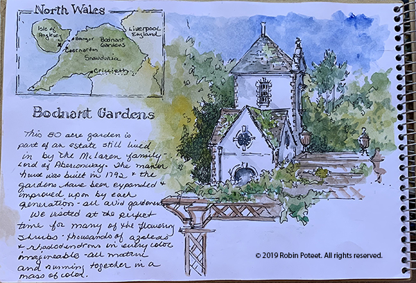
This first one is painting from a trip to Wales. In addition to her loose and beautiful painting she has included a painting of a map showing where this place is. (Click images to enlarge.)

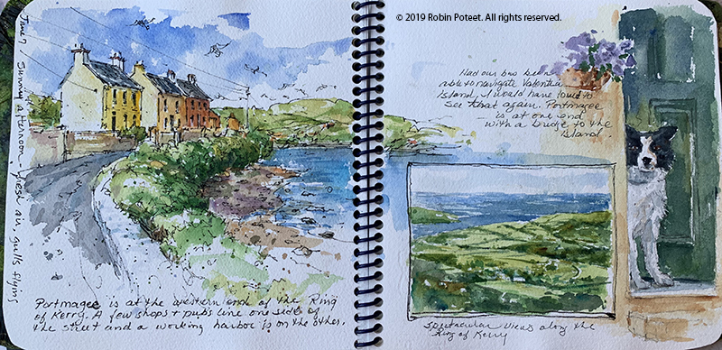
This next one is a spread from a trip to Ireland. This is a great example of how good she is at layout and design. Note that the image on the left carries over to the right hand page, but she’s included an inset of the countryside and the great dog painting.

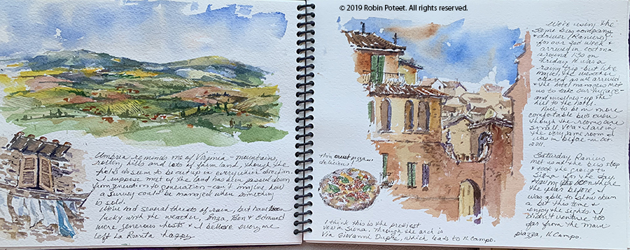
This next one is the main plaza in Siena Italy. I like the two-page spread and the way she’s captured the activity and the people on the street level. This is extremely hard to do.

This last one is of Umbria, where my sister lives. This is another good example of layout with the two main pictures, but I love the window with the laundry and the pizza on the lower parts of the page. You will see that both of these inspired some of my work in my own sketchbook.

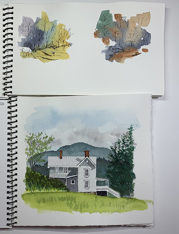
Robin provided a lot of roving commentary and critique, which was extremely useful. She did one demo of painting people, which we all said we needed. She emulated a page in a sketchbook (below). I’m sure she would have done more demos, but we were all so wrapped up in our own books we didn’t really ask her to. In hindsight I wish I could have watched her paint more.

I used my trip to Scotland in June of last year as my subject. I completed the cover and 10 of my 12 pages during the class time. I finished the last two pages when I returned home. Some of what I did is good, some not so much. There were times when I ran out of steam and it shows. Still, not too bad for a first effort.

The cover was made from gray mat board, but Robin embellishes hers by gluing hand painted tissue paper to them and then gluing a painted image to that. This part of the class was sort of ‘crafty’ and not really my thing. I think I’d be fine with mat board covers and the image and a title glued to them. She uses scrap mat board, which isn’t always clean, and also pointed out that the covers suffer wear and tear during travels so there is a need to cover them to make them look nice.

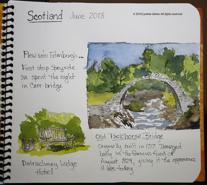
Here is my cover. The image is a quick sketch of Scottish countryside.

My next page includes a painting of the Old Packhorse Bridge and a bench outside our first hotel. I chose the bridge for this first page because I’ve painted it before and felt comfortable with it. Some of the students in the class said that painting the first page was intimidating because they feared they would mess up their book. Choosing something I was comfortable with was a good idea.

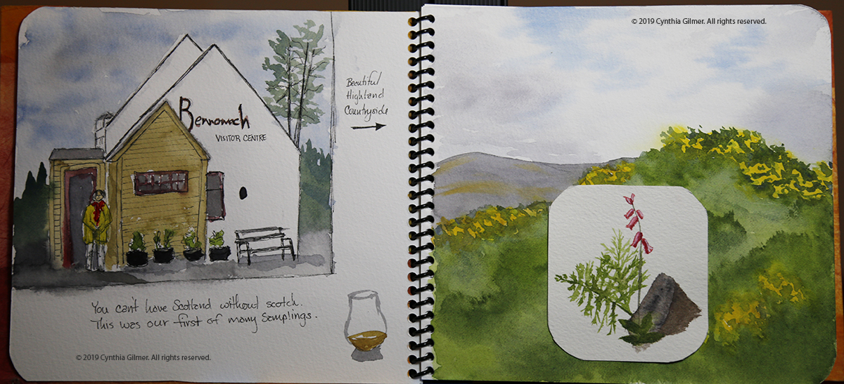
The next spread includes a painting of the first of many distilleries we visited. I included my sister standing in front — people are always hard. It’s something I need to practice more. The right hand page was a landscape, but I didn’t like it. I found it bland so Robin suggested that I could glue something on top of it to give it interest. I sketched a small botanical and did that.

The text was a challenge since I wasn’t prepared to recall details of my trip from eight months ago. Some of my pages have little to say. It would be easier to have more robust commentary if you did the book as you traveled or shortly afterward. It would also be helpful to keep a running journal.

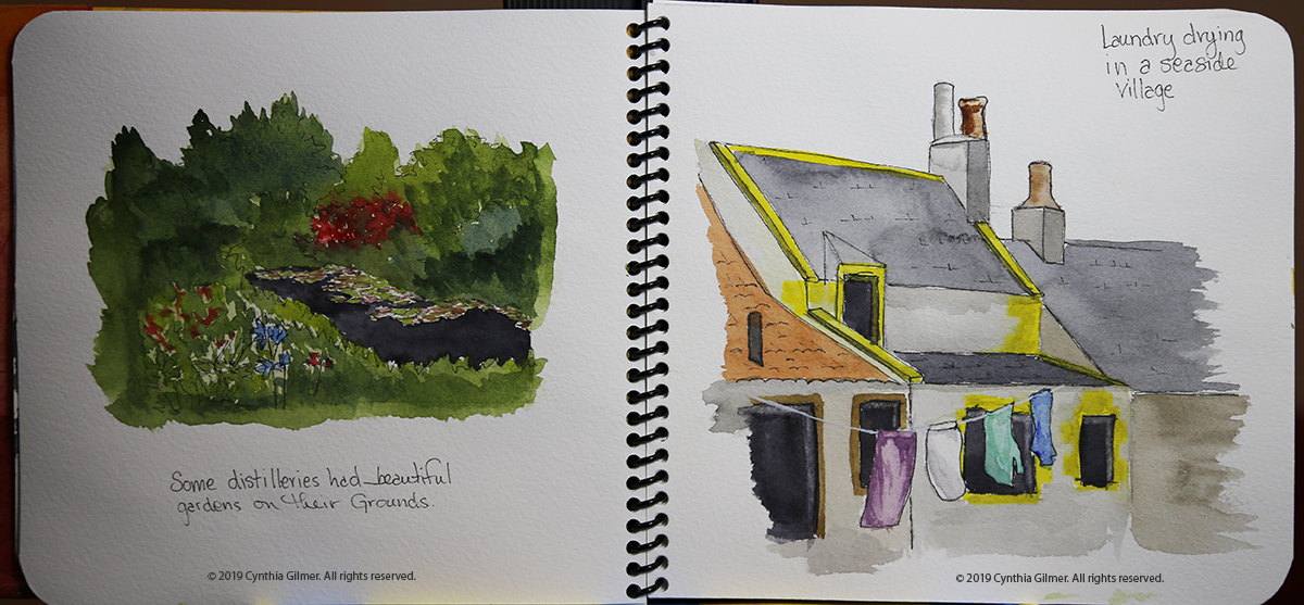
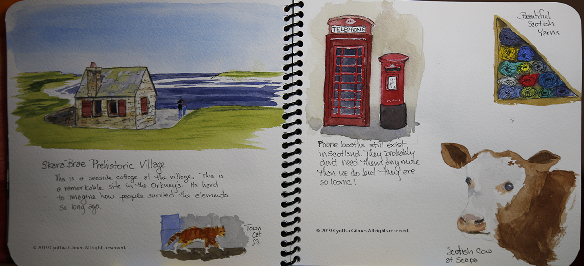
The next spread included a lily pond from a garden we toured and a painting of laundry drying in a seaside village we visited. This was inspired by Robin’s laundry sketch. Laundry hanging to dry is always so colorful.

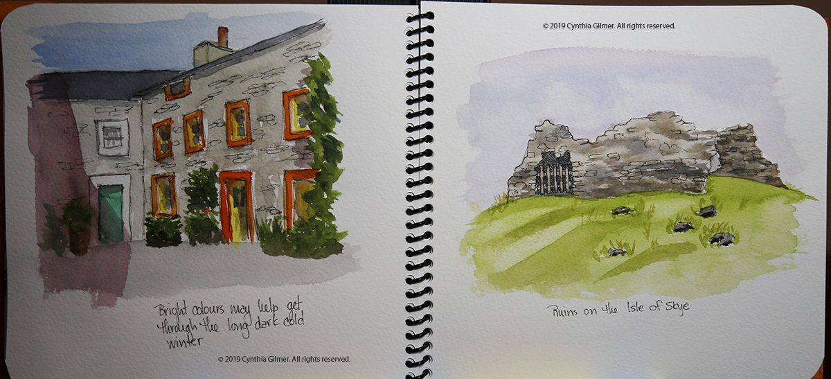
At this point I was realizing that my layouts were kind of boring. Robin suggested that I not include sky or frame these two in boxes, but let them fade out at their edges, which I did. I decided that the next two pages needed to be more interesting. As a result, they have more going on, but I’m clearly missing Robin’s designer’s eye. As I said, this is something I really need to work on.

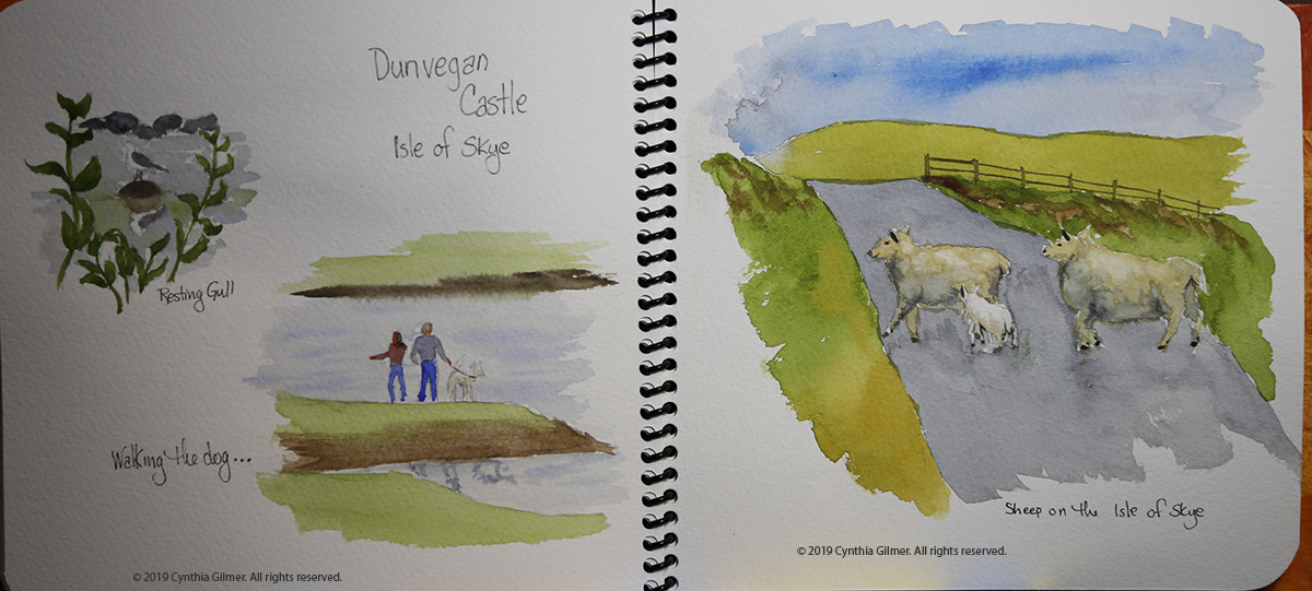
I was starting to run out of steam and interesting subjects on the next two spreads. The sheep crossing the road was one of the ones I did once I got back home.

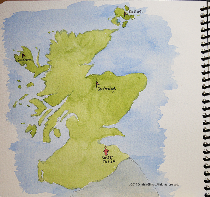
And finally, I tired my hand at a map.

While I have to say, none of this is my best work, I think I learned a lot that I can use to capture things plein air or in the room after a day of traveling. Sketching while traveling provides a new way to savor your vacation because you focus on capturing what you saw in a painting requires so much more reflection than just taking a photograph. I’m looking forward to doing more of this.

Sorry this is such a long post. If you’ve taken the time to read to the end, thank you!

Catching Up…

I haven’t blogged much for a while, so I thought I’d catch up on several paintings I’ve done in recent weeks. I continue to do all watercolors these days. I will get back to my oils eventually, but watercolor brings new challenges and will ultimately make be a better painter so no harm in focusing on them. I continue to improve but I have a long way to go.

I recently switched brands of watercolor paints and created my own pallet. I had been using Winsor & Newton, which is an excellent brand. The color choices I was using were driven by the recommendations from Purnell Pettyjohn, who I took a class from about three years ago. I decided it was time for me to select colors that matched my preferences, which of course have been evolving.

I did a lot of research on brands. My favorite Youtube teacher, Steve Mitchell (The Mind of Watercolor), highly recommends M. Graham. They have a large following and one of their claims to fame is that they have honey in them, which keeps them a little bit tacky. I thought about going that route, but the honey made me nervous because it’s so humid in the summer at our house in the mountains. I was afraid they would mold. I found another blog, The Scratchmade Journal, where the author lives in the mountains of North Carolina. She had been an M. Graham user for years, but found them completely unmanageable once she moved to the mountains. She switched to Da Vinci after a lot of testing. I tried them and so far I love them. The colors are vibrant, and they lift really well when you want to lighten areas that you’ve previously painted. My new pallet colors are all transparent or semi-transparent. I’m tweaking them a little as I go along, for example, I chose two yellows that are too close to being the same. I’m having fun experimenting.

Now…on to some of the paintings I’ve been working on…

A while back we went to St. Michal’s Maryland for a long weekend. While we were there we drove down Tilghman Island, which is a fairly isolated and quaint community on the Chesapeake Bay. We took a lot of photos and one was of a narrow isthmus with a few houses on it. There were storm clouds in the background, but the sun was shining on the houses. It was a lovely scene. I painted a small painting (12×6) and liked it a lot. I’ve been itching to start painting bigger watercolors, so I decided to do a larger version, which is 24×12. I changed up the scene a little, eliminating one house that I thought was too busy and capturing another instead. I like the results of the second painting as well. I plan to frame it and enter it into the Falls Church Arts all member show that starts in late April.

Here is the original, smaller version.

Here is the large version.

A month or so ago I was at home in the mountains and decided to paint a scene from a photo I took one morning. The fog was lifting from the valley floor. There was a field in the foreground that had hay bales in it from a recent mowing. I actually took the photo with my iPhone from a moving car (my husband was driving), but I still managed to capture the feeling. I think I’ve already painted it a couple of times but this is the best so far.

This next example is of a painting that I thought I’d lost control of, but somehow it came around. It’s from a photo I took at Afton Mountain Winery. At one point the trees were just blobs, and it had no depth at all, but I kept fiddling with it and it mostly came around. The three trees in the foreground on the right I wasn’t able to bring out much, because the ones behind them were already too dark to get contrast. Now that I look at them, I probably could have lifted some of the color from them. The foliage in the big trees is a little blobby. I need to get better at painting foliage. Steve Mitchell is really good at it, but I can’t make it work. This is not one for the gallery, but it’s pleasant enough to look at.

Finally, I wanted to try a waterfall painting. I knew it would be a challenge. I was reading and studying the section on water in “The Watercolorists Essential Notebook: Landscapes” by Gordon MacKenzie. I knew it would be challenging, but decided to try a small painting of a waterfall. The reference photo is a waterfall in Vesuvius VA. The painting is about 4×10. Keeping the white and getting the texture of falling water was challenging, but I was happy with the result. I had to cheat a little in the pool at the base to get the splash. I used opaque white ink to do that. I will try it again and see if I can do better with the rocks and plants on the cliff walls. I may do it bigger next time too.

There have been others, but these are the ones that seemed most worth a discussion. Till next time…and I’ll try not to take so long.


Plein Aire Painting

I mentioned in a previous post that I really like water soluble oils.  They have many of the same characteristics as regular oils. They dry slowly so you can blend the colors on the canvas. They have that nice sheen to them.  The main advantage they have over regular oils is that you don’t need harsh solutions like turpentine.  Today I learned they have a disadvantage that I hadn’t thought of.

Falls Church Arts has a plein aire show every year.  Entries must be painted outside on location and the scenes must come from inside the Falls Church City lines.  This presents me with several challenges.  First, I’m not a very practiced plein aire painter — I usually paint from photos.  Plein Aire is something I need to get better at because it will sharpen my skills in many ways.  Second, I’m mostly a landscape painter and Falls Church is pretty urban.

Last year I painted a scene from the front yard of a friend’s house.  It was a lovely scene.  The azaleas were in bloom. The painting wasn’t bad, but it wasn’t everything I wanted it to be, so I didn’t enter it.

Today I decided to sit out in the plaza in front of Mad Fox Brewing Company and paint the awnings, windows, and tables out front.  It is a lovely day with a mix of clouds and sun. I was a little intimidated by the people at first but most people didn’t pay much attention. Those who did were polite.  Kids were fascinated.   I relaxed and painted and the painting, which was challenging, started to slowly come together. Then it started to rain.  A disadvantage of water soluble oils is that they run in the rain (only when they are wet – once dry they are as permanent as regular oils). The painting can probably be repaired, but it’s going to take some time. I was going to post a picture, but it’s just too sad.   All is good though – I got to to spend the afternoon painting.