I haven’t blogged much for a while, so I thought I’d catch up on several paintings I’ve done in recent weeks. I continue to do all watercolors these days. I will get back to my oils eventually, but watercolor brings new challenges and will ultimately make be a better painter so no harm in focusing on them. I continue to improve but I have a long way to go.
I recently switched brands of watercolor paints and created my own pallet. I had been using Winsor & Newton, which is an excellent brand. The color choices I was using were driven by the recommendations from Purnell Pettyjohn, who I took a class from about three years ago. I decided it was time for me to select colors that matched my preferences, which of course have been evolving.
I did a lot of research on brands. My favorite Youtube teacher, Steve Mitchell (The Mind of Watercolor), highly recommends M. Graham. They have a large following and one of their claims to fame is that they have honey in them, which keeps them a little bit tacky. I thought about going that route, but the honey made me nervous because it’s so humid in the summer at our house in the mountains. I was afraid they would mold. I found another blog, The Scratchmade Journal, where the author lives in the mountains of North Carolina. She had been an M. Graham user for years, but found them completely unmanageable once she moved to the mountains. She switched to Da Vinci after a lot of testing. I tried them and so far I love them. The colors are vibrant, and they lift really well when you want to lighten areas that you’ve previously painted. My new pallet colors are all transparent or semi-transparent. I’m tweaking them a little as I go along, for example, I chose two yellows that are too close to being the same. I’m having fun experimenting.
Now…on to some of the paintings I’ve been working on…
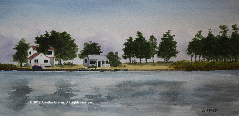
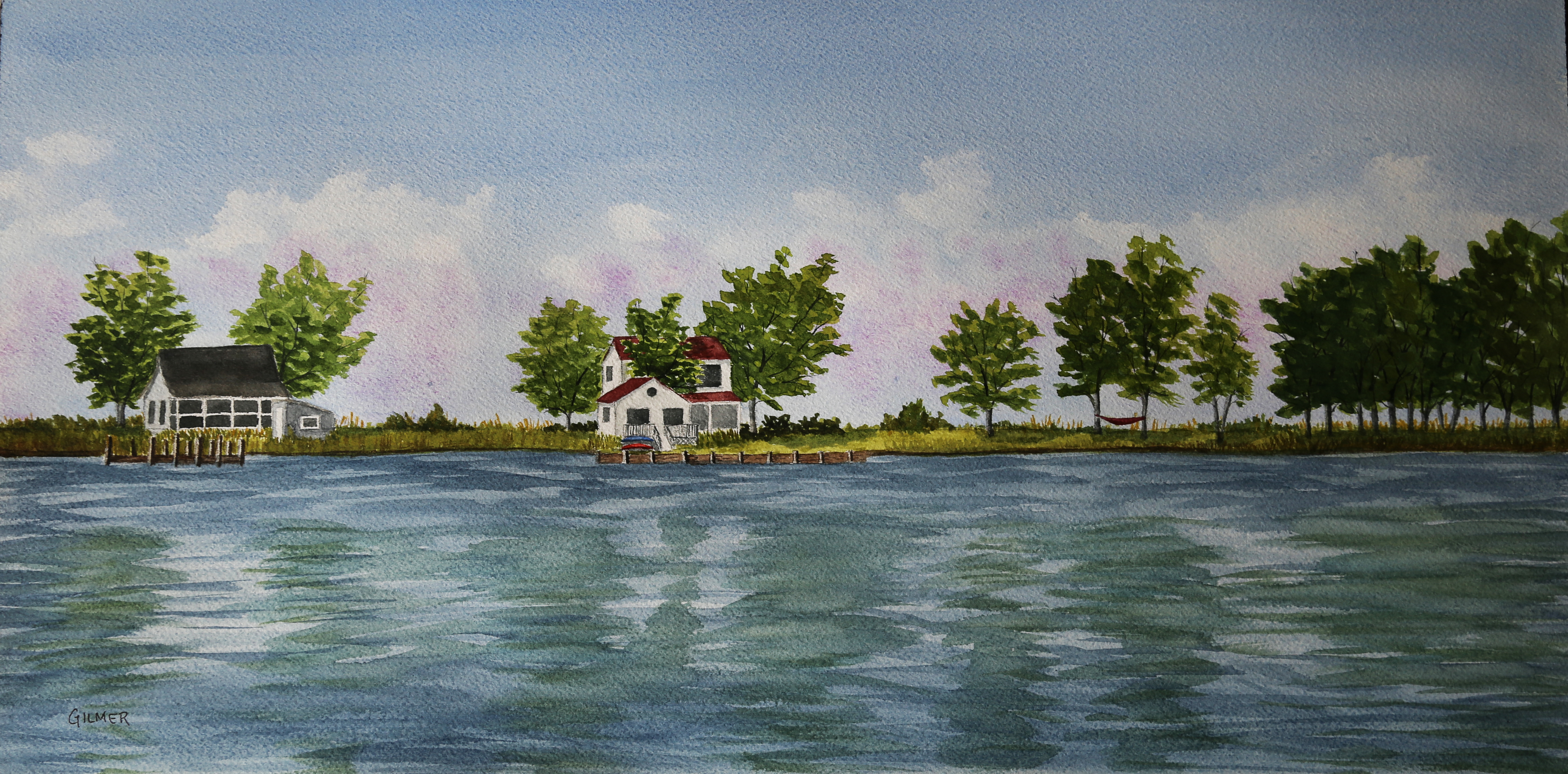
A while back we went to St. Michal’s Maryland for a long weekend. While we were there we drove down Tilghman Island, which is a fairly isolated and quaint community on the Chesapeake Bay. We took a lot of photos and one was of a narrow isthmus with a few houses on it. There were storm clouds in the background, but the sun was shining on the houses. It was a lovely scene. I painted a small painting (12×6) and liked it a lot. I’ve been itching to start painting bigger watercolors, so I decided to do a larger version, which is 24×12. I changed up the scene a little, eliminating one house that I thought was too busy and capturing another instead. I like the results of the second painting as well. I plan to frame it and enter it into the Falls Church Arts all member show that starts in late April.
Here is the original, smaller version.
Here is the large version.
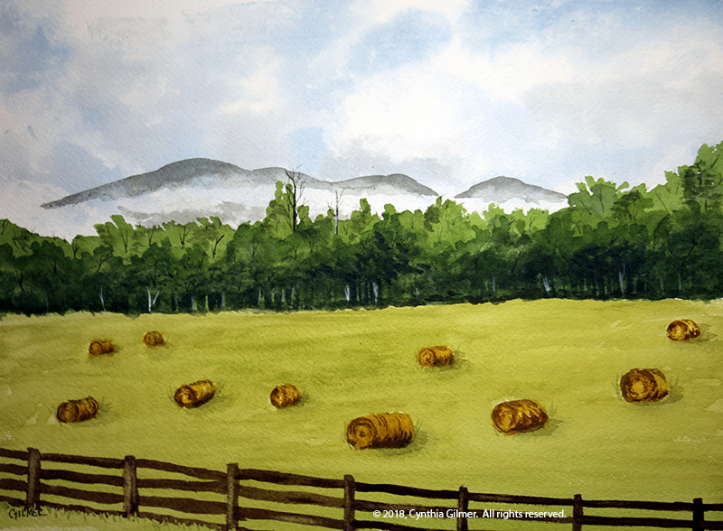
A month or so ago I was at home in the mountains and decided to paint a scene from a photo I took one morning. The fog was lifting from the valley floor. There was a field in the foreground that had hay bales in it from a recent mowing. I actually took the photo with my iPhone from a moving car (my husband was driving), but I still managed to capture the feeling. I think I’ve already painted it a couple of times but this is the best so far.
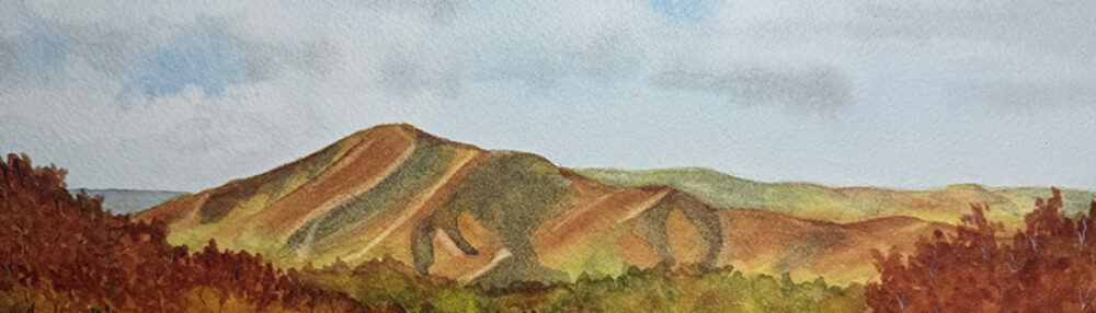
This next example is of a painting that I thought I’d lost control of, but somehow it came around. It’s from a photo I took at Afton Mountain Winery. At one point the trees were just blobs, and it had no depth at all, but I kept fiddling with it and it mostly came around. The three trees in the foreground on the right I wasn’t able to bring out much, because the ones behind them were already too dark to get contrast. Now that I look at them, I probably could have lifted some of the color from them. The foliage in the big trees is a little blobby. I need to get better at painting foliage. Steve Mitchell is really good at it, but I can’t make it work. This is not one for the gallery, but it’s pleasant enough to look at.

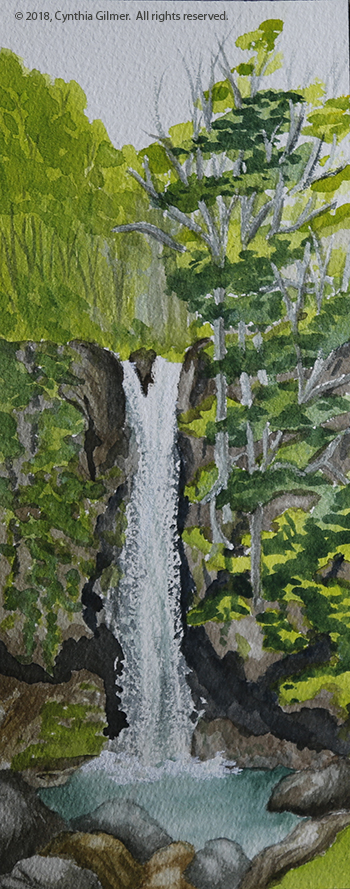
Finally, I wanted to try a waterfall painting. I knew it would be a challenge. I was reading and studying the section on water in “The Watercolorists Essential Notebook: Landscapes” by Gordon MacKenzie. I knew it would be challenging, but decided to try a small painting of a waterfall. The reference photo is a waterfall in Vesuvius VA. The painting is about 4×10. Keeping the white and getting the texture of falling water was challenging, but I was happy with the result. I had to cheat a little in the pool at the base to get the splash. I used opaque white ink to do that. I will try it again and see if I can do better with the rocks and plants on the cliff walls. I may do it bigger next time too.
There have been others, but these are the ones that seemed most worth a discussion. Till next time…and I’ll try not to take so long.