Painting Snow

I said I wasn’t going to post these because it’s spring, but spring doesn’t seem to want to come to the Mid-Atlantic states, so I give up. I’m going to post my snow paintings.

I did these in December.  They are my first attempts at snow scenes.  This really challenges my ability to see the right colors, as I discussed in an earlier post.  I mean snow is white, right?  As it turns out, it’s not really white.  At least it’s not all white.

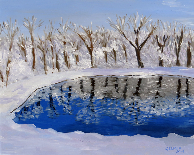
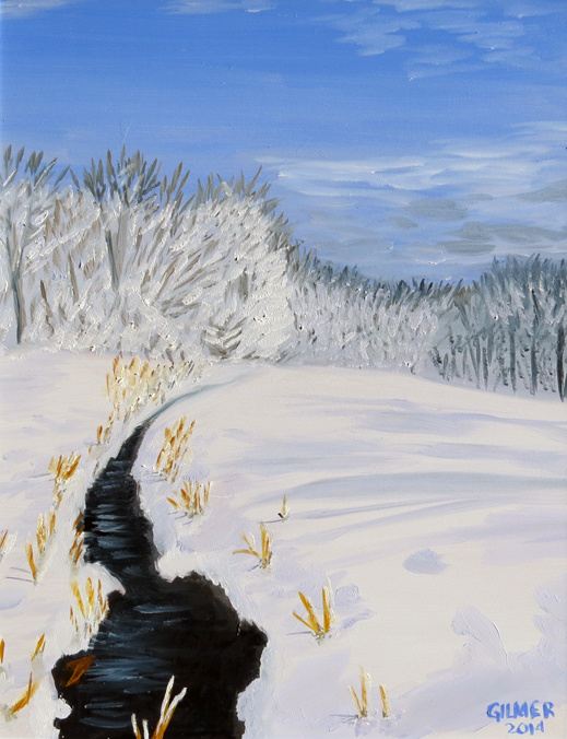
We were on the mountain for Thanksgiving in 2014 and on the Wednesday before Thanksgiving we got an early snowstorm.  It didn’t snow below about 1,500 feet, but at 3,400 feet we got about 10 inches.  It was a wet, heavy snow that stuck to the tree limbs.  It was beautiful.  I went out for a walk with my camera on Thanksgiving morning and took some pictures as the sun began to come out but before the snow started to fall from the tree limbs.  Our house is on a golf course, so it was easy to walk to some really pretty scenery that showed off Mother Nature’s work really well.

I did two small paintings from the photos I took.  One is of the pond at the base of the 7th fairway.  This was a beautiful scene but I struggled with the painting.  I like the trees and the snow, but I did not do the reflection on the surface of the pond justice.  To me it looks out of perspective, and of course the colors aren’t right.
Winter Pond sm
The second painting is of a photo taken further up where a stream crosses the 7th Fairway.  This one I like better.  I stood and waited for a long time for the sun to come out so I could get the contrasting shadows of the trees and the brilliant snow where it was not shadowed.  I like this one better.
7th Stream in Snow sm

Now I promise, no more winter pictures for a while.

Painting Fast

Many of the impressionists reportedly painted fast.  Of course in the age before decent photography, they often painted sketches of their subjects quickly before the light and other aspects of the scenes changed, and then they would repaint them in the studio.  Of course, these “sketches” are magnificent paintings in their own right.

I wouldn’t call myself a slow painter. I’ve never been a really patient person.  One of the reasons I started painting in the first place we to try to improve my patience. That said, I wouldn’t call myself a fast painter either.  Most of my paintings are done in multiple sessions each of several hours. This is especially true when I paint at our mountain house, because I’m there for a weekend and then gone for two weeks.  This is good, because I can put down some parts of a painting and then it will be pretty dry when I return to work on it some more.  However, it also spoils me because I can paint in layers, which is not a good option when you don’t have two-week breaks.

The other reason to learn to paint faster is that I will never be a good plein aire painter if I don’t learn to paint an entire scene in one setting. So to that end, when in Falls Church I’m going to try to paint entire (small) works in one session. The painting below was painted in about two hours from a photo I took several years ago on the North Carolina shore. (My friend Rodney tells me I need to do more waterscapes.) I confess that I had done a pencil sketch on the board earlier. I actually like this painting it a lot.  It’s best viewed at a distance, so the photograph may not do it justice.
Carolina Gull

Seeing Color

One challenge I have when I’m painting is getting my engineer’s brain to see color rather than seeing what color I think something should be.  For example, mountains are green in the summer, right?  Of course that’s true when you are standing next to them, but as they retreat into the distance and are subject to viewing through more atmosphere they fade to blue.  Getting the right color of blue is a challenge for me.  I never could get this right in the picture below although I painted over the mountains at least three times.  I love the scene and may try it again, but I decided I’d need to start from scratch.

OAT Overlook

The first example where I really realized that I wasn’t seeing color was in my class with Jean Barrett (which I wrote about in an earlier post).  When I was painting the scene looking out the dining room window of Il Casale di Mele there was a splash of light on the dining room table.  My engineer’s brain wanted to see this as a lighter color of brown than the table.  That made perfect sense to me since if you shine a light on a color you just get a lighter version of that same color – shadow and light.  Jean looks at me and looks at the photograph and says that splash of light is bright blue.  After a period of denial, careful consideration, and eventually acceptance I finally agreed that it was indeed blue. I adjusted my painting but Jean and I never agreed that my version was blue enough.   Below I have included the painting and the original photo.

Il Casale di Mele sm

ICDM Dining room

Then, in my class with Andras Bality at Nimrod Hall we spent a lot of time analyzing the color of the sky and the clouds.  My engineer’s brain thinks the sky is blue and clouds are gray and white.  In fact, the sky is not pure blue especially depending on what time of day it is, and clouds include white, gray, pink, purple, blue and often other colors.

I found a book that has helped me get past the color blindness of my engineer’s brain.  It’s called “1500 Color Mixing Recipes for oil, acrylic & watercolor” by William F. Powell.  Actually this book is a compilation of several color mixing recipe books he’s done.  I use the landscape section the most (of course) but there is a section for portraits, which I can see would be very useful.  There is also a special section for watercolors.  I will probably use that more after I take my next class at Nimrod this summer.

The way it works is that the book has pages of recipes.  It shows you different color swatches, and what combinations are used to make them.  I have found that it helps me see colors better, including the subtle differences, by comparing the swatches with the photograph I am painting.  It also helps me mix more vibrant colors.  Before, my colors would get “muddy” because I would mix too many colors together trying to get subtle differences.  Now I plan and mix my pallet with the aid of the recipes before I start the painting.  I’m very happy with the results so far.  Below is an example of a page from the book that I hope will help better show what I mean.
Recipies

One last note, the index of this book is amazing. You can look up a color based on a detailed list of items including different kinds of trees at different times of year, skies at different times of day, different kinds of rocks, etc.  It’s really amazing.  I have included an example page below.
Index