I’ve seen paintings done by some watercolorists using acrylic media but watercolor techniques to get that same loose wash feel to the painting. Some time ago I bought some fluid acrylics to do some experimenting. Inspired to paint more by my recent Nimrod experience I finally got around to trying them out.
I did three paintings, the first two with subjects I have painted many times and am comfortable with. The third was a bit more of a stretch. I also learned some things and applied changes with each painting. I will explain these with the discussions of the paintings.
First let me say that when I first started painting back in the mid 1990s, I started with standard acrylics. Acrylic is very forgiving. It dries quickly and you can paint over your mistakes inside of a few minutes. You can also paint back to front without a lot of planning as is required with watercolor because you need to leave the whites and the lights.
Once I started painting in oils I abandoned my acrylics. The downside to acrylics is that that they dry so fast that you can’t really mix colors on the canvas to get those wonderful blends and soft edges. Conversely, oil can be frustrating because it takes so long to dry that hard edges are very difficult.
Then I switched to watercolor which is a lot less forgiving than either, but for the last few years this has been my media of choice.
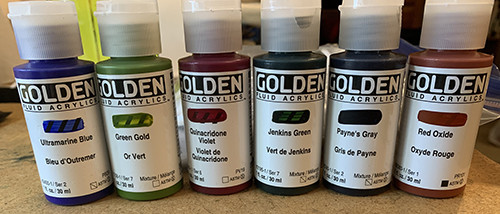
The fluid acrylic paints that I bought were the Golden brand. Golden specializes in only acrylics and is considered the premier brand of acrylic paints. I bought a set, which wasn’t geared towards landscapes and consisted of very bright primary colors. Mixing for landscape colors proved to be a challenge. Some of my colors are less than realistic, but I tried to stay true to the color values and had a lot of fun.
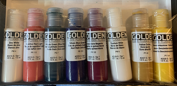
I used a wet pallet, which was made up of pallet paper over a wet sponge and the top closed and sealed. I had this from my acrylic painting days years ago. It keeps the paints kind of wet over night, but I found that with the fluid acrylics the consistency did change. The got thicker and lumpier.
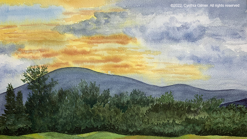
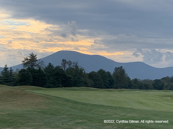
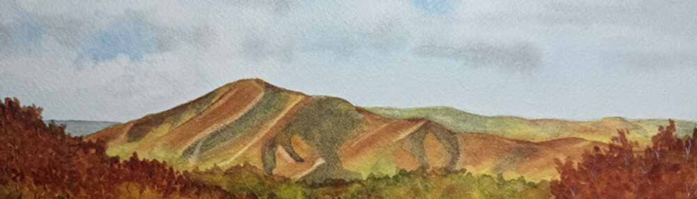
This first painting was done on a piece of canvas paper taped to a board. The reference photo was a summer season picture of Three Ridges from our local overlook. I’ve painted the view many times. I tried to approach it with light, watercolor like, washes and I succeeded in the mountains and the clouds, but not so much the sky and the foliage. I did learn that I could mix the paint on the canvas and I had a lot of fun blending the dark areas and the lights in the clouds. I used traditional acrylic brushes for this painting and I thought that I might get a better watercolor effect if I used watercolor brushes. I didn’t want to use my expensive watercolor brushes so I ordered an inexpensive but decent set of brushes for my next experiment.
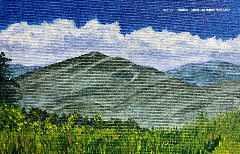
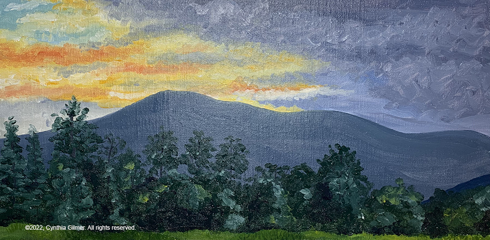
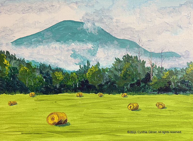
The second painting was done on a canvas board, which is higher quality than the canvas paper. I used another reference photo of Three Ridges but this one was from the trails in the valley. It was in the morning and there was a fog rising. The beautiful turquoise mountain was a result of the color mixing challenges I described earlier, but I actually ended up liking it. The watercolor brushes made a big difference. I think the sky is a little bit more wash-like in this one, but I don’t like the clouds as much. I did have a lot of fun with fog on the mountain. Being able to blend on the canvas was very helpful. I used watercolor techniques for the foliage. It looks like my style for watercolor but the colors are much denser. The field in the foreground is a good loose wash. The hay bales were much easier to paint than they would have been in watercolor, because I could just paint over the green. Those tall dead trees and the fence are my favorite part and they would have been nearly impossible to do well in watercolor because the values are lighter than the surrounding colors. I would have had to save the whites and it is hard to do that and get the same level of precision.
I am inspired to try this one in my new water color and gouache technique, so stay tuned for that.
The thing that stood out as most challenging for me in the second painting was color mixing. The bright Phthalo green was impossible to tone down to a color that appears in nature without having red oxide. The Phthalo blue is lovely but also very bright and not very versatile. So, I ordered some colors to augment the original set before starting a third painting.
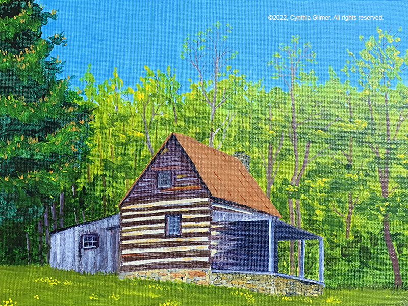
This next painting was a scene I’d not painted before. It is from a reference photo of a local historic site called Dodd Cabin. I painted it once before from the other side in the snow, so this was very different. I had my good paint brushes and my new paints. I went with a small (12” x 9”) stretched canvas for this one.
The resulting painting looks like a regular acrylic painting, except for perhaps the foliage. I don’t dislike it, but I ended up getting way into the details of a detailed subject, because I could. Acrylic lets you do that.
The colors were better, except for the sky which is too blue. I had a lot of fun with the trees, especially the pine tree on the left. The cabin was also fun to paint and ended up true to its photo.
So as for the experiment, it was both a success and a failure. The successes were that I had fun, I learned some good techniques for using fluid acrylics, and I may just let acrylics back into my life from time to time. The failure is that I didn’t really learn how to do those watercolor-like paintings with fluid acrylics. I may have to do some research and seek out some YouTube demonstrations to learn more.
This was a long post, and a bit technical. Thank you for reading!