Completed Commission and other News

It’s been a while since my last post. I have been busy with art and other life activities. I will try to catch up a bit.

First, I completed my commission of Brian’s view in Afton. This one was quite different because the medium was fluid acrylic. I ended up doing a composite from many reference photos. As with all of my commissions I worked with Brian, doing several prototypes, to understand what resonated with him. Then I went to work on the final painting. It is 22×18 and is on hot press watercolor paper. This is smoother than cold press, which is what I use for my watercolors. We experimented with many seasons before we settled on summer. Brian really liked the flowering trees in the spring scenes, so I made them crape myrtles to keep true with the season. I worked hard to make sure Humpback Rocks was clear, because that was important to Brian. Here is the final result. Brian was happy. I’m waiting for him to share a photo of the painting framed and hung in his house.

I have been accepted into the Waynesboro Fall Foliage show that will be held to be held October 14th and 15th. I will be in the emerging artist section which will be inside the gallery on Main Street. I will post more about this when it gets closer. It would be great to see some friends there.

Finally, I just returned from a wonderful cruise traveling from Amsterdam to Bordeaux. It was wonderful to walk in the footsteps of some of the great impressionists. While in Amsterdam we visited the Van Gogh gallery which was excellent. I highly recommend it if you are ever there. Here are a few photos I took of some of his magnificent works.

This one of a church is quite famous.

I really loved this landscape of thunderclouds over fields.

I found it quite moving and emotional to be in the presence of the palette he left behind when he died.

I always plan to paint when traveling and I take supplies and a sketchbook with me. I find that I have limited time, but I did manage to do a few sketches.

I have a few more exciting things that I’m working on to share and I will be doing that in subsequent posts soon.

Commissions I’m Working On

I have not one, but two commissions I’m working on this Spring. The first is for a friend, Jo Ann, who lives here in the neighborhood. She is doing some rearranging of the art in her house and has purchased three of my paintings. She would also like me to do a large (18×24) watercolor painting of Natural Bridge (Virginia) for her. She was thinking that she might prefer Spring colors, so I’ve been waiting for the trees to leaf out. Today was a beautiful day so I went down and did the hike. The trees are not quite as leafed out as I would like, but I can change that. I took several pictures and presented Jo Ann with three slightly different angles to choose from. I think this one is my favorite.

Once I get feedback from Jo Ann, I will do some small studies.

Last year when I did the Rockfish Valley Foundation Plein Air event, I had a couple come up to me at the show and sale and ask if I did commissions. They said they wanted someone to paint their view. They live in Afton Virginia and have a view of the Blue Ridge, including Humpback Rocks, one of the hikes along the Blue Ridge Parkway. They took my card, and I didn’t really expect to hear from them. A few weeks back I got an email from Brian, and he said he wanted to commission a painting. I’ve gone to their house and they do have a lovely view. Here is a nice photo.

Brian also wants a large painting (24×12) and he would like it done in fluid acrylic because he likes the vibrancy of the colors. I have done a small study to get us started on our back and forth. The composition needs a little work, but I have some ideas.

I have to share that one of the things that Brian told me that made me feel so good. He said one of the other artists are the show actually recommended that he see me about doing a commission. I am honored that one of my fellow artists did that. I am sad that I don’t know who it was.

I am looking forward to doing both of these works over the next few months! I will post progress and results here!

Odds and Ends I’ve Been Working On

First, I said I was going to do a third version of the autumn scene with the tree and the bridge in fluid acrylic. I did that and here are all three paintings side by side. I think the fluid acrylic came out pretty nice. The colors are very vibrant.

Fluid Acrylic – 10×8
Watercolor with white ink – 10×8
Watercolor washes and Gouache – 10×8

I also did a nice little sketch of a winter scene that was a lot of fun. I planned to do two versions of this, one on regular watercolor paper and one on a watercolor note card. Traditionally I have not liked watercolor note cards because the quality of the paper isn’t good. I found a brand called ARTEZA on Amazon that advertised 100% cotton paper so I thought I’d give them a try. Sadly they are a disappointment. While they may be 100% cotton the paper doesn’t absorb the water and behave like good quality watercolor paper. I haven’t given up yet, but I’m not happy with my first attempt. Here is the version done on regular watercolor paper.

Watercolor with White Opaque Watercolor 5×7

The December theme for the members at the Shenandoah Valley Art Center is always small works. To that end I did a 10×8 version of the same scene I did in fluid acrylics from my exploration for the RVF Plein Air Paint Out. I really like painting that scene. I forgot to take a picture of this before I framed it, so here it is under glass. It will be on display at the SVAC through early January.

Watercolor with gouache highlights 10×5

Finally, I got a new iPad and a 2nd Generation Apple pencil. A long time ago, before there were Apple pencils, I used to do “paintings” on my iPad. Back in those days I had a few third-party styli and a conductive brush. I haven’t done this for a long time. This is the same scene as above, but I did it from memory, not from a reference photo. It was done using Procreate and my Apple pencil. I had a little trouble with the pencil’s responsiveness which was frustrating, but in general it worked. I am very rusty at this, but I had a lot of fun. I will do more as I need the practice.

RVF Plein Air Paint Out 2022

The Rockfish Valley Foundation’s Plein Air Paint Out 2022 was held on October 7th, 8th and 9th. We had spectacular weather with clear crisp fall days. The colors were changing before our eyes. It was a wonderful experience. For those of you who follow me on Facebook, much of this will be a repeat, but there will be some additional commentary.

Day 1 – Morning

We started on Friday. We were asked to check in at the Rockfish Valley Foundation Museum between 9AM and 11AM. I checked in at about 9:15. There were a few other artists there and I’d already seen some out painting.

I went to my first scouted location. I had a wagon for my stuff, but I knew there was a bridge with a step up and a step down between me and where I was going, so I decided to put minimal supplies in my backpack with my easel and grab my chair. As it turns out, this was a good warm up location, but I really didn’t like the work I did there. Here is a photo of the scene and the two paintings (one is really just a sketch) that I did while I was there.

Day 1 – Afternoon

I had chosen a setting overlooking a field with hay bales, and foothills in the background, one with a higher elevation field. I later learned what I was looking at was Glenthorne Farm. We had a dinner up there on Saturday evening. It was open to painters, but I didn’t know this till I’d already planned my activities. It has stunning views and I will definitely paint from there next year.

Once I got set up in this location, I realized that about 90 degrees from where I was facing there was another nice view so I decided to make that my sketch and the original site my painting for the afternoon. I’m really glad I painted this scene on Friday, because at the end of the day they started picking up the hay bales and they were gone by Saturday. Artists love hay bales and we were incensed that they took them away.

Here are the photos of my afternoon set up and scene, and my paintings.

Day 2 – Morning

We were told that artists were gathering at the Camille Trailhead in the morning. That was already my planned site, so I was happy to oblige. I set up in the field facing Three Ridges and did a sketch and a painting. I struggled with this painting but I was okay with the final result. One challenge with painting fall in watercolor is that the colors mix together on the paper. Green and red are complementary colors, so if you let them mix together you get a muddy brown. I worked hard to prevent that. My mountain isn’t particularly realistic, but the effect is nice.

Here are photos and paintings from my morning.

There were a lot more people out walking around watching us paint on Saturday. Everyone was nice. I talked to a reporter from the local press, and I also saw our friends Kate and Mike. Once I was done with my first two paintings for Saturday rather than moving, I turned to face a scene that had been catching my eye all morning. It was the roof of the Elk Hill house peeking through the brilliant fall-colored trees that surrounded it. I decided to do this in fluid acrylics, which resulted in very vibrant colors. In hindsight, I realized I will need to bring my wet pallet into the field with me if I ever use fluid acrylics for plein air again. The paint in my wells dried very quickly. But I did get a nice little painting out of the exercise.

Here is the painting.

Sunday morning there was a quick paint exercise, but I needed to frame my work so I skipped it. I barely had enough time as it was. I took five paintings to the show and sale, and I sold three of them… Yay! The five I took included three that I’d painted in the field, and the two that I painted from my scouting exercise. Both of the fluid acrylics sold. I will take this as a sign that I need to keep painting with them.

Here is a photo of the paintings I showed.

It was a great experience. I got to meet several other local artists which was nice. I will definitely do it again next year.

Preparation and Planning for Plein Air Paint Out

So, back when I was at Nimrod Hall this summer I had a great plein air outing with my classmates. Fresh off of that high, I signed up to paint in the 2nd Annual Rockfish Valley Foundation Plein Air Paint Out. It seemed like a wonderful idea at the time, but now I’m stressing over it. I’m not really a plein air painter. My OCD engineer’s brain doesn’t like the uncertainty and primitiveness of painting outside of my studio. The thought of painting on the RVF trails with people watching me is unnerving. All of that said, it will be good for me, but I feel it’s important to be as prepared as possible.

With preparation in mind, I’ve gone scouting on the trails twice to choose some locations. I’m trying to pick places where the sun and fall light will be good at certain times of the day. I’ve also tried to find scenes that fit my style. They have done a very good job of prepping the place for artists. They have mowed the fields and created and left the hay bales. I think there will be plenty of fun things to paint.

For those of you in the area, below is a map of the trails where I’ve indicated where I will be painting on each day. Of course, these are subject to change. The weather is supposed to be very nice, although some days will be cool. It’s a three-day event and we will paint on Friday October 7th, Saturday October 8th, and Sunday Morning October 9th. On Sunday afternoon the works will be on display and for sale in the Tuckahoe Clubhouse in Stoney Creek. Here is a link to the web site.

Here are a few photos I have taken that align with some of my chosen location.

Day 1 – Morning
Day 1 – Afternoon
Day 2 – Morning
Day 2 – Afternoon

Finally, I’ve also done a little bit of practicing from a couple of the photos. This first one is a scene near where I plan to paint the afternoon of Day 2. I did this using fluid acrylics on paper. You may recall from my earlier fluid acrylics post that I was planning to experiment with other techniques. This one is done on hot press watercolor paper. It was very different from working on canvas because surface of the paper is absorbent. I liked it.

The second one I just finished today and it is also near where I plan to paint on Day 2. This one is all watercolor. I was going to do the highlights in gouache, but it wasn’t necessary.

I plan to paint mostly using watercolor, maybe highlighted with gouache. I will have some fluid acrylics with me in case the mood strikes me.

Stay tuned for the report after the fact. I’m nervous. I hope I produce some work I can be proud to display on Sunday.

Experimenting with Fluid Acrylics

I’ve seen paintings done by some watercolorists using acrylic media but watercolor techniques to get that same loose wash feel to the painting. Some time ago I bought some fluid acrylics to do some experimenting. Inspired to paint more by my recent Nimrod experience I finally got around to trying them out.

I did three paintings, the first two with subjects I have painted many times and am comfortable with. The third was a bit more of a stretch. I also learned some things and applied changes with each painting. I will explain these with the discussions of the paintings.

First let me say that when I first started painting back in the mid 1990s, I started with standard acrylics. Acrylic is very forgiving. It dries quickly and you can paint over your mistakes inside of a few minutes. You can also paint back to front without a lot of planning as is required with watercolor because you need to leave the whites and the lights.

Once I started painting in oils I abandoned my acrylics. The downside to acrylics is that that they dry so fast that you can’t really mix colors on the canvas to get those wonderful blends and soft edges. Conversely, oil can be frustrating because it takes so long to dry that hard edges are very difficult.

Then I switched to watercolor which is a lot less forgiving than either, but for the last few years this has been my media of choice.

The fluid acrylic paints that I bought were the Golden brand. Golden specializes in only acrylics and is considered the premier brand of acrylic paints. I bought a set, which wasn’t geared towards landscapes and consisted of very bright primary colors. Mixing for landscape colors proved to be a challenge. Some of my colors are less than realistic, but I tried to stay true to the color values and had a lot of fun.

I used a wet pallet, which was made up of pallet paper over a wet sponge and the top closed and sealed. I had this from my acrylic painting days years ago. It keeps the paints kind of wet over night, but I found that with the fluid acrylics the consistency did change. The got thicker and lumpier.

This first painting was done on a piece of canvas paper taped to a board. The reference photo was a summer season picture of Three Ridges from our local overlook. I’ve painted the view many times. I tried to approach it with light, watercolor like, washes and I succeeded in the mountains and the clouds, but not so much the sky and the foliage. I did learn that I could mix the paint on the canvas and I had a lot of fun blending the dark areas and the lights in the clouds. I used traditional acrylic brushes for this painting and I thought that I might get a better watercolor effect if I used watercolor brushes. I didn’t want to use my expensive watercolor brushes so I ordered an inexpensive but decent set of brushes for my next experiment.

The second painting was done on a canvas board, which is higher quality than the canvas paper. I used another reference photo of Three Ridges but this one was from the trails in the valley. It was in the morning and there was a fog rising. The beautiful turquoise mountain was a result of the color mixing challenges I described earlier, but I actually ended up liking it. The watercolor brushes made a big difference. I think the sky is a little bit more wash-like in this one, but I don’t like the clouds as much. I did have a lot of fun with fog on the mountain. Being able to blend on the canvas was very helpful. I used watercolor techniques for the foliage. It looks like my style for watercolor but the colors are much denser. The field in the foreground is a good loose wash. The hay bales were much easier to paint than they would have been in watercolor, because I could just paint over the green. Those tall dead trees and the fence are my favorite part and they would have been nearly impossible to do well in watercolor because the values are lighter than the surrounding colors. I would have had to save the whites and it is hard to do that and get the same level of precision.

I am inspired to try this one in my new water color and gouache technique, so stay tuned for that.

The thing that stood out as most challenging for me in the second painting was color mixing. The bright Phthalo green was impossible to tone down to a color that appears in nature without having red oxide. The Phthalo blue is lovely but also very bright and not very versatile. So, I ordered some colors to augment the original set before starting a third painting.

This next painting was a scene I’d not painted before. It is from a reference photo of a local historic site called Dodd Cabin. I painted it once before from the other side in the snow, so this was very different. I had my good paint brushes and my new paints. I went with a small (12” x 9”) stretched canvas for this one.

The resulting painting looks like a regular acrylic painting, except for perhaps the foliage. I don’t dislike it, but I ended up getting way into the details of a detailed subject, because I could. Acrylic lets you do that.

The colors were better, except for the sky which is too blue. I had a lot of fun with the trees, especially the pine tree on the left. The cabin was also fun to paint and ended up true to its photo.

So as for the experiment, it was both a success and a failure. The successes were that I had fun, I learned some good techniques for using fluid acrylics, and I may just let acrylics back into my life from time to time. The failure is that I didn’t really learn how to do those watercolor-like paintings with fluid acrylics. I may have to do some research and seek out some YouTube demonstrations to learn more.

This was a long post, and a bit technical. Thank you for reading!

Nimrod Hall 2019 – Part 2: The Art

I apologize for this really long post. I wanted to capture the whole week-long journey all at once. I love Nimrod Hall!

Day 1-sketching and getting my Rhythm

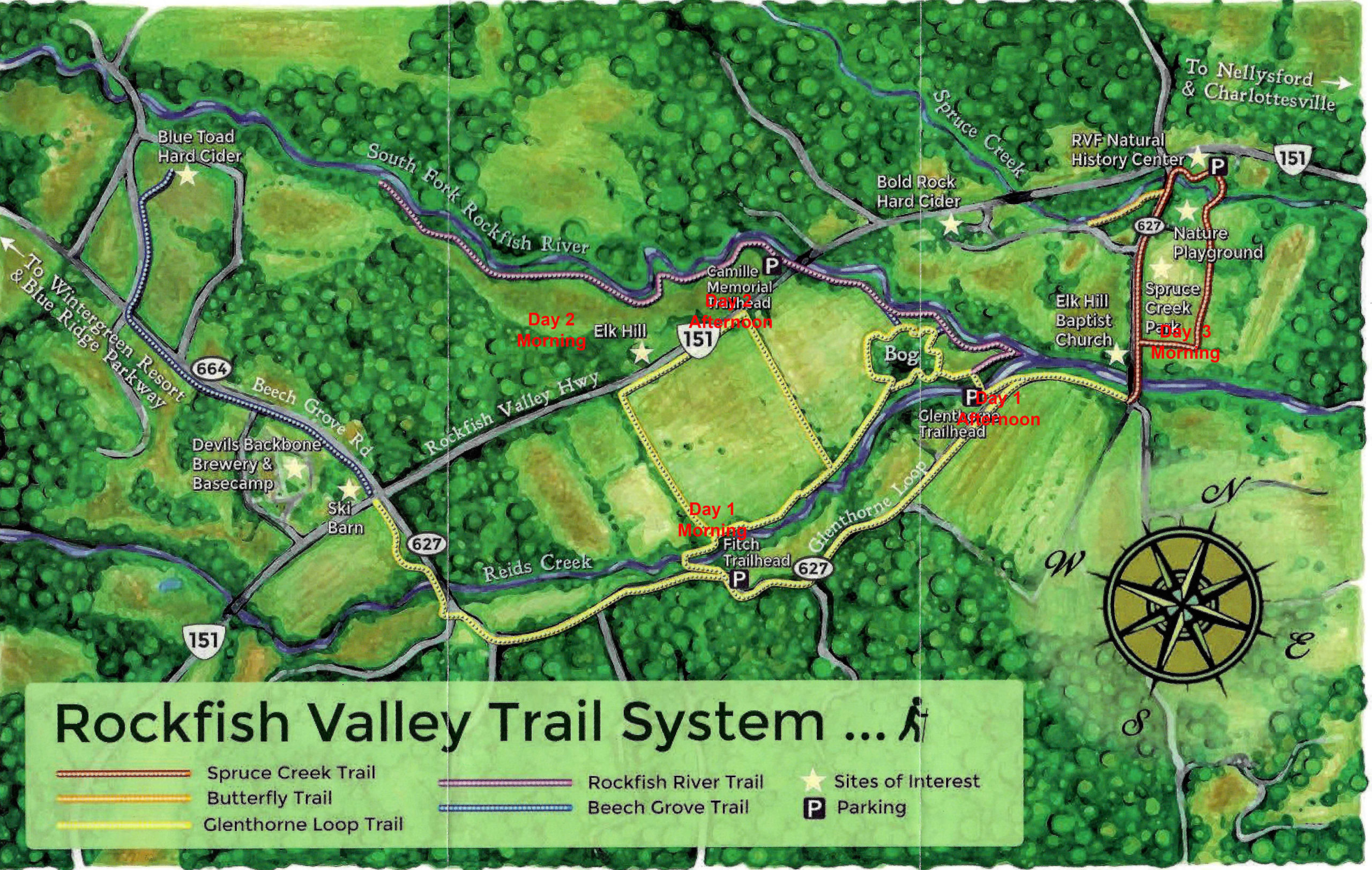
We arrive on Sunday afternoon. Actual painting days are Monday through Thursday. On Friday, check out time is about 11 AM. So that’s four full days of painting. A rare luxury of which I planned to take full advantage!

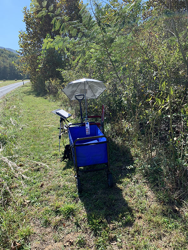
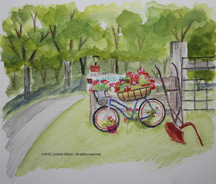
Monday morning I decided the best approach was to go out with my sketchbook. This would give me a chance to loosen up and get comfortable. Laura Loe is good at putting cute little paint-able things around. Last time I visited I noticed this bicycle at the front entrance to the property with geraniums and other flowers planted on it. I regretted not taking a photo of it since my last visit, so I decided it would be my first subject. I chose watercolor pencils as my medium, but did the foliage on the trees with regular water color. The challenge with this one is that it was our hottest day and I was sitting on my uncomfortable folding stool in the blazing hot sun. I could only tolerate that for so long. I did get a fun little sketch.

After that, I decided I needed to get 1) out of the sun, and 2) into a more comfortable chair, so I decided to paint the two red seesaws on the lawn between Square House and the Post Office. This allowed me to sit in an Adirondack chair under a tree. It was much more comfortable.

I chose line and wash as my medium. I did the sketch and inking (mostly) before lunch. After lunch the sun had moved so I was forced to move my chair. The charge in light and perspective did not matter too much since I’d already captured the drawing. I spent the afternoon finishing This up and felt it was a good second effort for the day.

Day 2- Landscape Painting in My studio

Monday evening our teacher, Kesra Hoffman did a gouache demo for our class. She said she resisted the medium at first but then decided that she could just use it like watercolor and grew to love it. I’m not sure I totally agree with that, but I do agree that if you start with a wash and build up, that first layer is similar to water color. Watching the demo was humbling because Kesra is so comfortable with the medium. I knew I needed to try it to see what kind of results I could get.

Another factor that helped set my direction for the day was my realization that I should get over needing to do plein air and paint in my studio. As I said in my earlier post I have always thought of Nimrod as a plein air location, but found that many of the artists there with me did not subscribe to that way of thinking. I figured I had paid for the studio so why not use it?

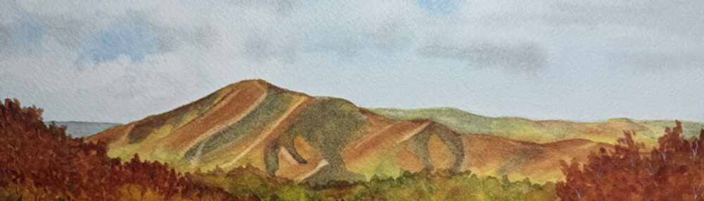
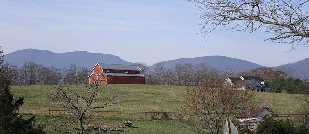
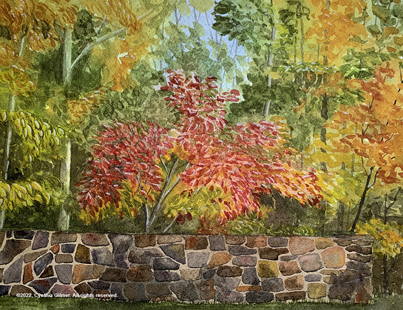
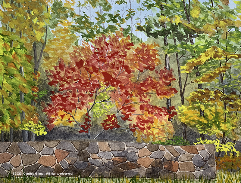
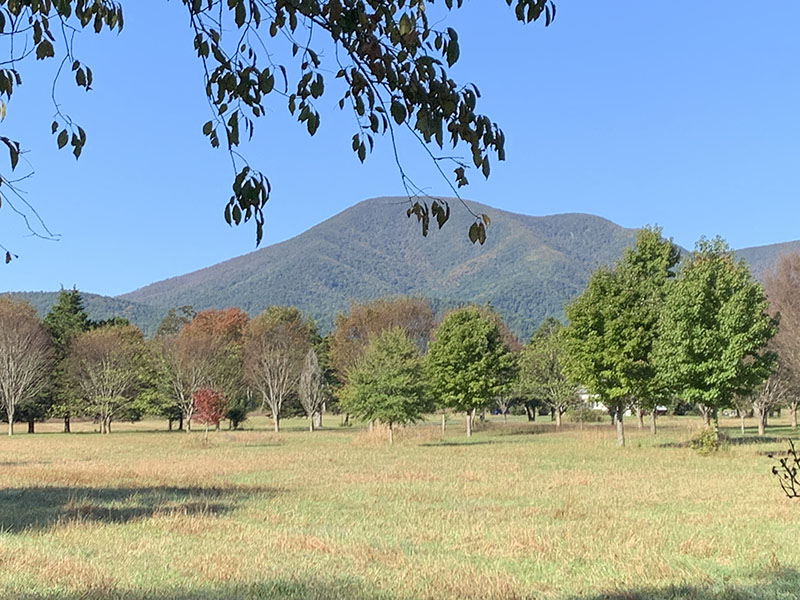
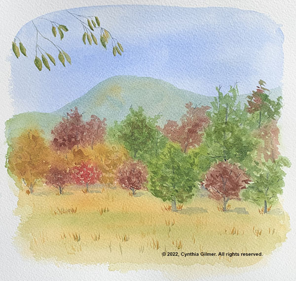
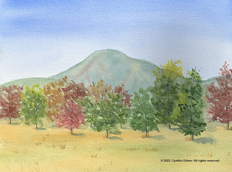
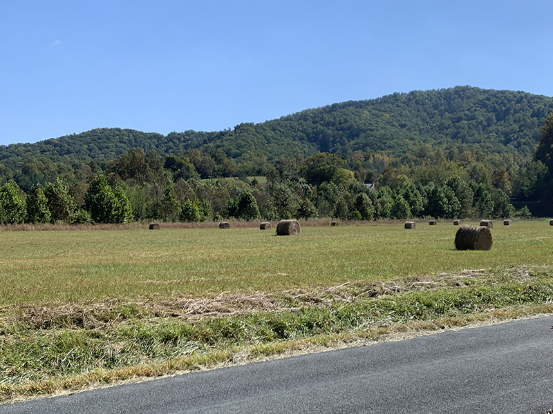
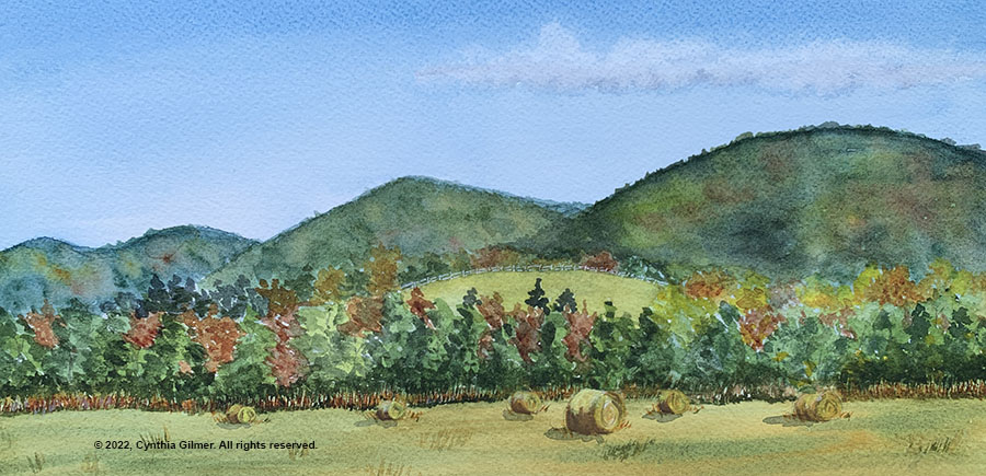
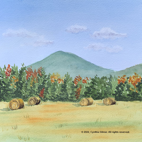
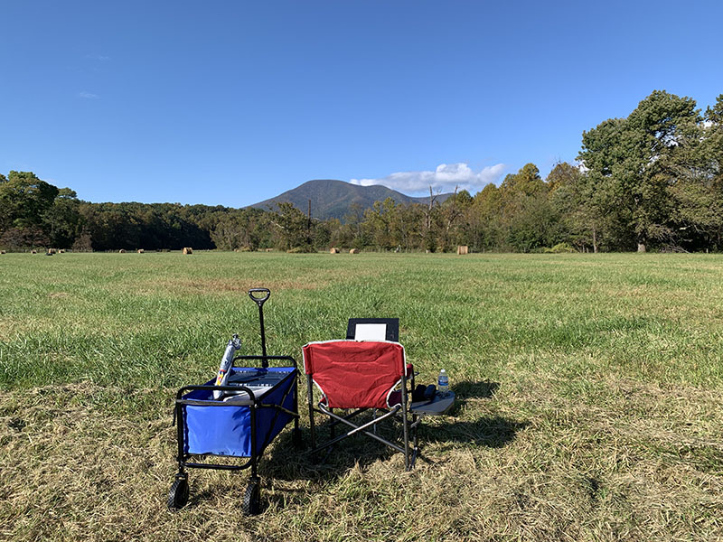
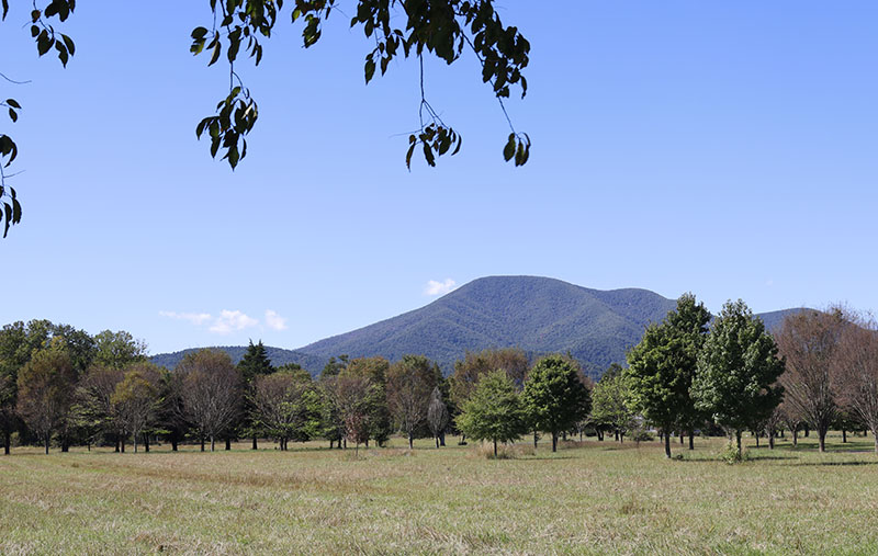
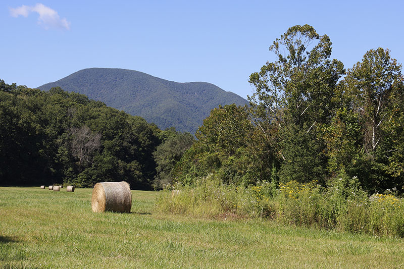
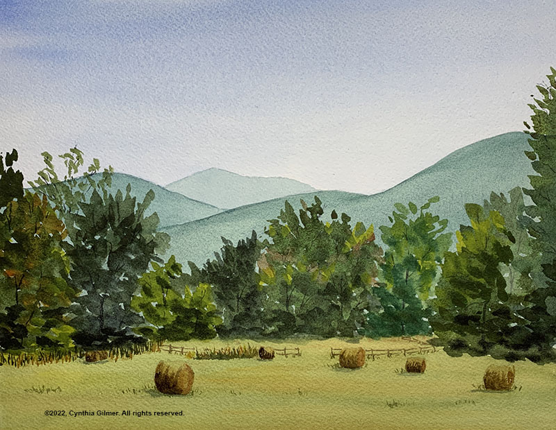
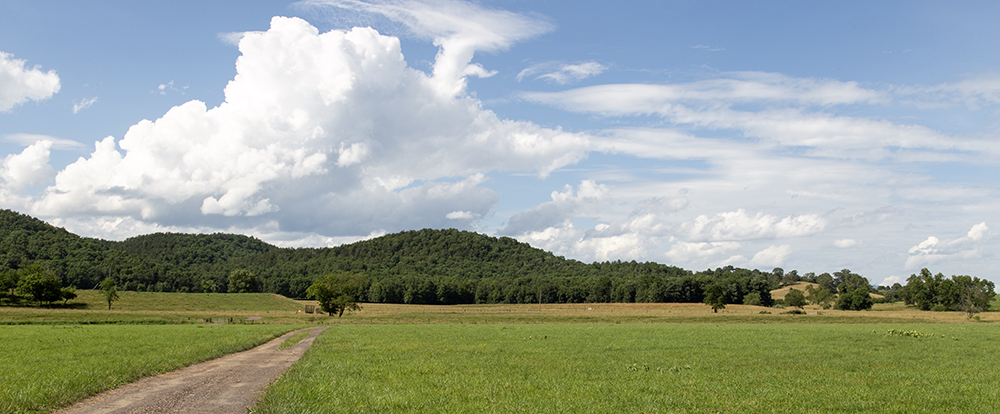
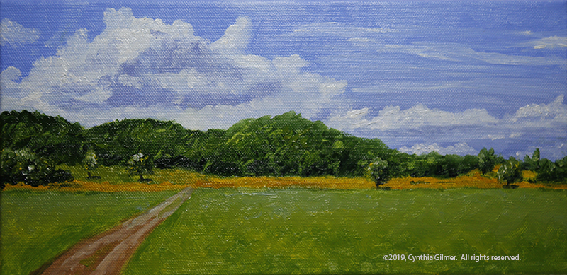
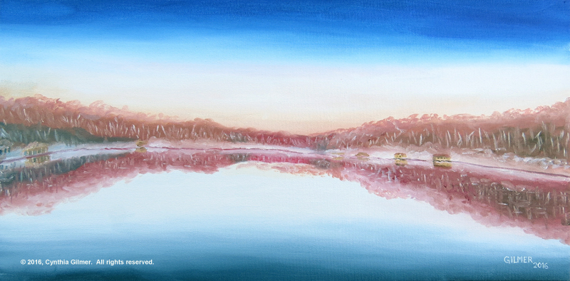
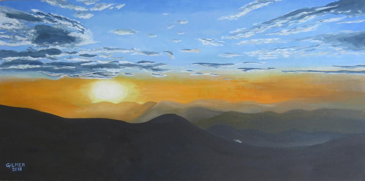
I went for a nice walk on Tuesday morning and took some nice pictures. I decided to spend my day painting a landscape from one of my photos in both watercolor and gouache to compare the two mediums. The reference photo I used is below. I like it because of the clouds and the contrast between the green grass and trees and the golden fields. I also noted the clump of trees right at the end of the road. Technically this is a composition no-no, but I kind of liked it so I decided to run with it.

I painted the watercolor and the gouache together, switching from one to the other during drying time. There are similarities and differences between the two mediums. I learned that the gouache can get undesirable “blooms” just like watercolor. The gouache yields harder edges where soft edges are easy in watercolor.

When Kesra came by in the afternoon and did her critique she pointed out a couple of things. First, my road did not go far enough into the center of the painting. She showed me how I’d made an error in the proportions as they appeared in the photo. Second, she pointed out that the trees at the end of the road weren’t really working. I’d hoped they would, but I was wrong. She also pointed out that the variations in color along the tree line in the gouache were really nice, but the watercolor was too consistent.

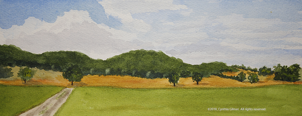
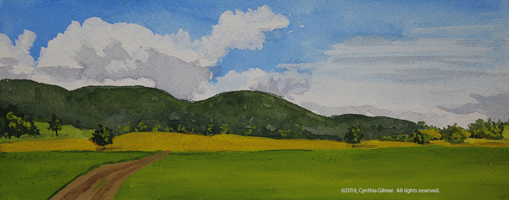
I was able to cover and move the road in the gouache, but that was not possible with the watercolor—a distinct difference between the opaque and transparent mediums. I also lifted some color on the tree line in the watercolor, but in a subsequent critique Kesra pointed out that it was a little too formulaic. Here are the two paintings. They are 10” x 4” on Arches 140 lb. cold press paper.

Watercolor

Gouache

I really liked doing the same scene in two different mediums. It was very educational, not only in learning about the different media, but also in studying and interpreting the scene. I decided to keep it going the next day by doing the same scene in oil and acrylic.

Day 3 – More Landscape Painting in my Studio

When I was packing to go to Nimrod I packed way more than I needed for art supplies, because I didn’t know what I’d be doing and wanted to have whatever I needed. I am happy I did that, because I ended up doing some things that were out of the ordinary…like painting in acrylics. I had these two little 12 x 6 stretched canvases that I tossed in. I like the 2:1 footprint for landscapes, although I usually paint bigger. Painting smaller has its advantages if you’re painting plein air or trying to do a lot of quick studies.

So on Wednesday morning with my two little canvases in hand I set out to paint the same scene in oil and acrylic. I haven’t painted much in acrylic in years. I get very frustrated with it because once I switched to oils, I couldn’t take acrylic’s fast drying time.

Once again I switched back and forth between the two. Of course, that didn’t allow the oil to dry…that takes weeks or even months. Switching still gave me a break. It’s always good to look away.

Similar to the gouache, the acrylic yields much harder edges. The fast drying paint makes it hard to blend the colors, but the oils are very difficult to get hard edges with. You can do it if you wait for it to dry, but that takes a long time. 

I like the colors better in the oil version. There is more variation. Some of that is the nature of the slower drying oils, but I also had a more extensive palette of oils to start with. I only had a limited number of acrylics, even after supplementing them by buying more in “The Art Box” bus which is parked at Nimrod every summer to provide artists with materials they find they need but don’t have with them.

When looking at all four versions I found that I got bolder with the skies on the second day, so the oil and acrylic versions have much more dramatic clouds, which I think is an improvement. I found myself wishing I’d been more daring with the skies in the watercolor and gouache versions.  Here are the two paintings from Wednesday.

Oil


Acrylic

Day 4 – Another Day of Gouache and Watercolor, but Not the Same Subject

I had one last day to paint and after spending two full days interpreting the same scene I was ready for something different. I did two more paintings on Thursday – one watercolor and one gouache.

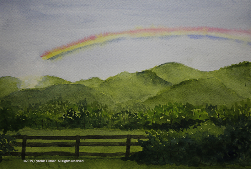
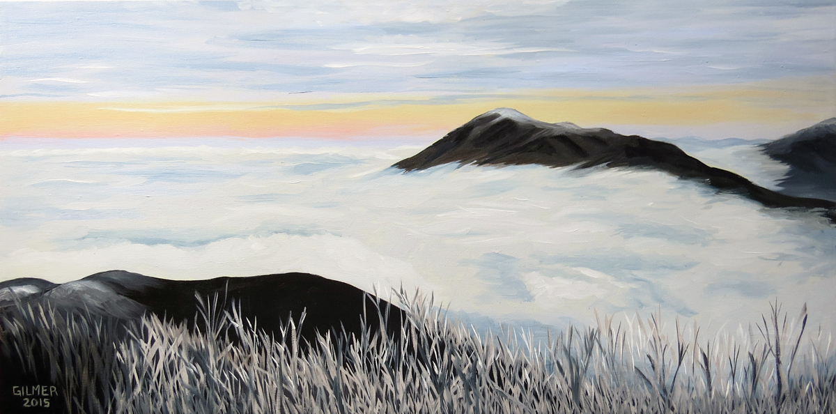
On Tuesday evening we had a thunderstorm followed by brightening skies and a rainbow over a nearby ridge. I brought out the camera and took a lot of pictures. While I was doing so I pronounced, rainbows are nearly impossible to paint. So what did I do? I painted the rainbow!

Several years ago I did an oil painting of a rainbow from a photo a friend had taken. I was not happy with the result. I decided that watercolor might be friendlier. I hoped that if I did a wet in wet approach I could get the primary colors to bleed into a full ROYGBV* spectrum. It kind of worked, but not nearly as well as I had hoped.

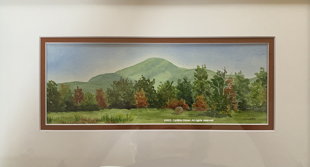
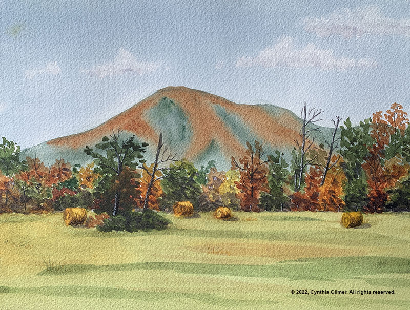
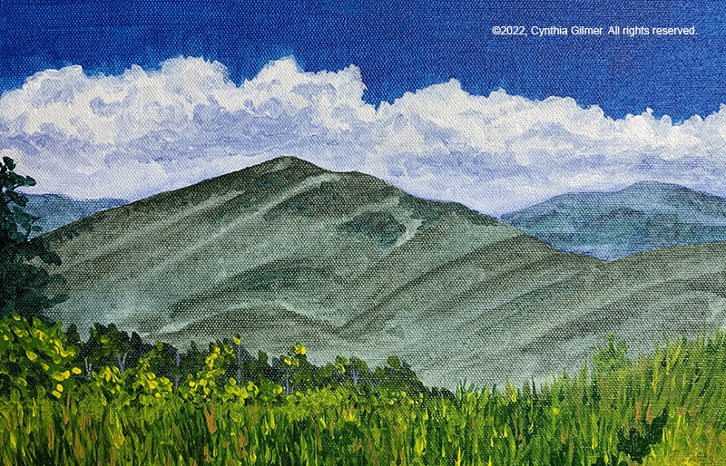
The criticism Kesra had for me was that I did not get enough atmospheric distance in my mountains. They were too green, which is never the case when you’re looking at them at a distance. This is something I’m still trying to train my engineer’s brain to do. I need to learn to see, and paint what I see, rather than painting what I know to be true. Yes, the mountains are green…and yes they look green to me in the picture, but they are much bluer than I think. I really need to work on this! Here is the painting. (10” x 7” Arches 140 lb cold press)

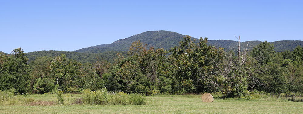
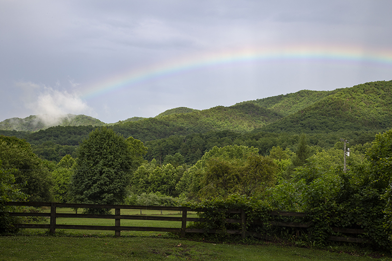
And here is the reference photo.

* red, orange, yellow, green, blue, violet

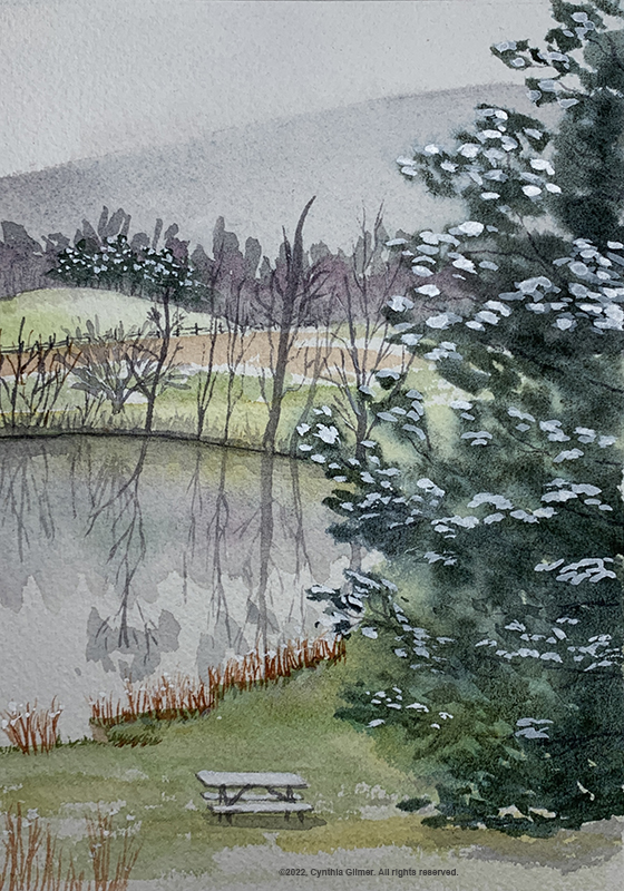
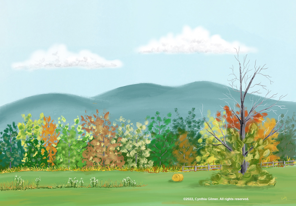
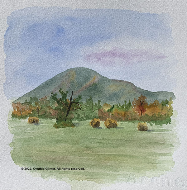
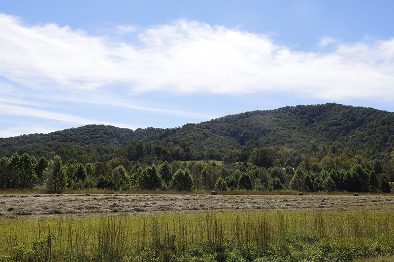
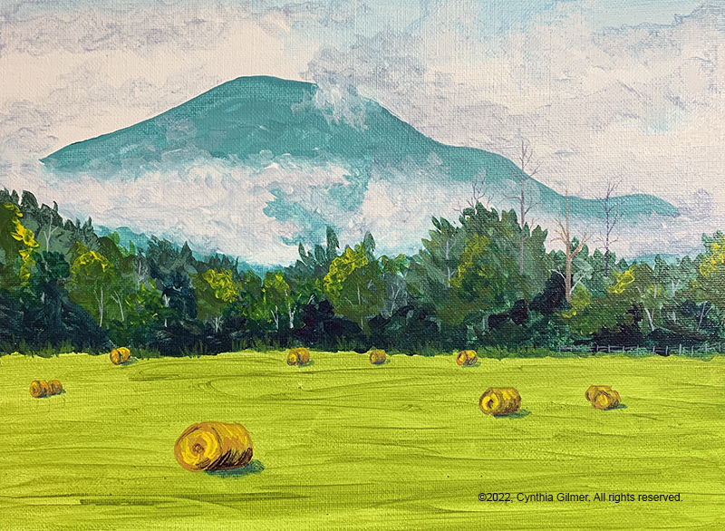
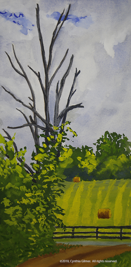
In the morning I’d gone for a walk and I found a pretty scene with a dead tree (dead trees are great fun to paint) and a field in the background with hay bales. I decided it would be fun to do as a gouache study for my final painting. This is probably the one I spent the least time on. We had the walk-through that evening and so there was a lot of pressure to get it done.

Kesra didn’t have a lot to say about this one. I like the sky but the rest of it is a little flat. I could probably correct that if I spent some time on shadows and highlights. I may also do this again in watercolor. Here is the painting. (6” x 12” Arches 140 lb. cold press)

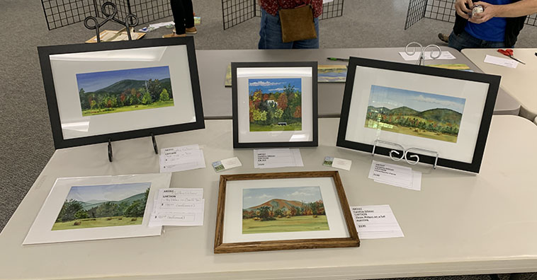
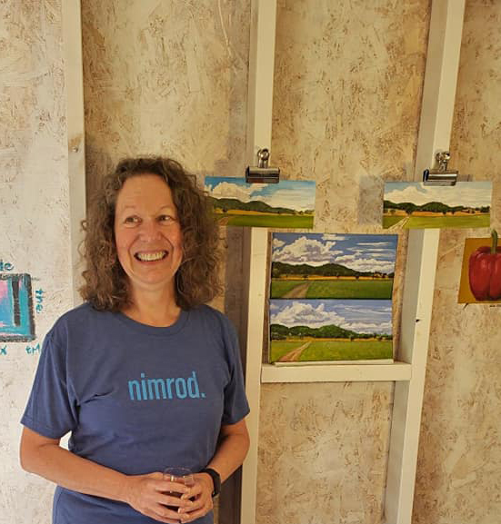
Each Nimrod art week finishes on Thursday night with a walk through where everyone displays what they were working on and people walk through and see it. As Laura Loe explained, it’s not really a critique… it’s more of a “love-fest”. I must say, people did some lovely work.

I painted up until almost the last minute and then tidied up my studio, which of course was a mess. I did take a break to shower, but most everyone was well dressed and I was still in my shorts and t-shirt. Oh well.

People seemed to like my story about my scene that I painted in different media. They were interested in which I liked best and I explained that all had their pluses and minuses, but the process was very educational. Here I am with my work.

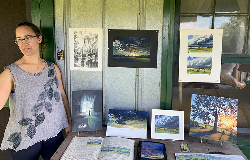
Is I said in an earlier post, Kesra did her own thing in the morning and did critiques of our work in the afternoon. She did some beautiful work. Her gouaches really pop. I’m hoping to keep practicing my gouache. I’m inspired by how beautiful hers are. Here she is with her body of work from the week and a few other things she threw in. The two landscapes on the upper right were the demo she did for us on Monday evening.

Nimrod is a magical place and it’s wonderful to spend time with such creative people in such an inspirational place.  I’m already looking forward to next year. 

Lake Anna, Et Cetera

Once again, I’m painting from other people’s photographs and I’m very thankful I have friends who are such good photographers. They provide me with much inspiration. Below is a painting I did from a photograph taken by my friend Chip Bumgardner. He has a house on Lake Anna in Virginia and he took this absolutely stunning photograph of the lakeshore during the snowstorm last winter.

The sky was a dark, almost midnight blue, which faded to white and eventually picked up the reflection of color from the shore. The sun was shining on the trees around the lake and they were red hue except for where they were covered with snow. There were a few visible snow covered boathouses. Then the entire scene was reflected on to the smooth, clear surface of the lake. I don’t know if Chip was lucky enough to get these colors straight from his camera, or if he adjusted them. Either way he deserves the artistic credit for the photo.

I don’t believe I did the photo justice, but I had fun painting it. My engineer’s brain struggles with composition because I am compelled to paint what is there. As I study and learn more about composition, I learn what makes a good arrangement, but still struggle with adapting the scene. The beauty of this photograph is that it’s perfect composition all by itself. The eye is drawn through the painting to the middle, most distant part of the shore. The contrasting colors cause the trees to stand out as the focal point of the picture.

My job was easy. I just copied what I saw. The tree colors in the reflection were slightly lighter and brighter and the water was darker and grayer. The boathouses were fun. I took a few liberties regarding their number and placement.

Below is the finished painting followed by Chip’s original photograph.

Lake Anna in Snow Chip B's Lake Anna Sunset

Continuing with photos from friends, I had not done a butterfly in a while and my friend Sharon Little took a very pretty picture of a Viceroy butterfly last summer. Below is a watercolor done from her photo.

EPSON MFP image

Skies

I was always challenged by skies, so lately I’ve taken them on with a vengeance and I feel like I’m seeing some success. I was showing photos of some of my paintings to my friend Rob and he remarked that my skies were nice, so I have a second opinion.

Part of the problem is my engineer’s brain.  Sky is blue, clouds are white, and cloud shadows are grey, right?  Nothing could be further from the truth.  Once I got past that things got better.  A couple of events helped me.  One was seeing some paintings by a Bobbi Pratt, a local Northern Virginia artist.  Bobbi does beautiful colorful skies. Second was the class I took from Andras Bality, who helped talk us through mixing our palette, pointing out the violets in the clouds.

Back in 2000 I painted a picture of a photo I’d taken of the Pont Du Gard in the South of France. I always loved the painting, but I hated the cloud.  I actually repainted this when I first started painting again last year thinking I’d get it right the second time.  The cloud is better, but still not right. I might have to try again now that I’m getting seriously into clouds.

2000 Version

2000 Version (acrylic on canvas)

2014 version (oil on board)

2014 version (oil on board)

Sunrises and sunsets have become some of my favorite subjects since I’ve been getting into skies.  I’ve taken on some truly challenging scenes, and I’ve been pleasantly surprised by the results.  Last spring we went to St. John, USVI for our anniversary and my husband took a stunning photo of the sunset from Zozo’s, a restaurant in the Caneel Bay resort.  In an act of total bravery I decided to try to paint it and I’m so glad I did.  It came out wonderfully.  I ended up painting most of the clouds with my fingers because I couldn’t get the brushes to do what I wanted.  I’ve learned more about brushes and how to select and use them since then.  I remember after I finished the sky I was terrified to paint the palm trees for fear I’d screw it up.  I didn’t.  It’s one of my favorite paintings.

Sunset at Zozo's

I also did it on the iPad.  The two ended up being sort of parallel studies for each other.  I was doing the painting in our mountain house.  I worked on the iPad version while I was in our Northern Virginia place.  I finished the iPad version first.

iPad version

iPad version

Last September I spent a week in the mountains and every morning I would walk to an overlook to photograph the sunrise. One morning the clouds were particularly luminescent.  I decided to attempt a painting of that.  I like the sky.  I painted the shadows first and finished the highlights in pure white after everything had dried.  I struggled a lot with the mountains and how they faded in the distance.  It’s not a favorite, but ultimately I like the result.

September Sunrise in Wintergreen

I’ve already posted my painting of the clouds lying in the valley, but this one was great fun.  I thought about naming it clouds from both sides 🙂 What’s nice about this one is that the photo almost appears to be black and white except for the streak of orange-yellow sky in between the layers. I tried to make the colors, except for that streak, very subtle to keep that black and white feeling.   I’m thinking about painting this one again in a larger size to go over my fireplace. That thought makes me nervous.  I’m not sure I could do it as well a second time around.

Three Ridges in Cloud

Most recently I decided to try a sunrise picture I took several years ago on the North Carolina shore.  This is still a work in progress and I’m not sure how I feel about it.  The colors are great.  I painted the sky and let it dry and then painted the clouds.  This is good if you want sharp edges, but it isn’t good if you want things to blend.  Some of these clouds have sharp edges but others are wispy.  I had to repaint the wispy ones with part of the sky to get them to blend.  There is also a cloud that looks a UFO.  I still need to work on it.  There may be hope for this, but I’m not sure. I’ll post the finished version if it’s any good.

A work in progress...

A work in progress…

In the beginning…

In 1998, I decided I wanted to try my hand at painting. I actually don’t recall what led me to this idea, but I tend to be a bit impulsive, so if the idea popped into my head I probably acted on it. At the time, I was a co-founder and Vice President for an Internet startup. We were still trying to figure out exactly what the company would do, so I had some free time on my hands.

I had taken art classes in high school and showed some aptitude. My older sister is an artist and I was always intimidated by my inability to keep up with her so I never pursued art outside of the classroom. I also never attempted anything as ambitious as painting with oils or acrylics.

As I said in my “about me”, I’m an engineer by training. More specifically, I’m a computer scientist — some engineers would take issue with me calling myself an engineer, but you get the idea. I’m a logical thinker and I approach problems in a specific way. Painting was no different. I went to a local craft store and bought some acrylic paints, brushes and canvas paper. I think I also bought a plastic palette that was covered and would keep paints wet for a few days. I didn’t know if I would be any good at painting so investing in actual stretched canvases seemed frivolous. I then began to experiment to see how paints worked.

I had a photograph I’d recently taken of a dogwood blossom. I decided that would be my subject. I practiced mixing colors and testing brush strokes. I wasn’t sure how to capture the background. The photo was focused on the blossom so the background was blurry. I decided to just paint it dark green with some slightly contrasting leaves. The leaves and the blossom in the foreground I painted in more detail. Interestingly enough, I ended up liking the painting, and I was encouraged to continue. I guess that’s a good thing because I now derive great pleasure from painting.

At some point later I actually had that first painting framed and gave it to my mother as a gift. Because it was on cheap canvas paper I had to have it mounted on a board. It ended up looking pretty nice as you can see from the photograph. Both digital photography and my skills at photographing paintings have improved a lot since the 1990s, but you get the idea.

First Painting

So this is how my journey from engineer to artist began and it continues…