This is going to be a long post, but it’s something I really want to make sure I capture, for myself and others who might be interested.
During the later half of my career, I spent a lot of my time doing what is known as human centered design, or design thinking. Design thinking is a problem-solving approach with a unique set of qualities: it is human centered, possibility driven, option focused, and iterative. (2017, Liedtka, et al.) It is also known for applying designers’ sensibilities to problem solving.
I often talk about my engineer’s brain and my artist’s brain, and how the two don’t work together. It has always puzzled me that I could not figure how to get my design thinking experience to influence my art. One challenge to this was that I usually paint for myself, making me the human at the center of the design effort. This means that I either like it or I don’t. Yes, I learn from my failures and I move on, but it’s hard to put a formal process around this.
My friend Carlo, who follows my art journey, came to me some months ago and asked me if I could do a painting for him and his wife Mary, of a place they once lived on the Magothy River near Annapolis Maryland. I have never been there. He sent me a couple of photos and I did a quick watercolor sketch and sent it back to him just to get his feedback.
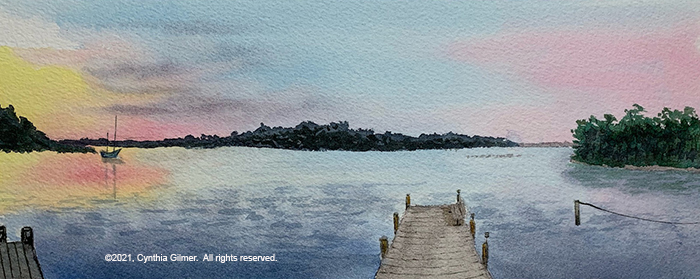

It was a good thing that I did, because while I duplicated the photo pretty exactly (except for the townhouses), the scene he was remembering was really quite different. I realized at that point that I actually had an opportunity in front of me to use all that I knew about design thinking to explore Carlo’s memories and attempt to develop a scene that would evoke the pleasantness of those memories.
I spent the next few months going back and forth with Carlo. I learned from that first sketch that it was important to show the perspective of the distant shore correctly. He pointed out that the river is over a mile wide from this vantage point. He sent more photos and I did an additional sketch. Each subsequent sketch was a composite of the earlier ones applying what I’d learned.


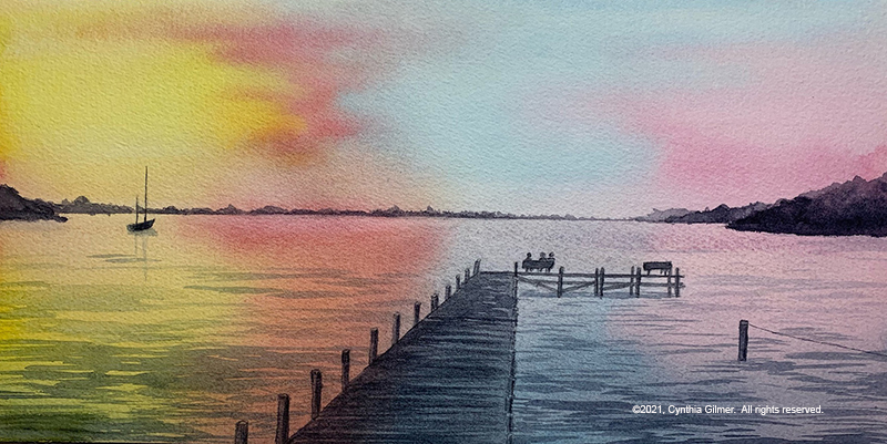
From discussions about this sketch I learned that the trees in the foreground on the right were not actually there (or should I say, not really in the scene he was recalling). I also learned that the bright yellow sky was overwhelming and made Carlo think sunrise more than sunset. He also mentioned at this point that he liked the pier going straight out of the center of the picture.
Based on what I learned I did two more sketches. Note that I wanted to test giving him multiple options to compare, so I didn’t show these two until later.
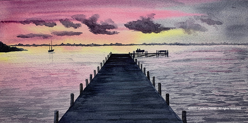
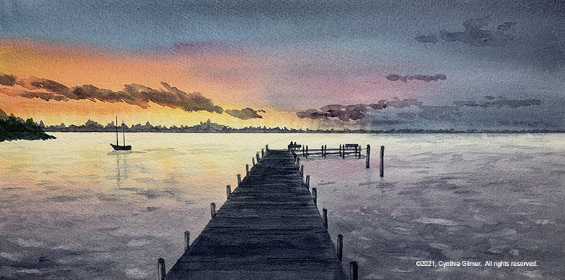
Then, I posted all four paintings together on a private page of this web site and this time I asked him a set of pointed questions and ask him to respond for each painting. Here were the questions:
What do you like most about the painting and why?
What do you dislike about the painting and why?
How does the painting make you feel?
This turned out to be an interesting exercise for me and I think also for Carlo. I learned a few key things from his feedback. First, I learned that even though the first painting missed the mark in almost every way, he liked the coloration of the pier most in that painting. I also learned that sketch 4 was his favorite, so I had a target to follow. I learned that he gravitated toward a calmer water appearance. He reiterated that he didn’t like the coloring of the sky in sketch 2. He didn’t like the prominence of the pier in sketch 3.
The other thing that emerged from this discussion was the size of the planned finished product. We were originally targeting a large painting for over their fireplace, but as I did the smaller sketches he was reminded of another print of a water scene he has and decided he’d rather have a smaller painting that he could pair with that painting. He would never have made this connection if we hadn’t gone through the iterative process of doing the “prototype” sketches.
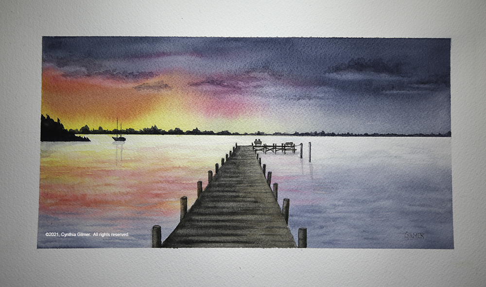
So based on everything that I learned, I painted the final product. The painting is 11.75 x 6, to match the print he wants to pair it with. That print has whitespace between the painting and the mat, so I taped off the frame on a larger piece of paper so he could duplicate that. Finally, I focused on the coloration of the sky, the distance of the land on the far side of the river, the calmness of the water, and the lighter coloration of the pier. Here is the finished product.
So, back to the original topic of this story, here’s what I took away from this process. Designers are artists, but artists are not necessarily designers. Even trained designers are really just artists when they are creating for themselves. Visual design takes artistic ability, but designing something someone else requires a human-centered process. This is where the connection is, with the act of designing for others, not with the underlying art. The real take-away is that I can use my experience in design thinking when I am painting for others to develop a product that they will be delighted with. If you got this far, thanks for listening.
