Class: Capturing the Subtle Beauty of Winter in Watercolor

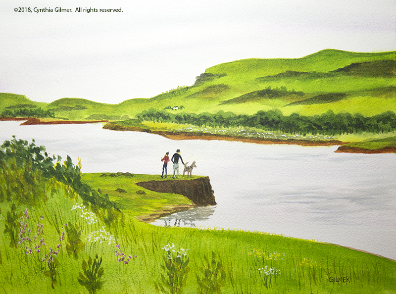
Now that I’ve joined the Shenandoah Valley Art Center I’ve started watching their class schedule and saw an upcoming one by Peg Sheridan. Her classes fill up quickly so I jumped on it. Peg lives in Staunton and teaches all around the area. She’s been a watercolorist for forty years! Her teaching style and demonstration skills were great. That said, she made it look so easy it was frustrating.

I showed up prepared to be taken out of my comfort zone. I think to some extent that happened.

Peg’s initial demonstration was very loose. She reiterated something I’ve been told by multiple other teachers, that you can start light and loose and then slowly construct your painting in layers on top of that.

Through out the class Peg was a treasure trove of tips and tricks. I took as many notes as I could. For those who do not paint (or aspire to), this might be more detail than you want. Some of the more valuable ones were:

  • When you start a painting, think about the outcome you’re trying to achieve. What kind of feelings are you trying to evoke?
  • She had a lot of advice on mixing paint that go beyond simply mixing paint on your palette. First, she demonstrated mixing paint on the paper using gravity – put on your washes and then tilt the paper and let things run together. Second, she said it you do mix on the palette, don’t mix completely – just swirl the colors together but make sure you pick up some of each as well as the mix when you put brush to paper. This cuts down on muddy, over mixed colors.
  • Use the side of your brush more – don’t always hold it like a pencil. Again, this is something I do with oils, but less so with watercolor. I need to fix that.
  • Stand more while you’re painting to stay loser. You use your arm more instead of your fingers. I usually stand when working in oil, but sit while working in watercolor. I am going to start to stand more, at least at the beginning of the painting when I want to be looser.
  • If you wet the paper wait till it starts to lose its shine before painting (I knew this but it’s always a test of my patience). Then as it dries, use thicker paint. Stop before it gets too dry because you’ll start getting back-runs.
  • If you over-paint to make your whites pop, use acrylic instead of gouache to get brighter whites.
  • For blotting clouds in the sky, wet the paper towel or tissue. It will pick up more paint.
  • Also for skies, leave the whites of clouds dry but wet the shadows and tap in color.

There were some others, but these were some that resonated with me.

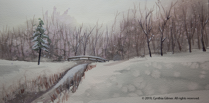
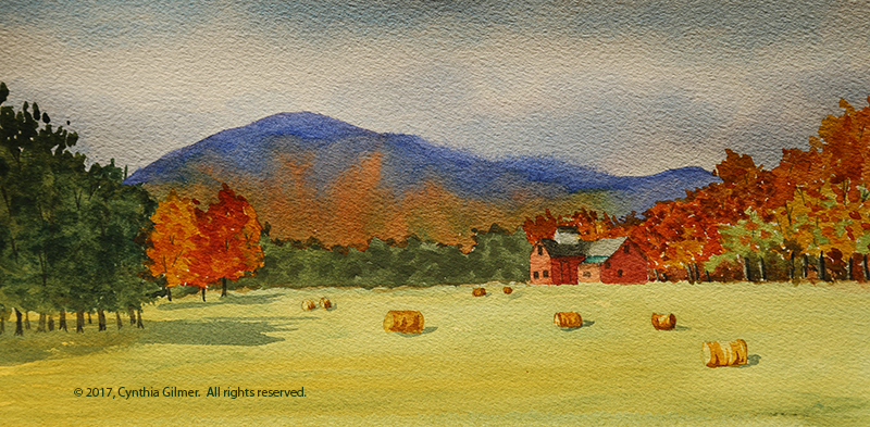
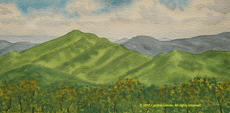
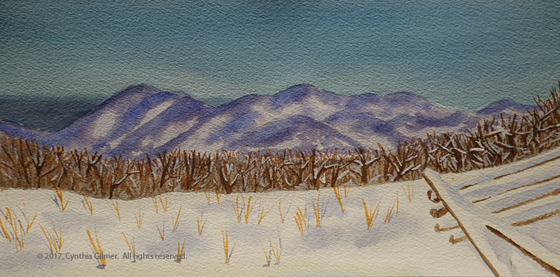
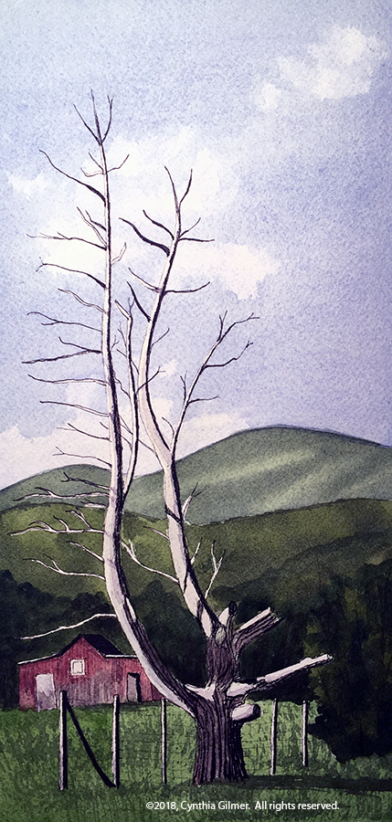
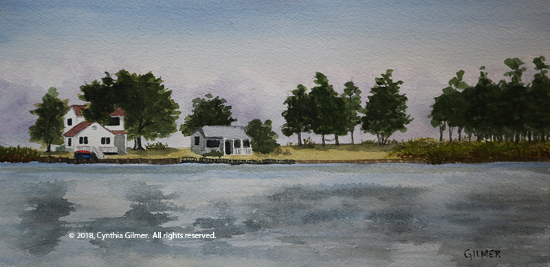
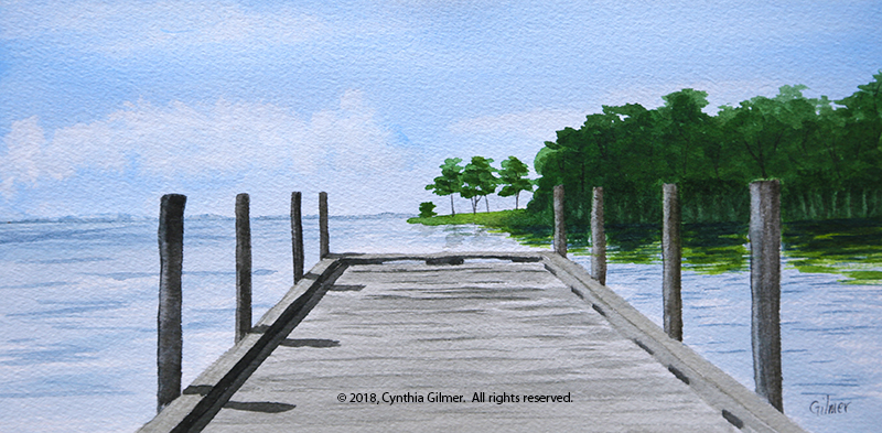
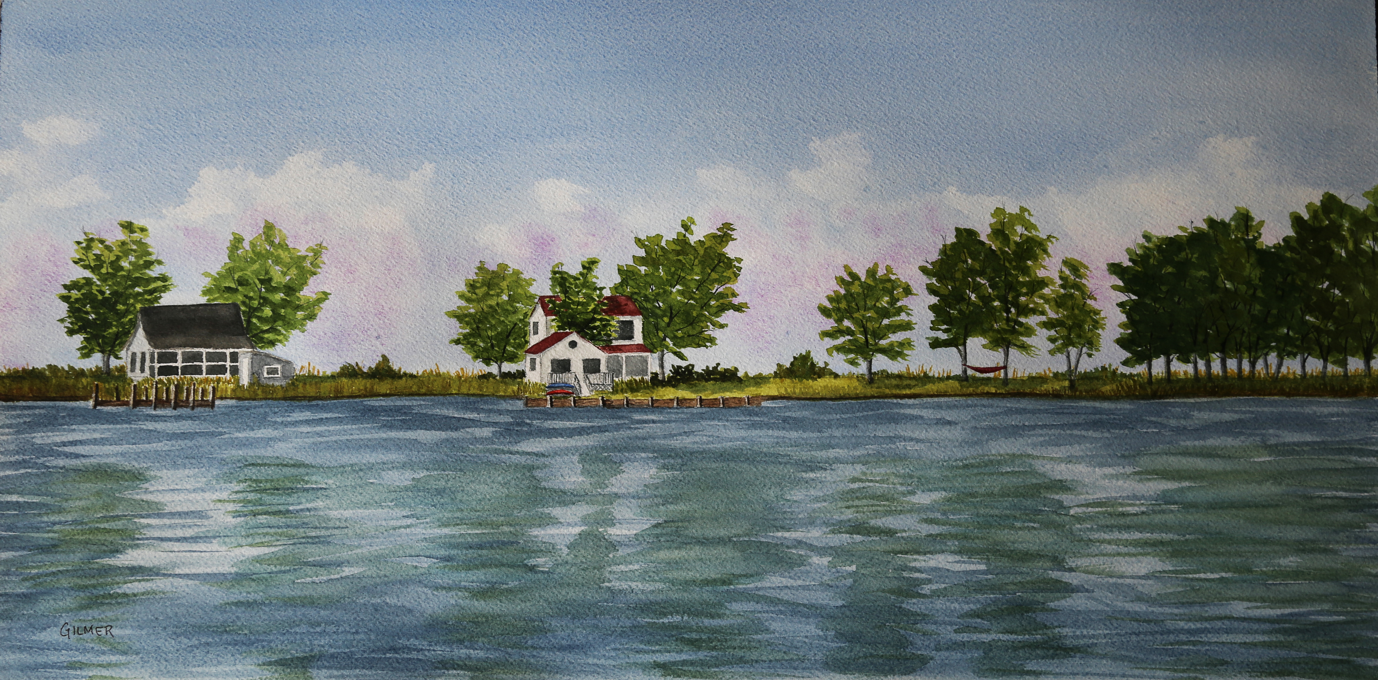
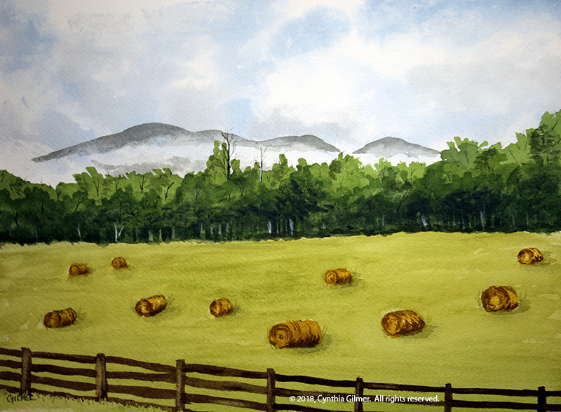
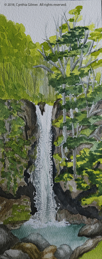
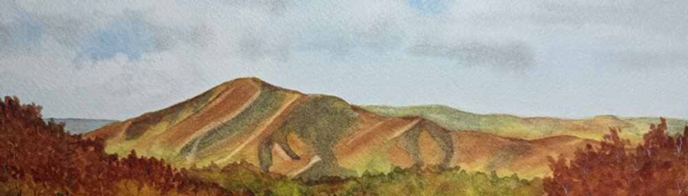
I did two studies in the class (shown below). Both are small. Peg’s advice was to strive to do several smaller paintings in the class rather than one big one to learn more. The first was a view of a bridge on the golf course near our house. I took the reference photo during the big snowstorm we got in December. The second was of a stream on the same golf course. This reference photo was taken several years ago on a sunny day after a big storm. Peg said she liked the first one but not the second. She thought the stream was too dark, and suggested I balance it with darker trees on the right, which I did. It still wasn’t her favorite, but I liked it well enough as a study piece.

Old Packhorse Bridge

I felt like doing a small painting. I wanted to do something intricate that I could obsess over the details on a bit. When we were in Scotland, the first place we stayed was a town call Carrbridge. The town is famous for an old stone bridge that crosses the River Dulnian. It’s called the Old Packhorse Bridge. While I was there I did a quick watercolor sketch from a photo I took, but decided it was time to do something more serious.

I took a different approach with this one. I tried very hard to use Marc Holmes’ tea-milk-honey approach where you start with a very light sketch and then gradually add more and deeper color in layers. I tend to be impatient, so I start adding too much too soon, but in this painting I was pretty disciplined. I’m also pleased that I left out a few details that I think made the scene less pretty. My engineer’s brain always wants to paint all of the details, including the ugly stuff.

After the pencil sketch I put a light layer of foliage in. Then I did the first layer of water. Then I did a light sketch of the rocks and bridge. Then I went back over the whole painting deepening the color and correcting a few things I didn’t like. Finally, I did the tree trunks and branches. I liked the result.

Here is the painting. It is 8×6 on arches paper with da Vinci watercolor paints.

Here is the photo.

Painting Fall – Some Recent Works

We’re finally seeing some fall colors here in the Blue Ridge Mountains after some cold weather hit. The good news about being an artist is that we can hurry the fall colors along in our paintings, and I confess to doing a little of that in some of my recent watercolors. I love painting fall colors!

The first one I did from a shot taken at the Raven’s Roost overlook on the Blue Ridge Parkway. There’s an iconic pine tree perched on a rocky point there that is a much photographed and much painted scene. I took the photo in September, but painted it more recently and decided to add some fall colors to the mountainside in the foreground. This is my second attempt at this scene, the first was okay, but I felt the tree trunk was too heavy in that version. This is 16×12 on Arches 140lb cold press using Da Vinci watercolors.

Fall in rural Virginia means hay bales. With all of the rain we got this year we have more than ever. A few weeks back I attended the Lynchburg Art Festival where my cousin’s husband Rodney Laughon, a wonderful landscape painter, exhibits. My cousin said his paintings of hay bales always sell. Plus they are such fun to paint. So with that inspiration I’ve been out with my camera collecting reference photos of hay bales. This photo was taken from a trail that runs along the Rockfish River near the village of Wintergreen. The mountain looming in the background is Three Ridges…one of my favorite subjects. The line of trees was not nearly so colorful in my photo, but it is fall, so I helped them along. This is 16×8 on Arches 140lb cold press using Da Vinci watercolors.

Finally, and this is not fall in Central Virginia, I painted a scene from my Scotland trip in June. I love this scene because of the people and their dog out enjoying the magnificent view on the point. Everything was so green! The photo was taken at Dunvegan Castle & Gardens on the Isle of Skye. This is 12×9 on Arches 140lb cold press using Da Vinci watercolors.

New Galleries and Venues

Please go to the home page of my blog and subscribe if you want to see all of my posts. I’m only occasionally posting on Facebook now.

Since we’ve moved to Central Virginia full time I’ve been looking around for galleries and organizations with whom I can partner. I’ve had a great relationship with Falls Church Arts during the past four plus years, and I’ve learned so much from them. I will likely maintain that membership, and hopefully still show there occasionally when I can work out the logistics, but they are now 150 miles away, so I need to find something new.

The Rockfish River Gallery is in the valley just a little north of Nellysford in the Rockfish Valley Community Center. It is focused on showing the works of local artists. They are an easy stop along Nelson County’s famed “151 corridor” where there are many wineries, breweries, cideries and other sites to see. I have placed two oil paintings and four watercolors there and I’m looking forward to seeing how much attention they get. Below are the paintings that can be seen there.

In addition, I’ve joined the Shenandoah Valley Art Center in Waynesboro. They are an organization similar to Falls Church Arts. They have a gallery in downtown Waynesboro and run exhibits as well as provide space for member artists to show. I’ve just joined so I don’t yet have anything on display, but hope to begin participating soon.

If you are visiting Central Virginia, please take the time to drop into these two venues where hopefully you’ll be able to see some of my work on display.

Fun Line and Wash

So I’m woefully behind and need to do some posts to catch up, but this isn’t one of them. I tend to want to spend time painting rather than blogging, but both are important if I’m to chronicle my journey. So today I decided to live in the moment and post about what I just did.

Earlier today I watched a video by Steve Mitchell, Mind of Watercolor. I watch most of his videos as he is very good at teaching compared to a lot of the YouTube artists. The topic was line and wash, which is something I’ve done very little of.

I had this scene I’d been wanting to do from the valley. There’s this towering dead tree that is a dramatic form, with a backdrop of a dilapidated barn and some foothills. I decided it would make a great line and wash, so that’s what I did today. It was a lot of fun. Here is a photo…taken with my iPhone, so it’s not the best. Click on the image to enlarge.

Sometimes the Simplest Things are the Most Fun

(Once again, I ask that those of you who are interested please go to my main page and subscribe so you don’t miss an update. I will begin announcing fewer of my posts on Facebook soon so as not to annoy those who are not interested.)

I spend a lot of time walking in our mountain community, and one of the things that I always find striking is the fire hydrants. Of course fires are a big deal when you live in a forest, so I’m really happy they are there, but in our natural setting, I love the way the red contrasts with the green around it. Red and green are complementary colors, so when you put them side-by-side you get great contrast and the hydrant really pops! I’ve taken a lot of pictures of them but yesterday I tried my hand at painting one.

This is a watercolor and it’s approximately 5×7. Sometimes it’s fun to paint small. I’ve also been watching recent videos from my favorite You Tube watercolor artist Steve Mitchell. He’s been demonstrating negative space painting, so I got to practice that as well. I painted the light colored foreground leaves and did a wash for the grass first. Then I did all of the very dark background shading of the forest around them using negative space painting. Then I painted and detailed the trunks, the rock, and some of the detail in the grass. Finally, I painted the hydrant and finished the detail in the grass. I masked the hydrant with tape during the earlier steps just to keep it white so the red would be very bright. Here is the result. It was a lot of fun and I’m happy with the result.

Subscribe, New Watercolors, and a Return to Oils

Finally, some things are settling down and I’m doing a bit of painting. Before we get to that, I want to let you know that you can now subscribe to my blog. I’m thinking that if those of you who are really interested subscribe I will post less on Facebook and stop annoying those who have no interest in my art journey. So please…if you like this blog, provide your email in the “subscribe” box on the home page and you will receive notifications when I add a new post. I promise I won’t sell your email or post too often.

Given that I took a couple of months off to move and did very little painting, I felt pretty rusty when I got back to it. For a while, I felt uninspired and disappointed in the results. I’ve done a few pieces lately that I feel a little better about. I decided that the best way to get my confidence back was to return to a subject that is comfortable to me. With that in mind, I painted Three Ridges from the overlook. I used a photo I took on a pretty day a few weeks ago. I changed the angle a little from past works to give it a different composition with trees in the foreground on the left and the fence running away from the viewer rather than straight across the scene. There were some pink flowers in the foreground, and if there’s anything I don’t like about this piece it is my attempt at capturing those. In retrospect, I probably should have masked them out so they could be lighter pink, or left them out of the scene altogether.  This is 12×9. 

The other thing I’ve been playing with a lot is wooded scenes. A while back I did an oil painting of a mountain stream in the woods and I really like that painting. We’ve been doing a bit of hiking and I’ve been trying to capture some shots of sunlit wooded paths. I did this watercolor study from one of those photos on a hike to the White Rock Falls (off the Blue Ridge Parkway). It took a bit to get the path to look right. At first it lacked depth, so I darkened up the foliage on either side and it started to pop. This one is still taped to the board, so I might mess with it a little more. This is also 12×9.

I’ve been threatening to get the oils out again, and my experience painting this scene in watercolor inspired me to do an oil version. The last couple of oils I’ve done, I’ve tried to learn from my approach to watercolor to give my paintings a more impressionistic look. I may have taken that a bit too far in this one, but I like the result well enough to say it’s not bad for the first oil painting I’ve done in over a year. (Note that the photo is not the best. It is still very wet and difficult to move somewhere where the light is better.) I tried some new techniques I’ve wanted to try including painting with a palette knife. This painting is a combination of brushwork and palette knife. I did the original sky and some of the foliage using the palette knife and then used a brush for more foliage, the path and the tree trunks. Finally, I finished the sunlight on the tree trunks with the edge of the palette knife. I did this quickly, as I would a plein air. I went back to it after a day because I thought there was too much sky showing through the lower trees. I think correcting that was a big improvement. This is 20×16 on canvas. 

As always, thank you for taking the time to read my musings about my journey.  Comments are always welcome. 


Fundraiser

So, my high school reunion was last weekend…more years than I care to admit. It was great to see everyone. The organizing committee did a fundraiser where they asked classmates to donate items that they could sell in a silent auction. They reached out asking if I would donate a painting, and of course I said yes. I donated the small version of my painting of the houses on the isthmus on Tilghman Island. I chose this because I went to high school in Maryland, and I thought that a Maryland Eastern Shore scene would resonate with my classmates.

I’m pleased to say that it sold for a good price, and even more pleased (and flattered) that it sold to a fellow artist. Chris Bussler, is the wife of one of my classmates. She lives in Tennessee and after a successful career as a Navy Officer she is now a full time artist. She does wonderful work that can be seen on her website.

I’m finally settling into my new life being mostly retired, but still much busier than I’d like to be. I am starting to finding some time to paint again. I hope to have some things to post soon.

The Next Phase…

So I quit my day job last week. I feel I’ve reached that phase of life where I can work at what matters to me, rather than just focusing on making a living. We plan to consolidate our two residences into one, our house in the Blue Ridge Mountains. Once we’ve gotten through the hassle of moving I am hoping to spend a lot more time painting.

I decided that a recent painting I did was appropriate for this event. It was painted from a photo I took last fall when we visited Tilghman Island. It’s 12×6 on Arches cold pressed paper. Sittin’ on the dock of the bay watching the tide roll away…wasting time…

Stay tuned… hopefully things will get interesting.


Catching Up…

I haven’t blogged much for a while, so I thought I’d catch up on several paintings I’ve done in recent weeks. I continue to do all watercolors these days. I will get back to my oils eventually, but watercolor brings new challenges and will ultimately make be a better painter so no harm in focusing on them. I continue to improve but I have a long way to go.

I recently switched brands of watercolor paints and created my own pallet. I had been using Winsor & Newton, which is an excellent brand. The color choices I was using were driven by the recommendations from Purnell Pettyjohn, who I took a class from about three years ago. I decided it was time for me to select colors that matched my preferences, which of course have been evolving.

I did a lot of research on brands. My favorite Youtube teacher, Steve Mitchell (The Mind of Watercolor), highly recommends M. Graham. They have a large following and one of their claims to fame is that they have honey in them, which keeps them a little bit tacky. I thought about going that route, but the honey made me nervous because it’s so humid in the summer at our house in the mountains. I was afraid they would mold. I found another blog, The Scratchmade Journal, where the author lives in the mountains of North Carolina. She had been an M. Graham user for years, but found them completely unmanageable once she moved to the mountains. She switched to Da Vinci after a lot of testing. I tried them and so far I love them. The colors are vibrant, and they lift really well when you want to lighten areas that you’ve previously painted. My new pallet colors are all transparent or semi-transparent. I’m tweaking them a little as I go along, for example, I chose two yellows that are too close to being the same. I’m having fun experimenting.

Now…on to some of the paintings I’ve been working on…

A while back we went to St. Michal’s Maryland for a long weekend. While we were there we drove down Tilghman Island, which is a fairly isolated and quaint community on the Chesapeake Bay. We took a lot of photos and one was of a narrow isthmus with a few houses on it. There were storm clouds in the background, but the sun was shining on the houses. It was a lovely scene. I painted a small painting (12×6) and liked it a lot. I’ve been itching to start painting bigger watercolors, so I decided to do a larger version, which is 24×12. I changed up the scene a little, eliminating one house that I thought was too busy and capturing another instead. I like the results of the second painting as well. I plan to frame it and enter it into the Falls Church Arts all member show that starts in late April.

Here is the original, smaller version.

Here is the large version.

A month or so ago I was at home in the mountains and decided to paint a scene from a photo I took one morning. The fog was lifting from the valley floor. There was a field in the foreground that had hay bales in it from a recent mowing. I actually took the photo with my iPhone from a moving car (my husband was driving), but I still managed to capture the feeling. I think I’ve already painted it a couple of times but this is the best so far.

This next example is of a painting that I thought I’d lost control of, but somehow it came around. It’s from a photo I took at Afton Mountain Winery. At one point the trees were just blobs, and it had no depth at all, but I kept fiddling with it and it mostly came around. The three trees in the foreground on the right I wasn’t able to bring out much, because the ones behind them were already too dark to get contrast. Now that I look at them, I probably could have lifted some of the color from them. The foliage in the big trees is a little blobby. I need to get better at painting foliage. Steve Mitchell is really good at it, but I can’t make it work. This is not one for the gallery, but it’s pleasant enough to look at.

Finally, I wanted to try a waterfall painting. I knew it would be a challenge. I was reading and studying the section on water in “The Watercolorists Essential Notebook: Landscapes” by Gordon MacKenzie. I knew it would be challenging, but decided to try a small painting of a waterfall. The reference photo is a waterfall in Vesuvius VA. The painting is about 4×10. Keeping the white and getting the texture of falling water was challenging, but I was happy with the result. I had to cheat a little in the pool at the base to get the splash. I used opaque white ink to do that. I will try it again and see if I can do better with the rocks and plants on the cliff walls. I may do it bigger next time too.

There have been others, but these are the ones that seemed most worth a discussion. Till next time…and I’ll try not to take so long.