Adventures in Watercolor

We spent about a week and a half at our mountain home for the holidays, and I took several days off from my pesky day job to do some painting.  As I’ve said, I’ve been trying to improve my watercolor skills.  One of the ways I’ve been doing that is by watching YouTube videos.  While I have learned a lot, and I’ve gotten some great ideas, the most important thing I’ve learned is that it takes a lot of practice!  You’ve got to try it for yourself and figure out how it works, and what works for you and your style.  So I decided to do as much painting as I could and I’m sharing the adventure.  Sorry this is a long post. I could have broken it into several small posts, but I think there’s value in covering all of these together.  (Note: clicking on any image to see a larger version.)

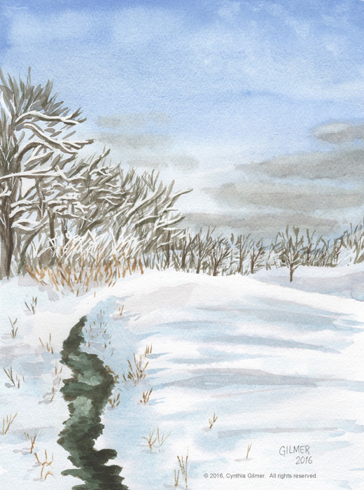
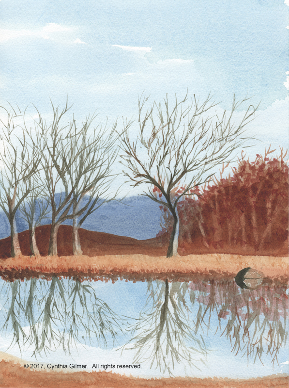
Snowy 7th Fairway Stream

In my most recent post, just after Christmas, I shared a painting I did of a snow scene of a pond on the golf course near our home.  To do this I watched a few videos on painting snow in watercolor, including this one by Grant Fuller.  I think the videos were all helpful.  I like the foreground including the grasses peaking up through the snow. I used masking fluid to block some of the white branches in the foreground trees and one of the strongest ridges in the field.  I augmented the whites with a white gel ink pen.  I don’t really like the clouds.  Skies look easy when I watch others do them, but I still struggle with them.  

snowy-7th-fairway-stream-2

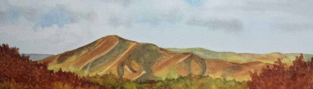
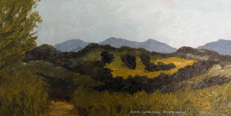
3 Ridges in Cloud (Watercolor version)

Next I decided to do a scene that I’ve done multiple times in oil, hoping that familiarity would help.  I’m not sure it did. Sometimes I think that watercolor is better if you’re not too tied to the original scene.  Photos should really just be an inspiration.  Many of the videos I’ve watched, including several by Steven Cronin like this one are done entirely from the artist’s imagination. I’m definitely not there yet!

In this painting, I like the sky, but not the way the clouds are laying in the valley.  I think the foreground trees turned out okay. I augmented them with my white gel ink pen.  For what it’s worth, this painting looks better in the original form.  The scan didn’t do it justice.  

three-ridges-in-cloud-wc

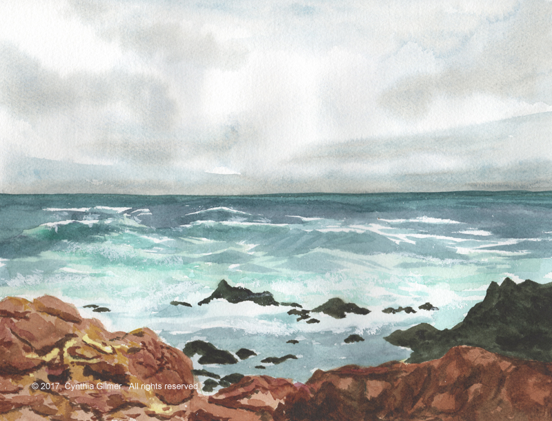
Stormy 17 Mile Drive

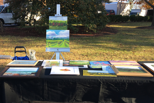
Then I decided to do a seascape, which was an ambitious undertaking. I have done very few of these, even in oil.  When I was showing my work at the Farmers’ Market in December, one of the other artists, Rajendra KC was quite taken with the oil version of this scene (in my gallery if you are interested).  Given that he is a very talented local artist, I was quite flattered by this.  I decided to try to do a watercolor version.  

I have to say, I surprised myself with this one. I had very low expectations but it came out very nice.  This is perhaps my best sky so far.  I did not mask the white caps. I used discipline (a challenge for me) to leave them white. (I did watch part of a video that showed this, but I didn’t capture the link.) I augmented the white caps with white gouache in places, which is how I got the look of spray. I also really enjoyed doing the rocks. I took my time, starting with washes for the lighter ones on the left and then slowly layering on shadows.   

stormy-17-mile-drive

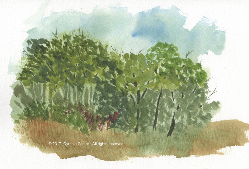
Clump of Trees (Study)

Then I discovered Steve Mitchell’s YouTube channel. I was quite taken with his landscapes and found his approach to be more valuable, from an instruction perspective, than many of the others. I watched several of his videos, but I thought this one on “accidental painting” would be fun to try. My version did not turn out nearly as nice as his, but it was a good learning experience. It also forced me to paint from my head, although I will confess that I allowed myself to be pulled in the direction of Steve’s example.  There are a lot of things I don’t like about this painting, but given that it was a quick study it’s also not bad.

clump-of-trees-study

Springtime Field

Inspired by my clump of trees study I decided to take on a painting from a photo I took of a field near Lovingston Virginia last spring.  I had a lot of fun with this one, and most of it I like.  There are some things I might do differently if I did it again. Rather than pointing those out I think I’ll leave it as an exercise for the reader.  

springtime-field

7th Fairway Pond

Finally, on the morning of the day we were to leave to come back to Northern Virginia I decided to do one last painting. I had limited time so I did this fairly quickly, but I think it turned out okay.  I like the sky and the shoreline of the pond – especially the rock!  I’m not crazy about the mid-ground trees or the reflections of the trees in the water, which I did quickly because I was running out of time.  

7th-fairway-pond

All in all, I think I made progress.  I’ve continued to watch videos and I have several more techniques I’m excited to try as soon as I’ve completed this post. Practice makes perfect – of course there is no perfect in art, but practice is a way to aspire to perfection.

Snowy Fairway Watercolor, etc.

It’s been a while since I posted anything. I have been painting and doing other art related things, just not posting for various reasons.  

One reason I haven’t been posting is that I’ve been challenging myself in watercolors.  As I’ve always said, they are much harder than oils. I’ve been doing more wet in wet painting and they just never turn out. My clouds look to heavy to float and my trees and leaves all run together. I know I will get better if I keep practicing, but I have accepted that it will take a long time.  

A couple of days ago I painted a scene from a photo I took a couple of years ago.  I did not do a lot of wet in wet in this painting, outside of the sky. Maybe that’s why I’m happier with the way it came out.  Snow is difficult because you need to leave the white white.  There is no opportunity for error. I did mask some of the tree branches and one ridge on the ground that I wanted to really stand out. It was fun because it’s a nice winter scene.
snowy-7th-fairway-stream-2

I also sold a print to someone who found me on the Internet, which is a first.  She bought a copy of the Rockbridge Vineyard Chairs that I did for my friend Kathy a few months back.  She wanted to give it as a Christmas gift to her sister-in-law who lived in Rockbridge County.  They had visited the winery together.  She told me how she searched to find me, but I have been unable to repeat it such that this painting comes up.  Still I’m very happy she found me. 

EPSON MFP image

The one other fun thing I did before the holidays. I showed my paintings with Falls Church Arts at the Falls Church Farmers’ Market. I didn’t sell anything, but several people took business cards.  Maybe I’ll hear back from one of them.  Regardless, it’s good exposure and I had fun. 

market-display

Happy Holidays and Happy New Year!  I’m taking the next few days off from my day job so maybe I’ll have something else to post soon. 

Nimrod Hall Summer Arts Program 2016

I am so happy to have had the opportunity to attend a weekend workshop at Nimrod Hall again. This year I chose the weekend workshop Kirah Van Sickle, who is an impressionist landscape painter based in Wilmington North Carolina. Her work is wonderful and fluid, and I was hoping she could help me get out of my head a little.

Kirah paints mostly in acrylics and also does some mixed media. The class was open to people who wanted to paint in oil, acrylic or watercolor.   We had a good group of ladies who took the class including Julia and Emily who took a different workshop the same weekend as me last year, Molly, Susan and Carol.  Everyone got a lot out of the class.

Nimrod 2016 Class

One of Kirah’s first suggestions during our Friday evening discussion is to paint fast and loose.  Most paintings will be studies, so don’t start with the idea of having a finished masterpiece. I have heard this before and know it. Being basically an impatient person I tend to paint fast. The thought that the painting I’m starting isn’t going to be a masterpiece is a challenge. Yes, I know it’s unlikely, but I have to start and approach the painting believing that it will be good – otherwise, it won’t be!

I have to say, one of the things that came from the class was getting back to some basics. I have gotten away from staining my canvases in advance and doing a good underpainting. Kirah showed how important that was to doing the value study with is a key to a successful painting.  Doing a value study allows you to identify and capture the dark and light areas of the painting without regard to color. She also said that most paintings will probably only have two to four values, which are easily captured using a burnt sienna underpainting.

Underpainting in oil is different than underpainting in acrylic.  Acrylic dries really fast so you can just paint on top of it. Oil dries very slowly. If you’re doing plein air in a single session you can’t wait for it to dry.  One of the things she showed me was how to paint on top of the underpainting without picking up too much of the color.  Put lots of paint on the brush, hold it sideways, drag and pick it up. This keeps you from actually mixing the colors.  She also pointed out that it’s critical to use a big brush and not be stingy with your paint if you want to get an impressionistic look. You also need to choke up on the brush unless you’re trying to make fine lines.

When I used to paint in acrylic as a beginner I used to paint back to front, meaning you paint objects in the most distant background first (like the sky) and then work your way forward. Oil and watercolor have both broken me of that. However, Kirah pointed out that it’s a perfectly acceptable way to approach a painting (except watercolor where you have to paint by value). With oil, you need to use the brush well, as described above, but you can paint back to front.

I always struggle with painting things a different color from what they actually are. My very literal engineers brain gets in the way. Before class I saw a painting of Kirah’s on her website of a place that looked so familiar.  I went back and looked at my photos and discovered I had a photo of the exact place from almost the same angle from a previous trip to Italy. I’ve looked at that photo and thought about painting it several times, but it just doesn’t inspire me.  The colors are too muted and as a result it’s kind of boring.  Kirah’s painting was so much prettier than reality because she’d brightened up the colors. I learned from her that it’s okay to change the color as long as you don’t change the value. Here is her painting (left) next to my photo (right).

Cortona Photos

One other point that she made was to pay attention to the undulation of the landscape. There’s a rhythm to the scene where things go up and down.  It’s important to the composition to catch that rhythm.

I painted two paintings in the class.  I had trouble finding good light to do these photos, so they are not the best representations. The first painting is a landscape from one of Nimrod’s many porches.  I did this in oil.  It had the Blue Ridge Mountains in the background with a field in the mid-ground all surrounded by lush foliage.  This painting is 20×10 and is on a Belgian linen canvas board.
Nimrod Landscape

The second painting is of the Nimrod studios and it is done in acrylic.  I haven’t painted in acrylic in years, but Kirah offered to allow us to share her Golden Open Acrylic paints.  These are specially formulated to dry slower than regular acrylics, allowing them to be blended on the canvas more like oils.  They did dry slower, but out in the open air, they still dried pretty fast.  This painting is 24×8 on canvas.

Studios at Nimrod

In addition to my in class painting I also did some watercolor sketching of the buildings at Nimrod.  Because it’s World Watercolor Month I posted these on Facebook.  I have a friend who is interested in buying them.  Now I’m challenged with repainting them since they are in my sketchbook on low quality paper. This will be a good exercise for me, since the thing she likes about them is their spontaneous sketchy quality.  I will need to stay out of my head to keep that as I redo them.

Nimrod Hall Sketch

EPSON MFP image

EPSON MFP image

All in all it was another great weekend at Nimrod.  I’m already looking forward to next summer.

Nimrod Hall Summer Arts Program 2015

I just returned from a wonderful weekend at the Nimrod Hall Summer Arts Program.  This year I took a watercolor workshop from Purnell Pettyjohn, a wonderful watercolorist from Lynchburg VA.  I chose the watercolor class because it’s a medium I struggle with.  It is very unforgiving and requires a lot of thought and planning.  My engineer’s brain struggles with the idea of leaving whites white and painting certain colors and shapes before others, so this was a good exercise for me.  The most important thing I learned was that it’s not as unforgiving as I had thought.  I learned how to tape and lift mistakes by scrubbing them with a bristle brush.  Just that lesson took a lot of the fear out of me.

Purnell is an excellent teacher!  We spent the first morning doing a step-by-step painting of a lady carrying pails of flowers in a field.  The fact that there was a human in the picture scared me, but her posture and the fact that she was walking away made drawing her manageable.  We started with the hat and shirt, moved on to the trees and  rocks on the left and right, did the washes for the mountains and the foreground and finished with the fence and a few shadows.  Everyone in the class (including the absolute beginners) did a great job. Below is my version.  I’ve also included the reference photo provided by Purnell.  Lady with Flowers

Lady with Flowers

Next, that afternoon, I attempted a plein aire out on the lawn.  I tried to apply what I learned but I struggled.  As I expected, I couldn’t discern the right order to do things in.  Purnell saw that several of us were challenged and did another demonstration.   During that demo I learned that order doesn’t always matter.  I also got to see her do trees where she did light leaves followed by darker leaves and then did the trunk and the limbs.  I was fascinated by her technique.

By this time it was late on Saturday afternoon.  Sunday is an early check out day so usually there is no additional painting. I was so anxious to try Purnell’s technique with the trees that I sketched a scene with the hammock in front of the old post office building and vowed to get up and paint before breakfast. I did and completed the painting below before I left Nimrod (except for a few finishing touches).  Purnell remained attentive and stopped by frequently giving several pointers that greatly improved the final product. I consider it a success that shows I did in fact learn a lot.  I also think I need to continue to practice because I’ve got a long way to go.

Nimrod Hammock

Nimrod Hall is a wonderful place.  The setting is gorgeous.  It is not luxurious, but it’s clean and comfortable. Most importantly, it’s intended for creativity.  You don’t have to worry about getting paint on things!

Here is a photo of Purnell painting on her porch this morning while another student looked on.
Purnell P 1

Here is a photo of the main house followed by a close up of the tub of flowers by the porch.

Nimrod Main House

Tub of Flowers

Here is a photo of my cabin.  This has four rooms with two shared bathrooms. I was in the room on the far right this time.

My Cabin

Here is one of the many beautiful views.

Nimrod View

I love Nimrod Hall.  I can’t wait to go back next summer!

iPad Art

I’m a big fan of my iPad. I’m always looking for new ways to put it to use, and drawing on it seemed like a possibility.  From my early iPad days I purchased apps like Brushes and Sketchbook Pro. More recently I got Procreate.  Mostly, I would tinker around with them but I’d get frustrated before getting too far.

Last spring I took a four-hour class through Falls Church Arts from Bobbi Pratte.  Bobbi is a wonderful landscape artist and I’m going to take an afternoon painting class from her in May. I’m looking forward to learning a lot.

In the class we experimented with Zen Brush, Sketch Club and Brushes.  After we’d done some experimenting with each Bobbi gave us each a photo of a flower and we “painted” them using Sketch Club.  I got a good start but ran out of time and had to finish my painting after class. The most important thing I learned was to use lots of layers! Below is my iris.
Iris

I was pleased with the results and since then II have gone on to do several more iPad “paintings”. Some have been studies that I did in conjunction with actual paintings, but others I just did for fun.  I will save the studies to discuss with the associated paintings.

Mostly I use Procreate.  I’m more comfortable with that than Sketch Club. I have tried several types of stylus — my favorite for painting on the iPad is the Sensu Solo.

As you know, I’m a big fan of butterflies, so I needed to try that out. Here is my monarch on pink pansies.
Butterfly

After some time of not doing much iPad art I was worried I’d lose my knack, so I took on something pretty challenging.  I drew the post office building from Nimrod Hall.  (Nimrod Hall is an art retreat in Bath County VA.  We’ll talk about that in a future post)
Nimrod PO

Finally, what’s really fun is that most of the apps record your brush strokes (mistakes and all) and you can play them back as a movie.  Below is the movie showing the strokes involved in me drawing the butterfly.  It’s 3 minutes and 16 seconds long.

Classes with Jean Barrett and My First Show

Around the time I got serious about starting to paint again I met my friend Dede Haas for drinks.  I knew Dede through my networking activities while I was running my company.  She is a consultant to technology companies specializing in channel sales, but she took a couple of years off while back to explore her love of photography. Her work is fabulous. Dede also lives near me and when we met she told me I should get involved with Falls Church Arts.

I decided to enroll in a class taught by Jean Marie Barrett called painting from the inside out. The premise was painting scenes looking out through windows and doors.  It was a fun and challenging class and served the purpose of getting me back into painting again.  Painting with Jean also served to build my confidence. Whenever I would cower in my lack of ability she would simply tell me I had the skills to do something and I should just do it.

I painted two paintings in that class.  Interestingly enough, they were both from photos taken at Il Casale di Mele on a trip to Umbria Italy a few years ago.  The first one is looking out the kitchen window.  That’s my friend Sophie at the counter.  This was my first painting in the class.  In my opinion it’s not very good, but it did serve to get me back into practice.
Sophie at Il Casale di Mele sm

The second piece I did is one of my best paintings ever.  I’m not sure I would have even attempted it if it had not been for the confidence Jean instilled in me.  This was done from a favorite photograph from the trip looking out a huge plate glass window from the dining room into the garden.

Il Casale di Mele sm

At Jean’s suggestion, I timidly entered it into the Falls Church Arts All Members Show (Spring 2014).  It didn’t win anything, but I was quite proud.  This was my first show.

Painting Party at Mad Fox

Last night Mad Fox Brewing Company, a craft brew pub near where I live, had a painting party.  They brought in a company called Creative Mankind, who conducted a two-hour workshop where people could paint.  No painting experience was necessary.  I was curious enough to sign up.

First of all, it was very popular.  There were probably close to 50 people who had signed up.  Creative Mankind set up spots with tabletop easels, a canvas, water, brushes, and acrylic paints including black, white, and the primary colors (red, blue and yellow) on a paper plate pallet.  They also had a small photo of olives in a martini glass for each person.  Once they got us all organized they gave some instructions and we all got started.

The subject was simple enough that even beginners had good success.  We started out painting the olives, then we painted the background, and finally we painted the glass and the reflection.  Most people did pretty well as you can see from the photos.

MFBC Painting Party 1 MFBC Painting Party 2

Some people went a little off script 🙂

MFBC Painting Party 3

I love the fact that organizations like Creative Mankind are encouraging people to explore their creative side.  A good time was had by all!

Classes with Jennifer

In 2002 I decided that I needed to take some basic art classes.  I was in the middle of starting my own company, so I had my hands full, but somehow I found time to sign up for a drawing class with the county adult education program.  It was called Drawing to Paint, and the teacher was Jennifer Schoechle.  I expected to do to class to learn to sketch so I could paint better.  It was quite different from what I expected, but it was very useful.

The class was based on chiaroscuro, which is the use of strong contrasts between light and dark.  We used primarily charcoal and usually began by covering the entire paper with a charcoal base and then using erasers and more charcoal to establish the lights and darks.  We also worked on perspective.  As it turns out, Jennifer was a gifted portrait painter, and chiaroscuro is a common technique in figure drawing.

While the class was very different than I expected, it was very good for me because it taught me to see contrast and value.  We also learned some basic techniques like drawing the negative space, which is sometimes very helpful, especially with composition.

I went on to take a second class through the county with Jennifer in figure drawing and painting and then a third where she had a group of students take a portrait painting class in her home.  I never imagined myself painting portraits, but it was a very good experience.  It was also my first exposure to oil painting – I had always used acrylics before that point.  Below is the portrait I painted in Jennifer’s private class.

Portrait 2002 sm

Sadly, I haven’t done anything in portrait painting since.  When I picked up my paintbrushes again in 2013 I thought I might try to take another class from her.  I looked her up and learned that she passed away in 2010 at the age of 61, far too young to lose such a gifted artist. Below is the only example I could find of Jennifer’s work on Google.

Jennifer's Portrait

Butterflies

Butterflies inspire me.  They are delicate and colorful and beautiful.  When I started painting I had some photographs of butterflies and decided they would be great subjects.  I did my very first butterfly pictures in regular acrylic paints on paper.  Acrylic was all I had and I hadn’t really explored other alternatives.  They came out well, but the acrylic paint was heavy on the paper.

Old Butterflies 2 sm Old Butterflies 1 sm

Around the same time, my sister told me about gouache.  She had done a painting for me from a trip we took together to Germany and it is gouache and pencil. I’ve always loved the look and thought the paint looked sheer and classy.  I decided to try my next butterfly in gouache.

What is so fun about painting a butterfly is getting into the patterns on the wings.  The good news is that they don’t match exactly.  If they did, my engineer’s brain would obsess about getting them to match and I’d never be able to finish the painting.  I really liked my swallowtail that I did in gouache.  I scanned it in and still use it as letterhead for my personal stationery and cards.

Old Butterflies 3 sm

A few years ago after several years of not painting at all I was struggling to get my eye and my technique back.  I decided that I needed to do some butterflies.   The good news is that there’s not a huge time commitment.  The gouache is tidy so there’s minimal set up and clean up and you can focus your time on doing the painting.  For these more recent butterflies I used gouache but did most of the black on the wings with ink.  I recently entered these in the Loving Life show (October 2014) at Falls Church Arts.  They did not win anything nor did they sell, but they got a nice spot right by the door.  I was also proud that they were selected, as this was my first curated show.

EPSON MFP image EPSON MFP image EPSON MFP image