If you enjoy this post please consider going to my home page and subscribing to my blog.
Since I started watercolor I’ve watched a lot of “instructional” videos to learn to do it better. Many of these are just demonstrations with no real instruction. Some provide a little commentary. Some are badly filmed and it’s really hard to see the details of the work. Then there’s Steve Mitchell’s Mind of Watercolor, which is hands down the best online watercolor instruction I’ve found.
I found Steve on YouTube a couple of years ago and I was immediately drawn to his spontaneous watercolors. I found his commentary very informative and his corny sense of humor endearing, so I subscribed to his channel and started watching him regularly. Eventually I decided that I was deriving real value from watching his videos and I didn’t think it was fair that I not give back something in return so I became a Patreon subscriber. I have learned so much from watching Steve’s videos that I still consider my monthly subscription fee an excellent investment.
The interesting thing is that I always watched his videos and then I’d take what I learned into the studio. This provides useful information but it’s often hard to translate into real transformative learning that will make my art better. This month I decided to watch in the studio with my sketchbook and palette near at hand, and to paint along. When he gets ahead of me, which he always does, I simply pause the video and catch up. I have to say, I’ve learned so much more doing it this way. I’ve done this with three of Steve’s videos so far. Here is what I feel I’ve accomplished.
The first video that I painted along with was called “Mixing Luminous Browns + Elephant Demo Watercolor & Gouache”.
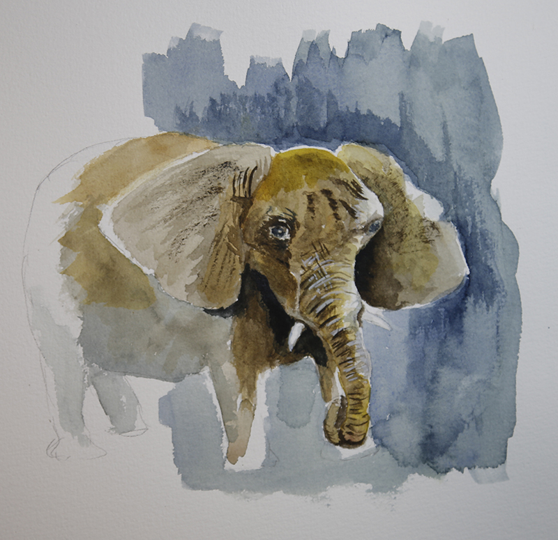
One of the goals of the video was to learn to mix browns that weren’t just mud. Unfortunately, I didn’t have a lot of the colors he was using, so I improvised with what I had. As a result, I don’t know that I learned much about mixing browns, but following along painting the elephant was extremely instructional. The biggest take-aways for me were the use of dark shadow contrasts to frame the lighter areas of the face. I also focused mainly on the head and very front of the animal and just faded out the back. Here is my elephant.
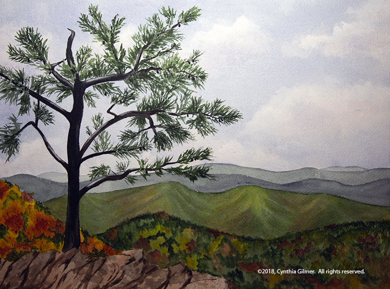
The second video was called “Tree in Afternoon Light Watercolor Painting – Ft. Meze Audio 99 Classics Headphones”.
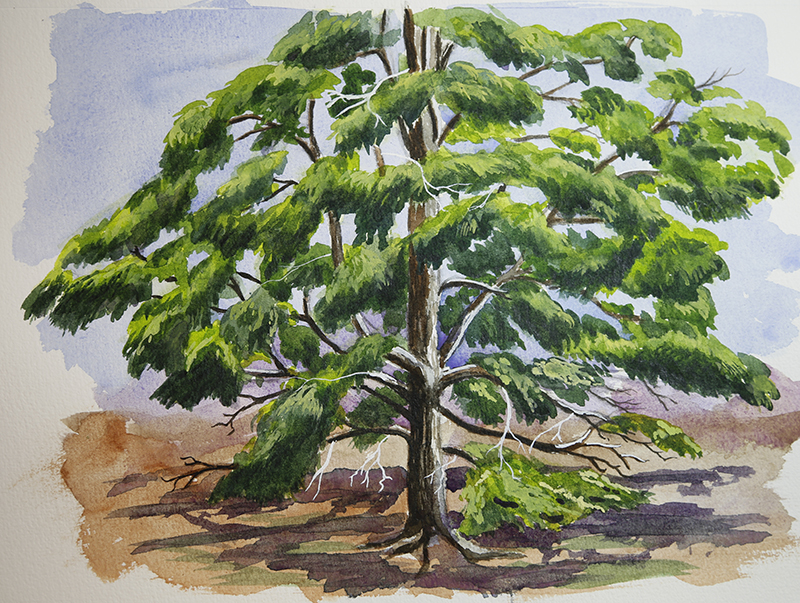
This one was a little unusual because it didn’t include much commentary. Steve has a pretty good YouTube following which makes him of interest to potential sponsors. I don’t think he takes a lot of paid sponsorships, but he does occasionally take free stuff and pays back in kind by giving his endorsement on a video. This was such a case where he had gotten some free headphones and chose to put up a video of him painting with just the music he was listening to. This doesn’t break with his process because he generally just films himself painting and then adds the commentary later. He said that he planned to do a version with commentary.
Because this one was minimal commentary, I had to just follow along and watch him paint. Early in the video he showed his reference photo and I was able to capture a screen shot and print that out which was very helpful. What I learned from this video was a lot about seeing light. The process of capturing the afternoon light on the trunk and the variations of green in the pine needles in a series of layers was very enlightening. The result here is not my favorite. I felt that I was unable to effectively capture the feeling of pine fronds…mine are more just blobs of green, but its not terrible and it was a learning experience.
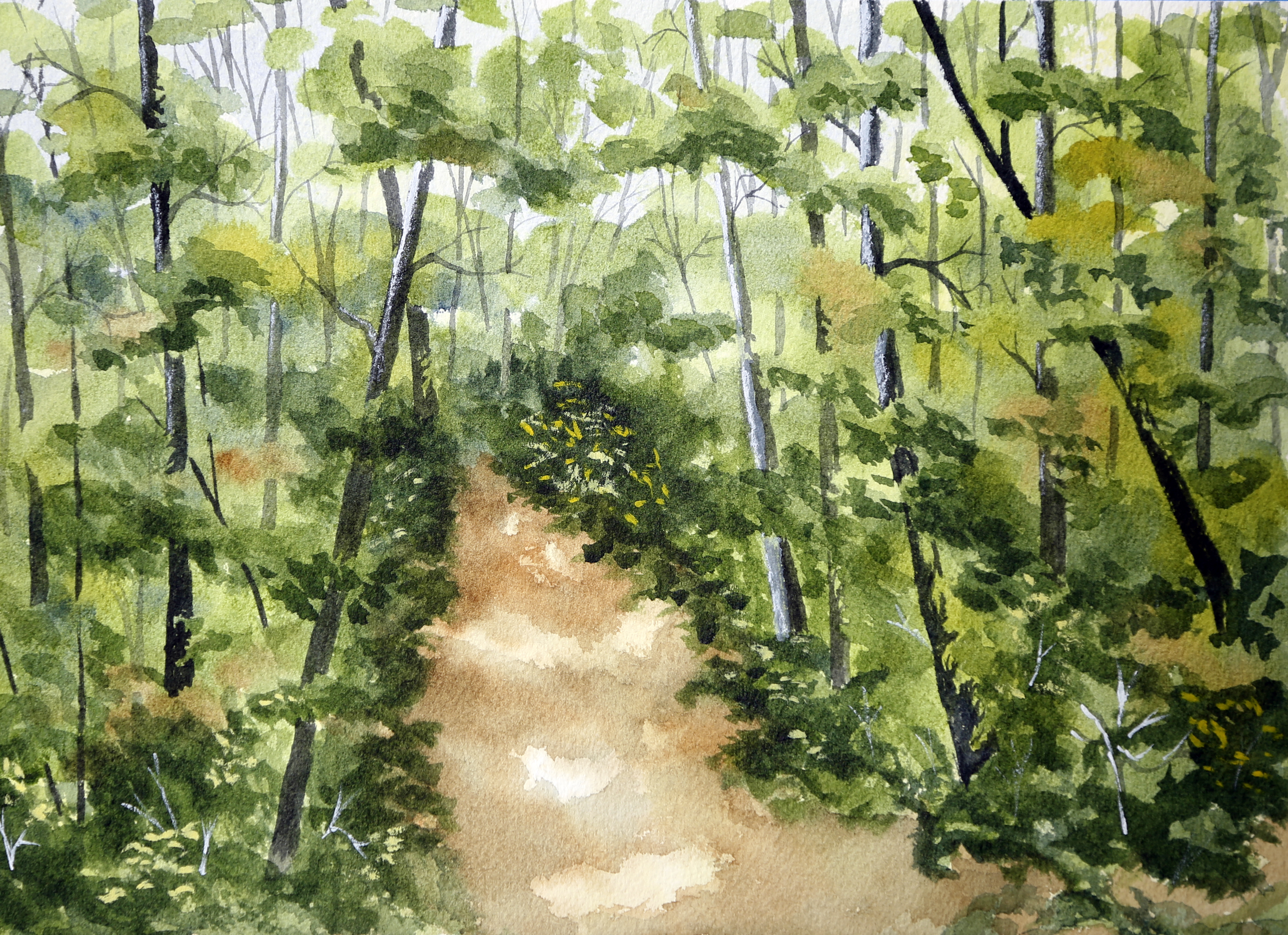
The last one was more of a tree study and was called “Tree Shadows Study & Playtime w/ArtGraf & Water-soluble Graphite”.

This one was a lot of fun. I’m a sucker for trying Steve’s product recommendations, although this video he was reviewing the ArtGraf Water-soluble Graphite, which he ultimately did not recommend. He’d expected something different and said that they really just compared with pan watercolors. Since I didn’t have the product I resorted to my regular watercolor palette when needed and did fine. He did rely heavily on water-soluble graphite pencils, which I had seen in an earlier video and I had purchased some so I was prepared. These are essentially graphite pencils that can be activated into washes with a wet brush just like watercolor pencils. I followed along as Steve did about three iterations of drawing, spending a lot of time capturing the lights and darks, and focusing on structure and depth to make the painting look 3-D and not flat. Finally, in the last iteration we added a hint of color.
One thing I felt came from my following along approach in all three videos was to gain some insights of seeing through Steve’s eyes. While I’ve accomplished a lot in mastering the mechanics of painting, I’m still trying to learn to see like an artist and to add my own expression to what I see. I think this last video was the best helping me with this. I’m not sure why…perhaps because it was a relatively simple study so I could focus on that aspect of it. Steve posted his reference photo on Patreon so I was able to look at that and see how he as capturing it, which was also very helpful in translating what he was seeing to what he was painting. Here is my version.

One thing I like about the results of this exercise is that I brought my own style to each painting. They are not as good as Steve’s, nor can I expect them to be, but each is uniquely mine.
Steve just posted a new video and it is a figure painting, which is going to present much more of a challenge. I’m not good at doing people, but it’s something I need to learn.