A Tale of Two Paintings

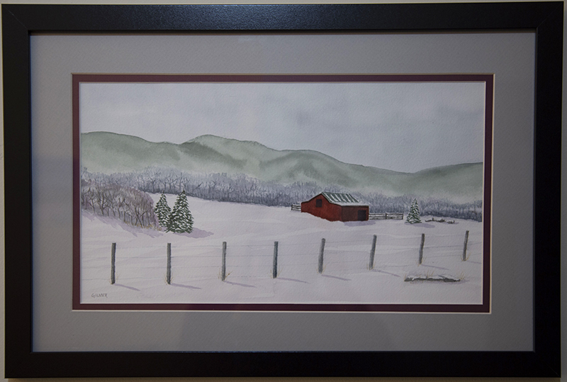
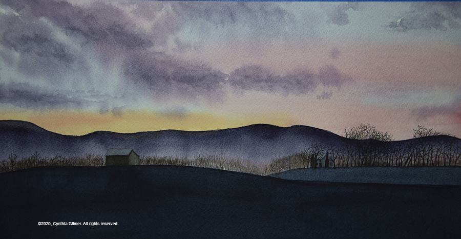
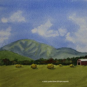
It’s always interesting when I paint the same subject twice, especially over a short period of time. I usually do this for a few different reasons. Sometimes I really like the first painting, and want one to keep and one to offer for sale (this is rare). Sometimes a really like the composition of a scene but want to paint it in a different season. Most often, I don’t like something in the first version so I try again, and the result is usually two paintings, each with pluses and minuses as is the case with this example. Maybe eventually I’ll do it again hoping for third time lucky.

I feel doing the same subject multiple times puts me in good company. Many great artists have painted multiple versions of the same scene. Scroll through this list of Monet’s works and look at how many repeats there are. There are actually 17 different versions of his famed Houses of Parliament! I’m sure he intended some of them to be studies for an eventual serious painting, but others he clearly painted a second time because he wanted to do something differently. In the end, 100+ years later they are all Monets and they are all considered masterpieces. That will never be the case with me, but I think it’s an interesting observation.

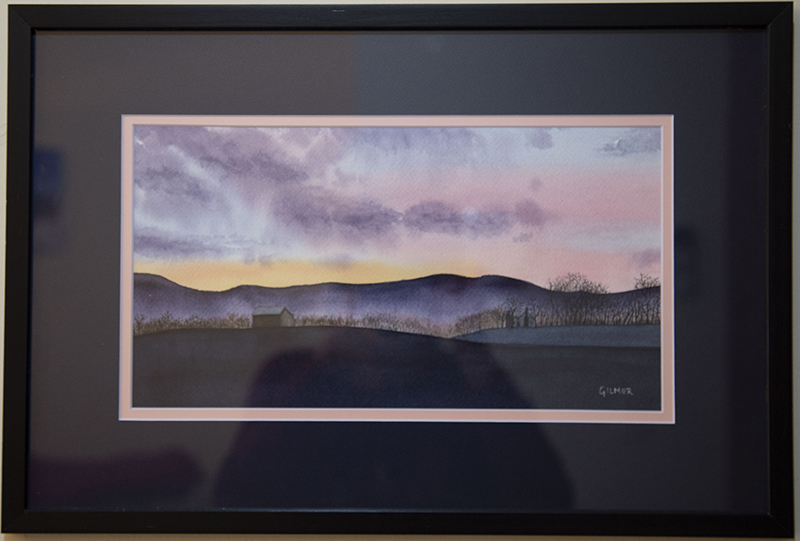
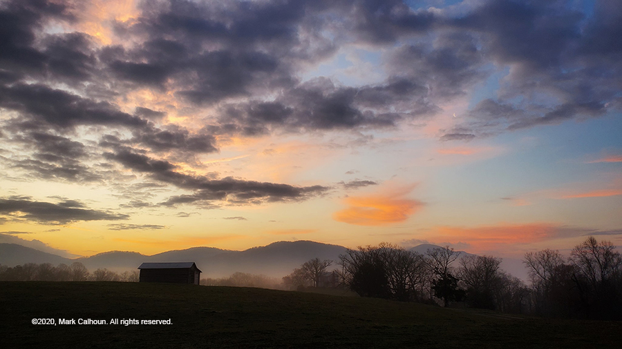
Usually I paint from my own reference photos, but in this case I did not. I follow a Facebook group called Exploring Virginia, where people post photos they take of the beautiful state I’m lucky enough to live in. Every now and then I see a photo that I find very inspirational and I ask permission to use it. The good news is that Virginians are nice people and the answer is almost always yes. Here is the photo reference for this painting, credit Mark Calhoun. Thank you Mark for being so generous with your work!

I love the sky, the silhouettes, and the mist rising behind the tree line. I cropped off some of the sky to achieve something closer to a 2:1 aspect ratio that I like for many of my landscapes. It’s a really tough subject, and I didn’t really do it justice, but the paintings stand alone.

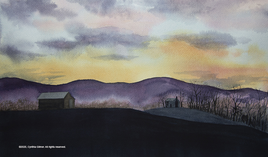
Version 1:

I masked out the barn and the house with painters’ tape and I started with multiple layers of wet-in-wet for the sky. For the mountains I glazed a deep purple hue and then dropped water into the lower part to create the mist. The tree details were done using a nib pen loaded with watercolor pigment. The pink highlights were added. The house and the barn done in multiple layers as was the foreground, to eventually achieve the shadow value I wanted.

There were several challenges (aka learning opportunities) from this first attempt. First, I did not stretch the paper. I don’t usually stretch, but the extreme wet-in-wet for the sky resulted in buckling that caused some unevenness. The clouds ended up with harder edges than I would like. I reworked them later, but wasn’t able to achieve the softness that I wanted.

There were also some things I really liked. I liked the mist and the silhouettes of the trees. I also really like the barn with a slight reflection of the setting sun on the roof.

Version 2:

I used basically the same approach as above, but I stretched the paper and this helped the sky be more even. I spent a lot more time working the clouds when they were still wet and got more softness than in the previous version. I masked out the moon, which I didn’t even notice when I did the first version. I had some challenges making it fit in when I put on the finishing touches. I ended up reworking that cloud to partially obscure the moon and I liked the result.

Several things I think were better in Version 1. The colors in the sky are bolder. I feel that the barn in the second version is too small. To a critical eye, it is too small in comparison to the house, since the barn is a lot farther forward. I think I get away with it because of the distance between them. The mist in the first version is lighter and that contrast helps the overall composition. I compressed the vertical aspect a little in the second version and as a result, the mountains lost some of their height. I think this compromised the mist and the height of the trees.

In summary, I don’t hate either, but there are things I would do differently if I did it again. I’ll give it a break for now, but we may see a third version at some point in the future.

Stay safe and be well!

Social Distancing

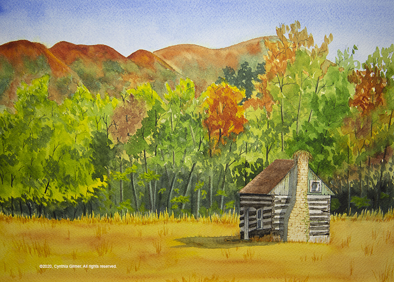
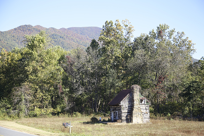
With the COVID-19 pandemic I am not working, so in theory I’m painting more. I am sitting in my studio a lot, but don’t feel like I’m accomplishing that much. That said, I recently did a painting of an abandoned cabin, from a photograph I took last fall. This cabin was in a small town called Tyro, situated on Route 56, not too far from where we live. It was early fall. The leaves on the tops of the mountains were changing, as were some at lower elevations.

I spent a lot of time on this painting compared to most. I had fun with the tree line, especially capturing the dark shadows under the umbrella of foliage. I masked out the cabin so I could do it last and I spent a good deal of time doing the detail. The finer details in this painting were done using a nib pen loaded with watercolor, a technique I’ve been using a lot since Steve Mitchell from the Mind of Watercolor introduced it to me a month or so ago.

Funny, but my husband is really bothered by the logs not being straight on the front face of the cabin. That is exactly how they were in the photograph (see below). If anything, I was frustrated that I was unable to make the cabin look rundown enough. Still, I’m happy enough with the result.

Everyone, please practice social distancing and stay well.

Gouache Experiment

I registered to spend a week at Nimrod Hall again this summer, but it was not to be. Laura Loe, the owner and operator of Nimrod, decided to cancel the whole 2020 season in light of the need for social distancing to stay safe. I was heartbroken, but it was the right thing to do. I will need to focus on the 2021 season instead.

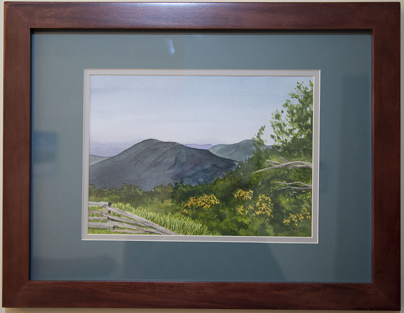
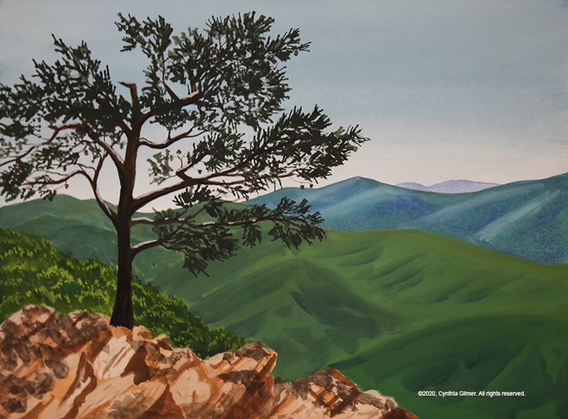
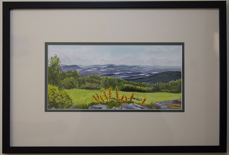
Nimrod is such a magical place where artists go to fuel our creativity. This year I had signed up with Kesra Hoffman again. I don’t usually sign up for the same instructor, but Kesra is very versatile (watercolor, acrylic, gouache), allowing me to run with whatever medium I am in the mood for. But since she really excels at gouache I thought I’d practice a bit. Here’s a painting done from a photo I took of the Raven’s Roost Overlook, on the Blue Ridge Parkway not to far from where we live.

It’s on Arches 140 lb hot pressed watercolor paper. For watercolor I usually work on cold pressed paper, which has a rough surface. I thought the smoother surface would be nice with gouache.

Gouache is opaque watercolor, so in many ways it behaves the same, but it is also very different. One thing that really struck me for this painting is the difference in how the colors work. Watercolor dries lighter than what it appears when you apply it. Gouache dries darker. As a result, the colors in this painting are bright and bold, and not particularly realistic. I ended up not minding that too much. I particularly like the highlights and the shadows in the mountains. I can’t get that effect in watercolor. I think that is partly because watercolor is transparent and blends more than gouache, and partly because of the smoother surface of the paper. I will need to experiment more.

I hope everyone is home and safe and free from COVID-19. Please take care and be well!

My Blog Has Moved!

As I’ve been painting more and more, and trying harder to get my name out there, I’ve been thinking that I should grow up and get a real web site under my own name for my art. I recently bought my domain name, cynthiagilmer.com, and I have rehosted my blog on that URL. I’m excited to have a real art website and hopefully will be doing some enhancements to my gallery in the near future. The old site should redirect to the new location for now. I will be cancelling that service and eventually the domain name will expire and potentially be resold, but for now you should be able to find me using either URL.

If you are a subscriber you should get this new post just as you have those in the past. I may be checking with some of you to make sure that happens.

If you are not a subscriber but wish to subscribe, please go to my main page and enter your email in the space provided at the upper right on the page. You will receive an email requiring that you validate your address before your subscription is complete.

I also have an update on my 6X6 post from a few weeks ago. I am a member of a social group here at Wintergreen called Mountain Women. They have a handicraft group and I decided to go and paint with them. It was being held at my friend Sallie’s house, and she was the impetus of me painting my series of 6×6 paintings because she had a small wall where she wanted to hang one of my paintings. Because of that, I took the series of paintings with me to the event.

They were a hit! I sold two (Afton Mountain Vineyard, and our backyard stream) to Mary, one of the attendees, who will frame them herself.

I also sold two to Sallie. One was the cub creek barn and the other one was a redo of the spring stream running through a nearby field, which I started at the crafting meeting. I like this version so much better than the first. I did a lot of the detail with watercolor and a nib pen, a technique that I started using recently and really like.

I framed these for Sallie in the frames I had. Since we are social distancing because of COVID-19 I’m not sure when I’ll get to give them to her, but the look very nice sitting in my studio in their frames.

I’m always so flattered when someone likes my art enough to buy it. It motivates me to keep painting.

Finally, I have been taking a weekly class on using ink and watercolor together from a local artist named John Hancock. I attended two sessions, both of which were excellent, but now it is on hold until coronavirus is no longer a threat. I will blog about that when I finally get a chance to complete it.

6×6 Paintings – Help Me Decide

So several years ago when I first started experimenting with watercolor Falls Church Arts did a 6×6 to 12×12 show where they wanted all works to be square and in that size range. I painted two 6 inch x 6 inch paintings from photos taken in Wintergreen and Italy and entered them into the show. They were accepted, which was nice, but when I look back at them now I think how far I’ve come.

I decided I wanted to reuse the frames, so I set out to paint two new 6×6 paintings. I didn’t like the first two I did so I started painting more and before I knew it I had seven 6×6 watercolor paintings. All have good and bad points, as with all paintings. I can’t decide which two to put into the frames. I thought I’d share them all and let my readers help me choose.

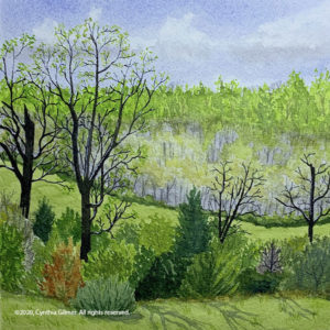
The first one is from a photo I took several years ago of a stream running through a field not far from where we live. The photo was taken in the early spring, and the real problem with this one is that I tried to change seasons to summer, but didn’t change the large trees in the foreground. In the photo they were just barely leafing out, so they ended up looking like dead trees. I tried to add more leaves to one of them, but the result is not the best. I still like the peaceful feel of the scene.

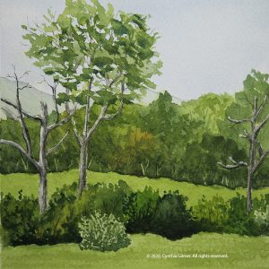
The second painting, which was really done simultaneously with the first, was from a photo of Three Ridges from the valley. I changed the house on the right to a barn, but not a very good one. Plus it’s too far right which hurts the composition. In my opinion, this one is just ho-hum.

After I did these first two and didn’t like them I decided to try some things that were more ambitious. Both were scenes I’d done before, but not in this form factor. I’d also been practicing some techniques that I thought were well suited to these subjects. I like these two better than the first two, but don’t let my opinions influence you. If there’s anything I’ve learned over the past few years, it’s that art is very personal. People like what they like.

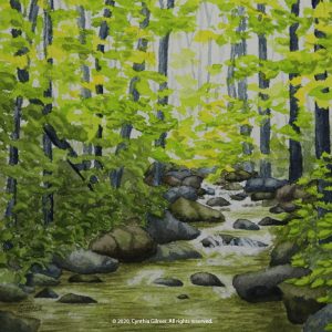
One of the things I’d been practicing was rocks, trying not to over obsess with the photograph and just letting the shapes and groupings form as I painted, sort of like doodling. So I did this scene of the stream that is in our backyard. It’s fun because of the light dancing through the trees. I used white acrylic paint to make the little rapids pop.

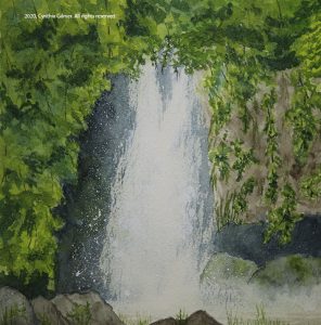
There’s a waterfall on Route 56 in Rockbridge County that is on private property but the owners have generously let people stop to photograph and enjoy the scene. I recently heard that they had stopped allowing this because some people had been destructive, which is very sad. In this painting, I had fun with the deep shadows behind the falls and the spatter of the spray, using white gouache. It was a happy accident that I got a misty feeling along the edges of the falls and the surface of the water.

Having done those two I was on a roll, starting to have fun with the small, square form factor. I liked the fact that I could knock them out relatively quickly, so I just kept going.

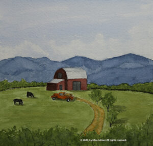
There is a barn that you can see from Route 29 in Greene County that is beautiful in the morning sun with a backdrop of the Blue Ridge. I’ve never gotten a good photo of it because there’s no place to stop. All I have are a few bad cell phone photos taken from a moving car. I used one of those as the inspiration for this next painting, but I modified the scene a lot. I added the cows, the truck, and the road. I also changed the trees in the front. Unfortunately, the resulting composition isn’t the best. The barn is too much in the center, breaking the rule of thirds. I like the effect of the mountains. They represent one of those situations where the watercolor painted itself.

This next one is of Afton Mountain Vineyards. I’ve done this in oil and watercolor before, but set out to do this one quickly. I took a very different approach with the sky than my usual technique. I let the hard edges define the whites. The result is more dramatic and less subtle than my usual skies, but I like the result. I may try to use it more often.

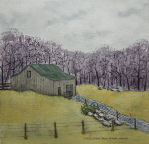
Finally, I decided to do the cub creek barn again. I recently watched a video from my favorite online instructor, Steve Mitchell from the Mind of Watercolor, where demonstrated using a nib pen to apply watercolor to detail a painting. I used that here. I really like the technique and I’m sure I’ll continue to use it a lot.

Those are the seven I have to choose from. Let me know which two you like best.

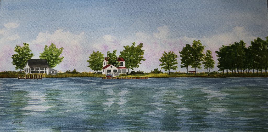
In other news (I really need to blog more often so my posts aren’t so long), I have two paintings in shows this month. The first is one I did a couple of years ago from a photo I took on Tilghman Island. This is in the Falls Church Arts All-Member Show, which runs through March 8th.

The second is in the Shenandoah Valley Art Center’s monthly member show, which is themed “red” this month. I painted this specifically for the show. The photo is the same one used for the painting of the cub creek barn above. It was taken in the late summer, so I needed to drastically change the seasons, and the color of the barn to make it fit. I’m pleased that I’m getting better at using some artistic license to change the material I’m working from, although sometimes I’m more successful than others. This painting is on display at SVAC through March 3rd.

Catching Up on some Recent Activity

Sometimes when I have some spare time I need to make a decision between blogging and painting…and painting has been winning out lately, which is a good thing.

I’ve also been selling some art, which it always very gratifying. Art is a very personal thing. People usually chose to buy art for emotional reasons. I never take it personally if someone doesn’t like my art, but I do find it very validating when someone is willing to spend money to own one of my paintings.

The Paris Barn painting I entered into the show at Falls Church Arts (see my last post) sold. I actually expected the person who owned the property where the barn is located to buy it. She had expressed an interest in it in the past. That would have met the required emotional connection, but interestingly enough, someone else bought it. I was pleased.

I also had a couple of paintings sell from the Rockfish River Gallery. One was a watercolor of the mountains in summer. The other was an oil painting of Three Ridges in cloud. This is the smaller version of the painting that hangs above my fireplace.

So having paintings sell challenges me to paint more. I need inventory to keep my shows and gallery displays going. Here are some miscellaneous things I’ve done recently.

Actually, the first isn’t recent. This is an oil painting I did last winter. I thought I’d already written about it but couldn’t find where I had. This was done from a photo I took last January after we had a beautiful rime frost, where the fog froze to the trees on the peaks of the mountains. It was gorgeous, and I assure you the painting doesn’t do reality justice. That said, I was happy enough with my interpretation of the scene. This was entered into the “Purple” themed show at the Shenandoah Valley Arts Center last month and it is now on display in the Rockfish River Gallery. It is oil, 24×12 inches.

Because Kathy at the gallery has been doing such a great job selling my art I decided to give her a few new pieces. The first is a painting I did of a stately old dead tree on Beech Grove Road on the way up the mountain to Wintergreen. I’d painted this scene before and liked the painting so much I decided to hang it in my house (for now) rather than selling it. I enjoyed painting it a second time. The scene has great composition without any help from me. This piece is watercolor and ink, 8×14 inches.

The other painting I put in the Rockfish River Gallery was a watercolor I did of a scene along Cub Creek Road, a well-maintained dirt road that connects Beech Grove Road to Route 56. When I took the photo, the leaves had just started to change. I decided to help them along a bit in my painting. I love painting fall colors! This painting is watercolor, 16×6 inches.

The show that just went up at the Shenandoah Valley Arts Center was called “Small Works”. I had done a tiny little study of Three Ridges in fall color. The fall, although short lived, was stunning on the Blue Ridge this year. At first I didn’t like this, but it grew on me. I messed with it a little, darkening and varying the green trees in the foreground and bringing out some shadows. I ended up liking it enough to enter it into the “Small Works” show. It definitely qualifies. It is watercolor 10×4 – tiny! [Update: This painting sold during the show.]

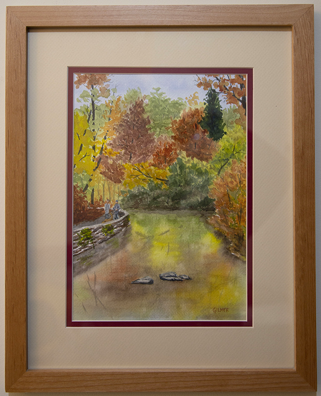
One other piece I did recently that I haven’t even put in a frame yet is a fall scene from a trip we took to Natural Bridge State Park a few months ago. The fall colors were peaking and this painting was from a photo I took showing the reflection of the trees in the river along the path. Natural Bridge was behind me as I took the photo. I love painting reflections. I still have much to learn about doing them well. One of my goals for my landscapes is to create scenes that draw people in and make them feel relaxed and at peace. I think this painting accomplishes that, for me at least. It is watercolor, 7×10 inches.

That’s what I’ve been working on lately. I tend to paint more in the winter when the weather drives me inside. I have several other things in my mind or started, so hopefully I’ll have more to share soon.

Happy Holidays!

September 2019 Shows

Please go to the to right of my home page and provide your email to subscribe to this page if you want to see all of my posts.  Please note that you will receive an email and you must confirm to complete the process

I have four paintings in two different shows in September and October. That’s a first for me and I’m very excited.

My painting Paris Barn, was accepted into a juried show at Falls Church Arts. The juror is Glen Kessler, a Rockville Maryland based landscape painter. I’m always proud when my work is accepted into a juried show.

The reference photo for this painting was taken by Breck Carter, and was posted in the Exploring Virginia group on Facebook. It was used with permission from Breck.

Paris Barn – 14×10 Watercolor

This show will be on display from September 14th through October 13th at the Falls Church Arts gallery located at 700-B W Broad Street in Falls Church City.

I also put three works into the member show at the Shenandoah Valley Art Center in Waynesboro VA. This is not a juried show, but SVAC represents many fine artists and I’m always proud to have my work displayed with theirs. I chose all travel pictures for this show.

Venice Canal – 9×12 Watercolor

The first is a painting I did of the canals of Venice. This was done from a reference photo I took in 2011.

The second is a picture from the Isle of Skye in Scotland. The reference photo for this was taken during our visit in 2018.

Isle of Skye – 12×9 Watercolor

The third is of a church on Mykonos in the Greek Isles. This reference photo was taken on our recent visit in July of 2019.

Mykonos – 5×7 Watercolor

This Show will be on display from September 7th – October 30th at the SVAC gallery located at 126 S Wayne Avenue in Waynesboro Virginia.

I hope that if you live near either of these locations you’ll be able to visit the shows.


Nimrod Hall 2019 – Part 2: The Art

I apologize for this really long post. I wanted to capture the whole week-long journey all at once. I love Nimrod Hall!

Day 1-sketching and getting my Rhythm

We arrive on Sunday afternoon. Actual painting days are Monday through Thursday. On Friday, check out time is about 11 AM. So that’s four full days of painting. A rare luxury of which I planned to take full advantage!

Monday morning I decided the best approach was to go out with my sketchbook. This would give me a chance to loosen up and get comfortable. Laura Loe is good at putting cute little paint-able things around. Last time I visited I noticed this bicycle at the front entrance to the property with geraniums and other flowers planted on it. I regretted not taking a photo of it since my last visit, so I decided it would be my first subject. I chose watercolor pencils as my medium, but did the foliage on the trees with regular water color. The challenge with this one is that it was our hottest day and I was sitting on my uncomfortable folding stool in the blazing hot sun. I could only tolerate that for so long. I did get a fun little sketch.

After that, I decided I needed to get 1) out of the sun, and 2) into a more comfortable chair, so I decided to paint the two red seesaws on the lawn between Square House and the Post Office. This allowed me to sit in an Adirondack chair under a tree. It was much more comfortable.

I chose line and wash as my medium. I did the sketch and inking (mostly) before lunch. After lunch the sun had moved so I was forced to move my chair. The charge in light and perspective did not matter too much since I’d already captured the drawing. I spent the afternoon finishing This up and felt it was a good second effort for the day.

Day 2- Landscape Painting in My studio

Monday evening our teacher, Kesra Hoffman did a gouache demo for our class. She said she resisted the medium at first but then decided that she could just use it like watercolor and grew to love it. I’m not sure I totally agree with that, but I do agree that if you start with a wash and build up, that first layer is similar to water color. Watching the demo was humbling because Kesra is so comfortable with the medium. I knew I needed to try it to see what kind of results I could get.

Another factor that helped set my direction for the day was my realization that I should get over needing to do plein air and paint in my studio. As I said in my earlier post I have always thought of Nimrod as a plein air location, but found that many of the artists there with me did not subscribe to that way of thinking. I figured I had paid for the studio so why not use it?

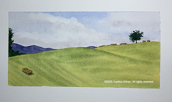
I went for a nice walk on Tuesday morning and took some nice pictures. I decided to spend my day painting a landscape from one of my photos in both watercolor and gouache to compare the two mediums. The reference photo I used is below. I like it because of the clouds and the contrast between the green grass and trees and the golden fields. I also noted the clump of trees right at the end of the road. Technically this is a composition no-no, but I kind of liked it so I decided to run with it.

I painted the watercolor and the gouache together, switching from one to the other during drying time. There are similarities and differences between the two mediums. I learned that the gouache can get undesirable “blooms” just like watercolor. The gouache yields harder edges where soft edges are easy in watercolor.

When Kesra came by in the afternoon and did her critique she pointed out a couple of things. First, my road did not go far enough into the center of the painting. She showed me how I’d made an error in the proportions as they appeared in the photo. Second, she pointed out that the trees at the end of the road weren’t really working. I’d hoped they would, but I was wrong. She also pointed out that the variations in color along the tree line in the gouache were really nice, but the watercolor was too consistent.

I was able to cover and move the road in the gouache, but that was not possible with the watercolor—a distinct difference between the opaque and transparent mediums. I also lifted some color on the tree line in the watercolor, but in a subsequent critique Kesra pointed out that it was a little too formulaic. Here are the two paintings. They are 10” x 4” on Arches 140 lb. cold press paper.

Watercolor

Gouache

I really liked doing the same scene in two different mediums. It was very educational, not only in learning about the different media, but also in studying and interpreting the scene. I decided to keep it going the next day by doing the same scene in oil and acrylic.

Day 3 – More Landscape Painting in my Studio

When I was packing to go to Nimrod I packed way more than I needed for art supplies, because I didn’t know what I’d be doing and wanted to have whatever I needed. I am happy I did that, because I ended up doing some things that were out of the ordinary…like painting in acrylics. I had these two little 12 x 6 stretched canvases that I tossed in. I like the 2:1 footprint for landscapes, although I usually paint bigger. Painting smaller has its advantages if you’re painting plein air or trying to do a lot of quick studies.

So on Wednesday morning with my two little canvases in hand I set out to paint the same scene in oil and acrylic. I haven’t painted much in acrylic in years. I get very frustrated with it because once I switched to oils, I couldn’t take acrylic’s fast drying time.

Once again I switched back and forth between the two. Of course, that didn’t allow the oil to dry…that takes weeks or even months. Switching still gave me a break. It’s always good to look away.

Similar to the gouache, the acrylic yields much harder edges. The fast drying paint makes it hard to blend the colors, but the oils are very difficult to get hard edges with. You can do it if you wait for it to dry, but that takes a long time. 

I like the colors better in the oil version. There is more variation. Some of that is the nature of the slower drying oils, but I also had a more extensive palette of oils to start with. I only had a limited number of acrylics, even after supplementing them by buying more in “The Art Box” bus which is parked at Nimrod every summer to provide artists with materials they find they need but don’t have with them.

When looking at all four versions I found that I got bolder with the skies on the second day, so the oil and acrylic versions have much more dramatic clouds, which I think is an improvement. I found myself wishing I’d been more daring with the skies in the watercolor and gouache versions.  Here are the two paintings from Wednesday.

Oil


Acrylic

Day 4 – Another Day of Gouache and Watercolor, but Not the Same Subject

I had one last day to paint and after spending two full days interpreting the same scene I was ready for something different. I did two more paintings on Thursday – one watercolor and one gouache.

On Tuesday evening we had a thunderstorm followed by brightening skies and a rainbow over a nearby ridge. I brought out the camera and took a lot of pictures. While I was doing so I pronounced, rainbows are nearly impossible to paint. So what did I do? I painted the rainbow!

Several years ago I did an oil painting of a rainbow from a photo a friend had taken. I was not happy with the result. I decided that watercolor might be friendlier. I hoped that if I did a wet in wet approach I could get the primary colors to bleed into a full ROYGBV* spectrum. It kind of worked, but not nearly as well as I had hoped.

The criticism Kesra had for me was that I did not get enough atmospheric distance in my mountains. They were too green, which is never the case when you’re looking at them at a distance. This is something I’m still trying to train my engineer’s brain to do. I need to learn to see, and paint what I see, rather than painting what I know to be true. Yes, the mountains are green…and yes they look green to me in the picture, but they are much bluer than I think. I really need to work on this! Here is the painting. (10” x 7” Arches 140 lb cold press)

And here is the reference photo.

* red, orange, yellow, green, blue, violet

In the morning I’d gone for a walk and I found a pretty scene with a dead tree (dead trees are great fun to paint) and a field in the background with hay bales. I decided it would be fun to do as a gouache study for my final painting. This is probably the one I spent the least time on. We had the walk-through that evening and so there was a lot of pressure to get it done.

Kesra didn’t have a lot to say about this one. I like the sky but the rest of it is a little flat. I could probably correct that if I spent some time on shadows and highlights. I may also do this again in watercolor. Here is the painting. (6” x 12” Arches 140 lb. cold press)

Each Nimrod art week finishes on Thursday night with a walk through where everyone displays what they were working on and people walk through and see it. As Laura Loe explained, it’s not really a critique… it’s more of a “love-fest”. I must say, people did some lovely work.

I painted up until almost the last minute and then tidied up my studio, which of course was a mess. I did take a break to shower, but most everyone was well dressed and I was still in my shorts and t-shirt. Oh well.

People seemed to like my story about my scene that I painted in different media. They were interested in which I liked best and I explained that all had their pluses and minuses, but the process was very educational. Here I am with my work.

Is I said in an earlier post, Kesra did her own thing in the morning and did critiques of our work in the afternoon. She did some beautiful work. Her gouaches really pop. I’m hoping to keep practicing my gouache. I’m inspired by how beautiful hers are. Here she is with her body of work from the week and a few other things she threw in. The two landscapes on the upper right were the demo she did for us on Monday evening.

Nimrod is a magical place and it’s wonderful to spend time with such creative people in such an inspirational place.  I’m already looking forward to next year. 

Following Along with Steve

If you enjoy this post please consider going to my home page and subscribing to my blog.

Since I started watercolor I’ve watched a lot of “instructional” videos to learn to do it better. Many of these are just demonstrations with no real instruction. Some provide a little commentary. Some are badly filmed and it’s really hard to see the details of the work. Then there’s Steve Mitchell’s Mind of Watercolor, which is hands down the best online watercolor instruction I’ve found.

I found Steve on YouTube a couple of years ago and I was immediately drawn to his spontaneous watercolors. I found his commentary very informative and his corny sense of humor endearing, so I subscribed to his channel and started watching him regularly. Eventually I decided that I was deriving real value from watching his videos and I didn’t think it was fair that I not give back something in return so I became a Patreon subscriber. I have learned so much from watching Steve’s videos that I still consider my monthly subscription fee an excellent investment.

The interesting thing is that I always watched his videos and then I’d take what I learned into the studio. This provides useful information but it’s often hard to translate into real transformative learning that will make my art better. This month I decided to watch in the studio with my sketchbook and palette near at hand, and to paint along. When he gets ahead of me, which he always does, I simply pause the video and catch up. I have to say, I’ve learned so much more doing it this way. I’ve done this with three of Steve’s videos so far. Here is what I feel I’ve accomplished.

The first video that I painted along with was called “Mixing Luminous Browns + Elephant Demo Watercolor & Gouache”.

One of the goals of the video was to learn to mix browns that weren’t just mud. Unfortunately, I didn’t have a lot of the colors he was using, so I improvised with what I had. As a result, I don’t know that I learned much about mixing browns, but following along painting the elephant was extremely instructional. The biggest take-aways for me were the use of dark shadow contrasts to frame the lighter areas of the face. I also focused mainly on the head and very front of the animal and just faded out the back. Here is my elephant.

The second video was called “Tree in Afternoon Light Watercolor Painting – Ft. Meze Audio 99 Classics Headphones”.

This one was a little unusual because it didn’t include much commentary. Steve has a pretty good YouTube following which makes him of interest to potential sponsors. I don’t think he takes a lot of paid sponsorships, but he does occasionally take free stuff and pays back in kind by giving his endorsement on a video. This was such a case where he had gotten some free headphones and chose to put up a video of him painting with just the music he was listening to. This doesn’t break with his process because he generally just films himself painting and then adds the commentary later. He said that he planned to do a version with commentary.

Because this one was minimal commentary, I had to just follow along and watch him paint. Early in the video he showed his reference photo and I was able to capture a screen shot and print that out which was very helpful. What I learned from this video was a lot about seeing light. The process of capturing the afternoon light on the trunk and the variations of green in the pine needles in a series of layers was very enlightening. The result here is not my favorite. I felt that I was unable to effectively capture the feeling of pine fronds…mine are more just blobs of green, but its not terrible and it was a learning experience.

The last one was more of a tree study and was called “Tree Shadows Study & Playtime w/ArtGraf & Water-soluble Graphite”.

This one was a lot of fun. I’m a sucker for trying Steve’s product recommendations, although this video he was reviewing the ArtGraf Water-soluble Graphite, which he ultimately did not recommend. He’d expected something different and said that they really just compared with pan watercolors. Since I didn’t have the product I resorted to my regular watercolor palette when needed and did fine. He did rely heavily on water-soluble graphite pencils, which I had seen in an earlier video and I had purchased some so I was prepared. These are essentially graphite pencils that can be activated into washes with a wet brush just like watercolor pencils. I followed along as Steve did about three iterations of drawing, spending a lot of time capturing the lights and darks, and focusing on structure and depth to make the painting look 3-D and not flat. Finally, in the last iteration we added a hint of color.

One thing I felt came from my following along approach in all three videos was to gain some insights of seeing through Steve’s eyes. While I’ve accomplished a lot in mastering the mechanics of painting, I’m still trying to learn to see like an artist and to add my own expression to what I see. I think this last video was the best helping me with this. I’m not sure why…perhaps because it was a relatively simple study so I could focus on that aspect of it. Steve posted his reference photo on Patreon so I was able to look at that and see how he as capturing it, which was also very helpful in translating what he was seeing to what he was painting. Here is my version.

One thing I like about the results of this exercise is that I brought my own style to each painting. They are not as good as Steve’s, nor can I expect them to be, but each is uniquely mine.

Steve just posted a new video and it is a figure painting, which is going to present much more of a challenge. I’m not good at doing people, but it’s something I need to learn.

Class: Traveling with Watercolors

I’ve wanted to attend a class or a workshop at the Beverley Street Studio School (BSSS) in Staunton Virginia for a while, but every time I’ve tried to sign up, the things I’ve been interested in have been full. My timing was lucky more recently and I was able to sign up for a two day Traveling with Watercolors class (February 15-16) with Roanoke based artist Robin Poteet. The BSSS prides itself in providing high quality art instruction in a non-degree setting. I am thrilled that they are only about 45 minutes from me and look forward to attending more of their classes and workshops.

This class interested me because I do try to travel with my watercolors, but if find I rarely actually use them while traveling. This is for a variety of reasons, but I thought maybe a class could give me some pointers on how to get the most out of painting while on travel. I also read a book called The Urban Sketcher by Marc Taro Holmes a few years back and I was intrigued by the idea of doing ink and wash sketches on site and thought this would give me more insights into that. I really didn’t have any expectations for the class, but it was great fun and provided me 12 hours of uninterrupted paint time. It allowed me to explore a new approach and mindset for painting and also gave me time to reflect on a recent vacation that I chose as the subject for this class.

Robin is a wonderful watercolor artist. She does beautiful studio work that you can see on her website, but she’s also has been leading travel painting trips for many years and has an awesome collection of travel sketchbooks that she’s developed during her travels.

She makes her own sketchbooks, which allows her to make them from her paper of choice (Arches). Watercolor sketchbooks don’t usually have 100% cotton paper in them, and lesser quality paper can be very frustrating. She gave us each a 12-page sketchbook that she made, and explained how she cuts the pages, makes the mat board covers and has them bound at Staples.

We started the class with her sharing all of her sketchbooks, I would estimate that she had close to 30 of them, and they provided great inspiration. She is a former designer and talked about the importance of the layout of each page, many of which had multiple sketches on a single page along with text. The page layout is my biggest challenge and will be something I need to work on. Below are several pictures of pages from her books.

This first one is painting from a trip to Wales. In addition to her loose and beautiful painting she has included a painting of a map showing where this place is. (Click images to enlarge.)

This next one is a spread from a trip to Ireland. This is a great example of how good she is at layout and design. Note that the image on the left carries over to the right hand page, but she’s included an inset of the countryside and the great dog painting.

This next one is the main plaza in Siena Italy. I like the two-page spread and the way she’s captured the activity and the people on the street level. This is extremely hard to do.

This last one is of Umbria, where my sister lives. This is another good example of layout with the two main pictures, but I love the window with the laundry and the pizza on the lower parts of the page. You will see that both of these inspired some of my work in my own sketchbook.

Robin provided a lot of roving commentary and critique, which was extremely useful. She did one demo of painting people, which we all said we needed. She emulated a page in a sketchbook (below). I’m sure she would have done more demos, but we were all so wrapped up in our own books we didn’t really ask her to. In hindsight I wish I could have watched her paint more.

I used my trip to Scotland in June of last year as my subject. I completed the cover and 10 of my 12 pages during the class time. I finished the last two pages when I returned home. Some of what I did is good, some not so much. There were times when I ran out of steam and it shows. Still, not too bad for a first effort.

The cover was made from gray mat board, but Robin embellishes hers by gluing hand painted tissue paper to them and then gluing a painted image to that. This part of the class was sort of ‘crafty’ and not really my thing. I think I’d be fine with mat board covers and the image and a title glued to them. She uses scrap mat board, which isn’t always clean, and also pointed out that the covers suffer wear and tear during travels so there is a need to cover them to make them look nice.

Here is my cover. The image is a quick sketch of Scottish countryside.

My next page includes a painting of the Old Packhorse Bridge and a bench outside our first hotel. I chose the bridge for this first page because I’ve painted it before and felt comfortable with it. Some of the students in the class said that painting the first page was intimidating because they feared they would mess up their book. Choosing something I was comfortable with was a good idea.

The next spread includes a painting of the first of many distilleries we visited. I included my sister standing in front — people are always hard. It’s something I need to practice more. The right hand page was a landscape, but I didn’t like it. I found it bland so Robin suggested that I could glue something on top of it to give it interest. I sketched a small botanical and did that.
The text was a challenge since I wasn’t prepared to recall details of my trip from eight months ago. Some of my pages have little to say. It would be easier to have more robust commentary if you did the book as you traveled or shortly afterward. It would also be helpful to keep a running journal.
The next spread included a lily pond from a garden we toured and a painting of laundry drying in a seaside village we visited. This was inspired by Robin’s laundry sketch. Laundry hanging to dry is always so colorful.

At this point I was realizing that my layouts were kind of boring. Robin suggested that I not include sky or frame these two in boxes, but let them fade out at their edges, which I did. I decided that the next two pages needed to be more interesting. As a result, they have more going on, but I’m clearly missing Robin’s designer’s eye. As I said, this is something I really need to work on.

I was starting to run out of steam and interesting subjects on the next two spreads. The sheep crossing the road was one of the ones I did once I got back home.

And finally, I tired my hand at a map.

While I have to say, none of this is my best work, I think I learned a lot that I can use to capture things plein air or in the room after a day of traveling. Sketching while traveling provides a new way to savor your vacation because you focus on capturing what you saw in a painting requires so much more reflection than just taking a photograph. I’m looking forward to doing more of this.

Sorry this is such a long post. If you’ve taken the time to read to the end, thank you!