After a two-year break, Nimrod Hall Summer Arts was back up and running again this year as a fully functioning art retreat. In 2020 the season was canceled because of covid, and in 2021 they attempted to do an abbreviated version, but the year off left some of the buildings in a state of disrepair so they were unable to open. I signed up each of the lost years and was devastated each time I received the cancellation notice.
This year things were pretty much back to normal. Some of the buildings had gotten a facelift. The food was fabulous, as always. The group of artists who were there with me were wonderful. I really needed to get out of my funk and start painting again. Nimrod always helps with attitude.
As I mentioned in my last post, which I’m sorry was so long ago, my previous Nimrod teacher, Kesra Hoffman taught in June this year. I was cruising at that time so I was unable to work with her again. I chose watercolorist Kathy Calhoun’s class instead. This was Kathy’s first year doing a full week, but she’s done many weekend workshops. She is a full-time art teacher in a private school. She seemed to want to provide more instruction than I prefer, but I did spend some time with her and I learned some things. The class had a diverse level of experience, which added to her challenge, but she did well.
We arrived on Sunday afternoon, settled in, and met each other. I rented a studio again, as I did on my last visit. This helps give me a place to set up where I’m not always carrying everything around. I brought watercolor, gouache, and acrylic with me. I wanted to be ready for anything.
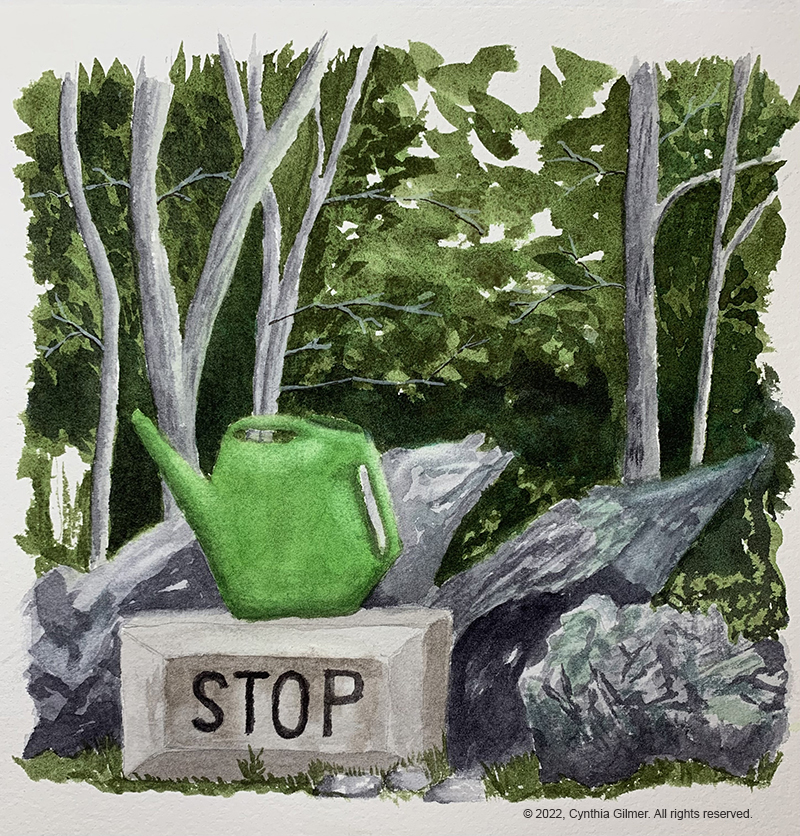
On Monday morning, I worked on finishing a painting I’d started in my sketch book some months ago. I needed to shake off the cobwebs. I’d done the foliage, but nothing else. The reference photo was a scene from my neighbor’s yard with a watering can perched up on a concrete block that says “stop”. It’s a fun little scene that I’d been thinking about painting for a while. I was happy with the result and felt a little bit more comfortable painting after the exercise.
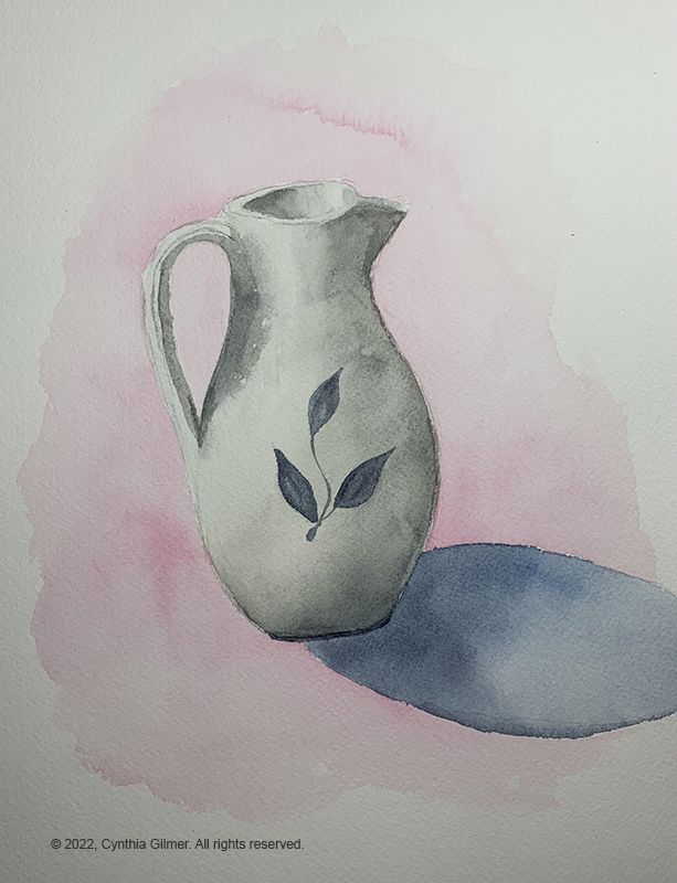
That afternoon, Kathy decided that we were going to work on still-life paintings as an exercise. I don’t do much still-life painting, so it was good practice for me. I chose a clay pitcher as my subject. We focused on shadows and highlights, and the cast shadow of the object. I should have included a surface edge showing the table in my background. Without it, my pitcher looks like it’s suspended in midair. I guess we know why I’m not a still-life painter.
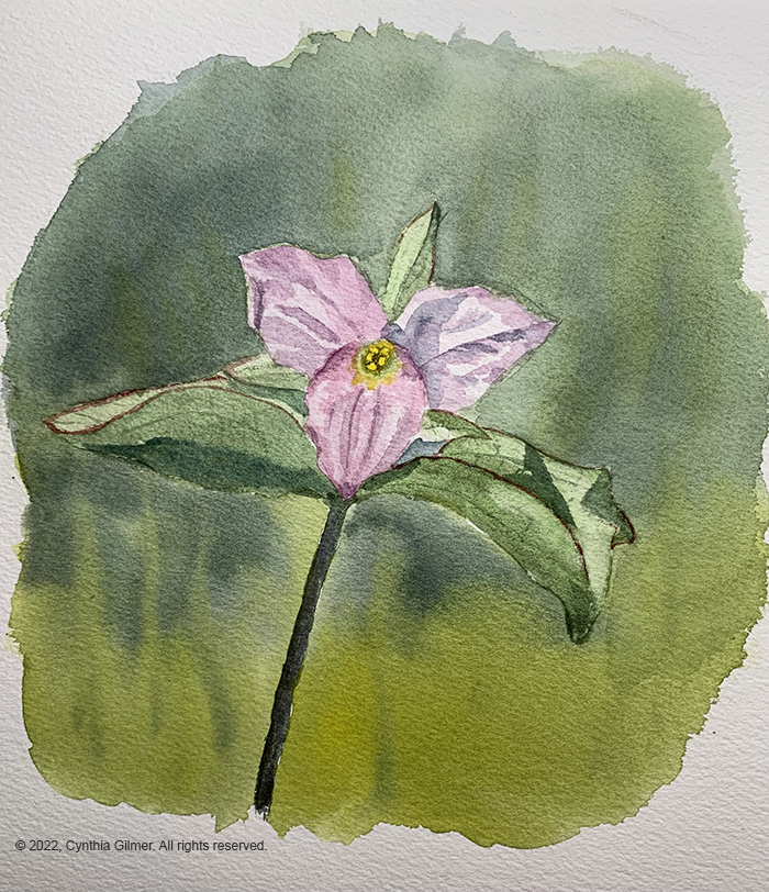
After the still-life exercise I went back to my studio and decided I still needed to get some of the rust off so I painted a flower. I don’t do florals often either. I chose a photo of a trillium that my husband, Bill, had taken. I like trillium, because it means that spring is about to make it up to our mountain top. It’s such a delicate flower. It’s a cute painting, but not great. It was still fun.
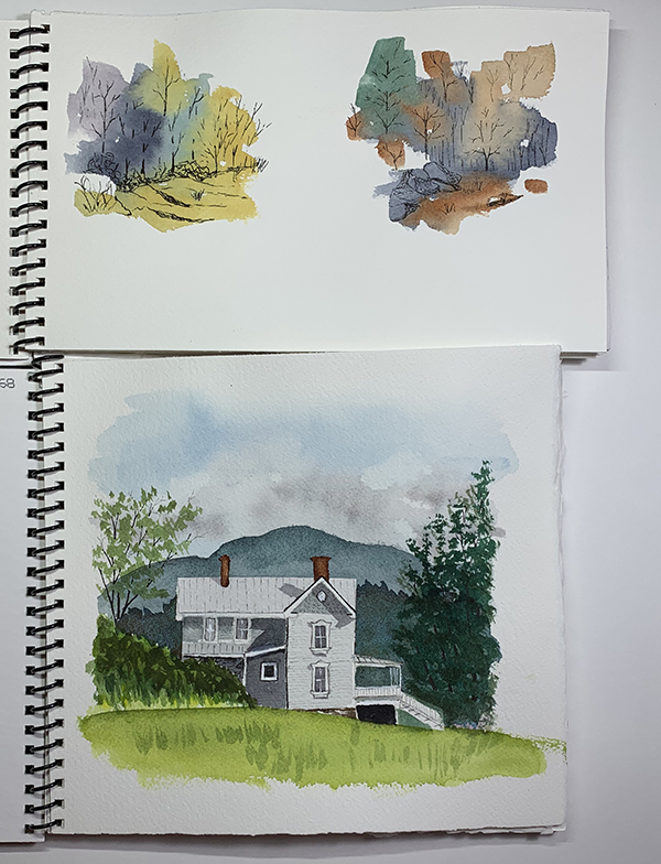
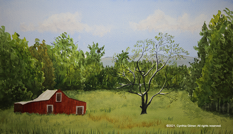
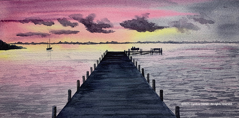
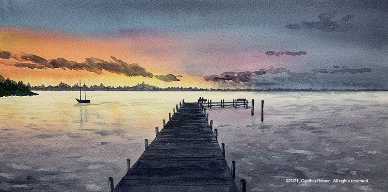
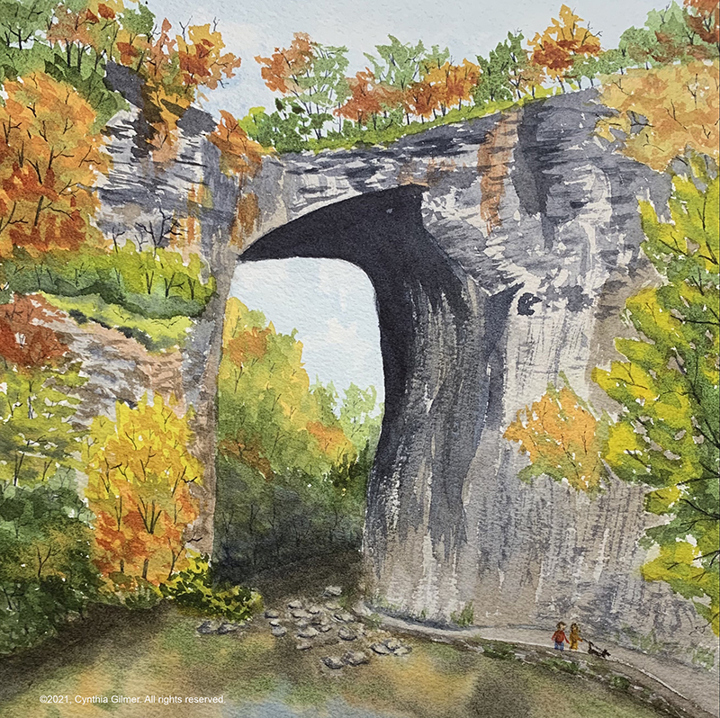
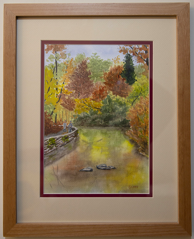
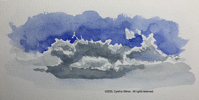
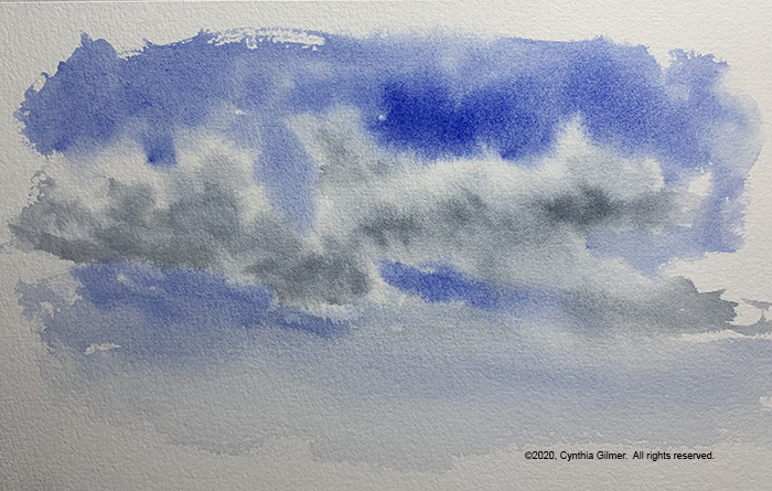
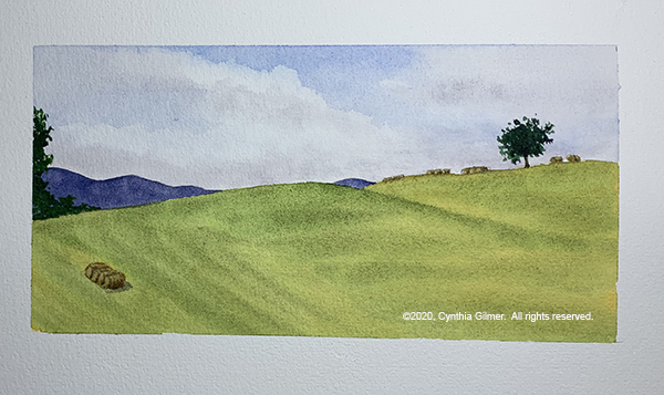
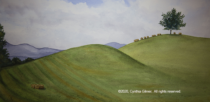
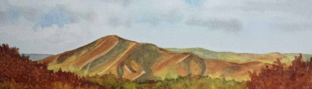
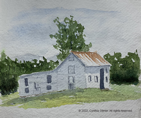
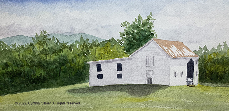
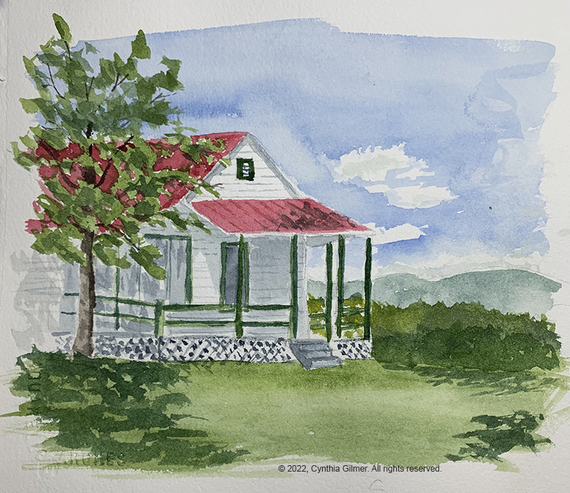
On Tuesday morning, Kathy decided we were going to do a plein air of the barn. I don’t really like to do plein air. I guess my tidy brain likes more perfection than you can achieve in the field, but I need to get better at it so I was happy to have the opportunity. Kathy emphasized doing a sketch first that helped nail down the color, composition and value. I normally wouldn’t do this, but wanted to follow directions, so I did a sketch in a little handmade sketchbook I had. I followed this by a full painting on a watercolor block. It’s funny but I, and most others who have seen them, liked the sketch better. It was looser and more fun. Perhaps this should be a lesson to me. Here it the sketch followed by the painting.
I was inspired by this exercise to sign up as a participant in the Rockfish Valley Foundation’s Plein Air Paint Out in October. More info on that later.
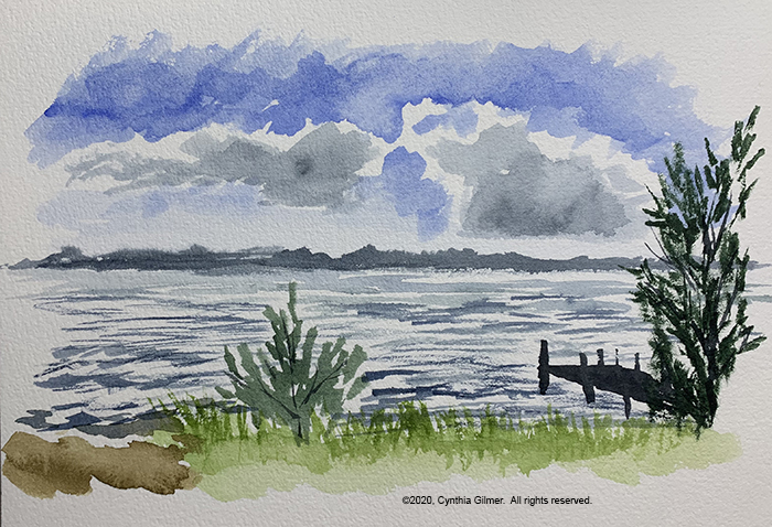
On Wednesday I opted out of Kathy’s sessions and decided to paint alone. It was a lovely sunny morning so I started with another plein air of one of the Nimrod cottages, Sunset 3. All of the cottages have challenging perspective. I tried to maintain what I learned about being loose from Tuesday’s session. I’m not crazy about this one, but it’s good plein air practice.
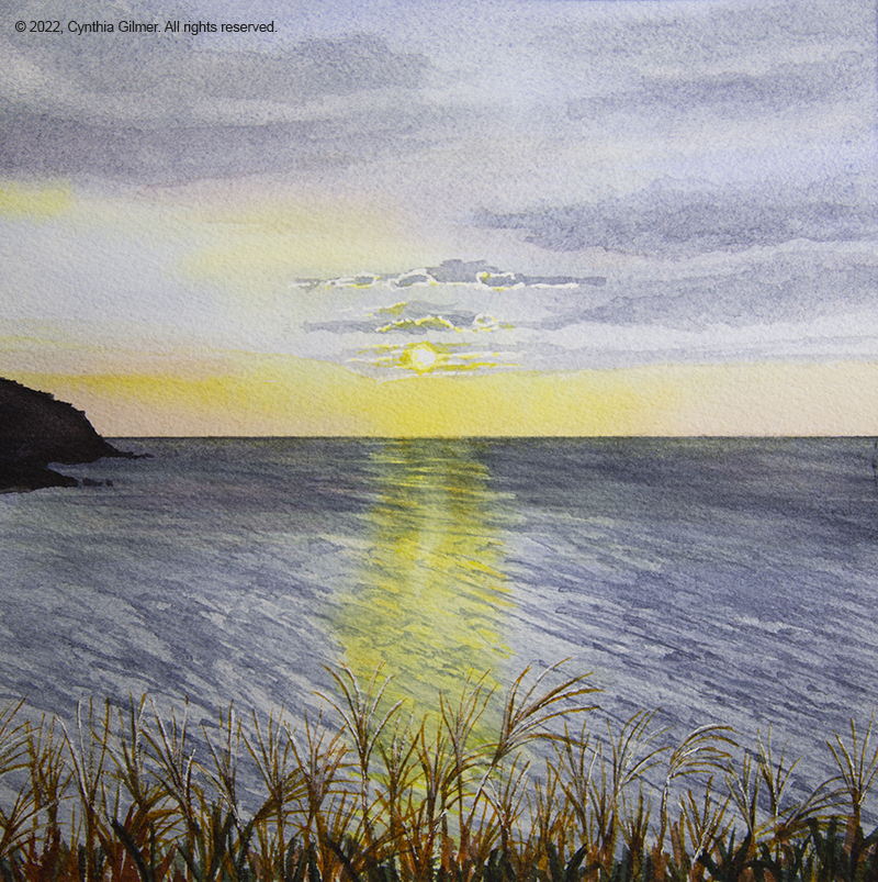
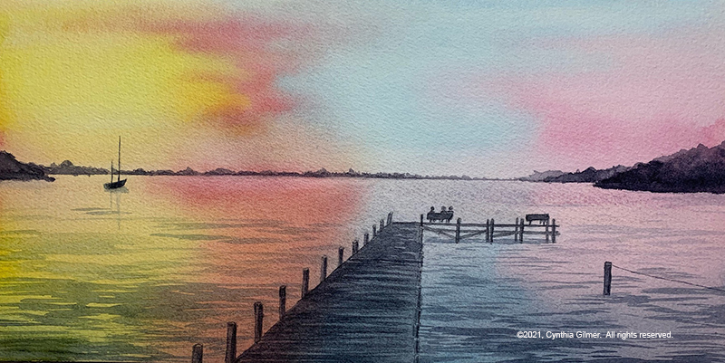
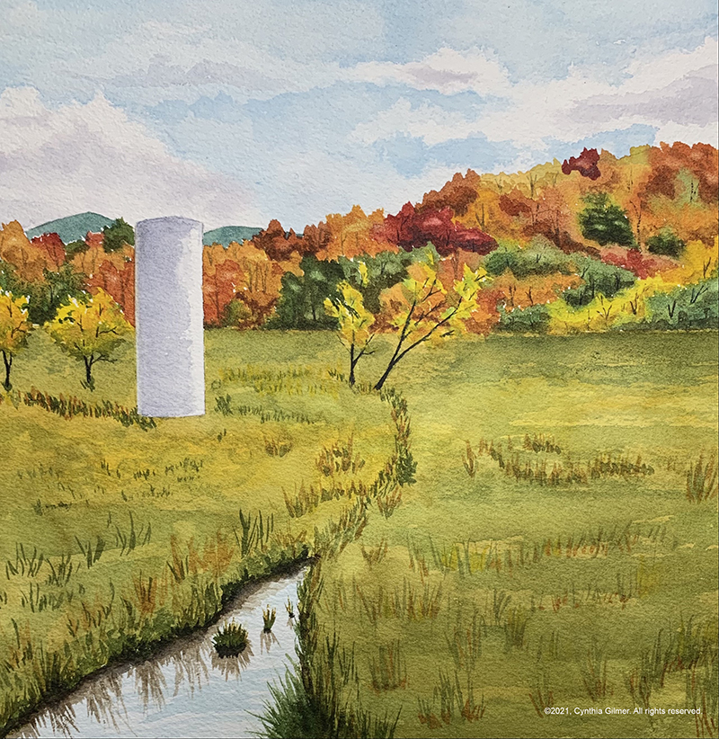
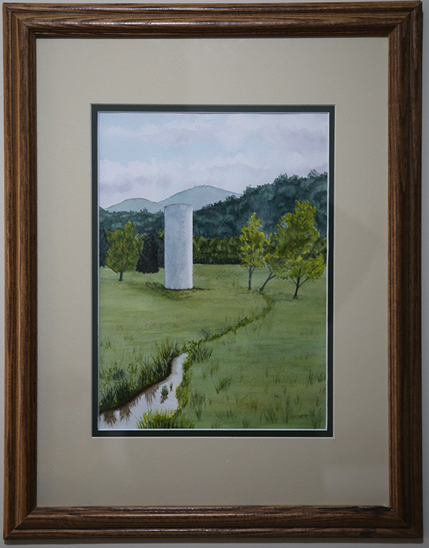
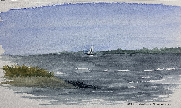
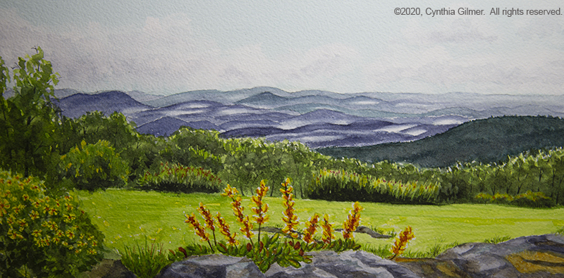
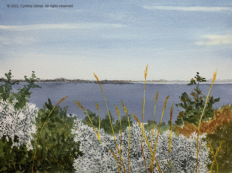
In the afternoon I decided to start on an experiment that I’ve wanted to try for a while. I wanted to do a mixed media using watercolor and gouache (opaque watercolor). I had a photo I’d taken at Westmoreland State Park on the Northern Neck. It was looking out over the water, and there were wildflowers in the foreground. I knew the watercolor washes would be best for the sky, water and foliage, but there was no way to capture the flowers and grasses well using watercolor. I started with the sky and water. I had a little trouble with it bleeding along the horizon, but I was able to recover it. Then I did the foliage. I variegated the foliage that would be behind the flowers so that you would still see some of the light and deep greens. Then I switched to gouache and painted the flowers and the grasses. I really liked the result. Other artists responded positively too. I am going to start using this technique more.
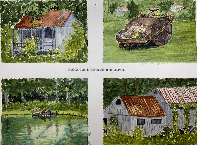
I finished the above painting on Thursday morning. Late morning Kathy came by and said she’s challenged her students to do three paintings with a theme in the afternoon. I had gone down by the pond and boys camp on my morning walk and had several pictures so I divided a piece of paper into four smaller sections and worked on four paintings from those photos. I paint fast, so the time frame worked for me. I rotated between the four paintings, letting each dry in between layers. I do admit that I got fatigued and it shows in the level of detail, particularly in the bottom two which I finished last. I put off finishing the one of the pond because I didn’t like the initial reflections, but I was eventually able to recover them somewhat. The perspective on the two boys camp cabins on the bottom is wrong. I was below them but the painting shows them from above. My favorite of the four was the roller with the flowers. That one was really fun to paint.
Thursday evening was the walkthrough, when everyone walks around and sees the work everyone did all week. This always ends in Nimrod owner Laura Loe’s studio where she shows us all of her recent works and paintings in progress. She has a unique style, so it’s always a treat to see her work.
It was a wonderful week and just what my artist’s soul needed. I am pleased that I made a commitment to the plein air event because hopefully that will keep me painting.
I know this was a long post. If you read to here, thank you! I am hoping to be painting and posting more regularly going forward. I have some things in my studio that I haven’t shared yet, so I’ll try to start with those.