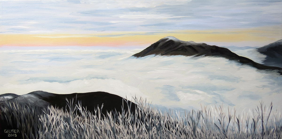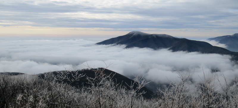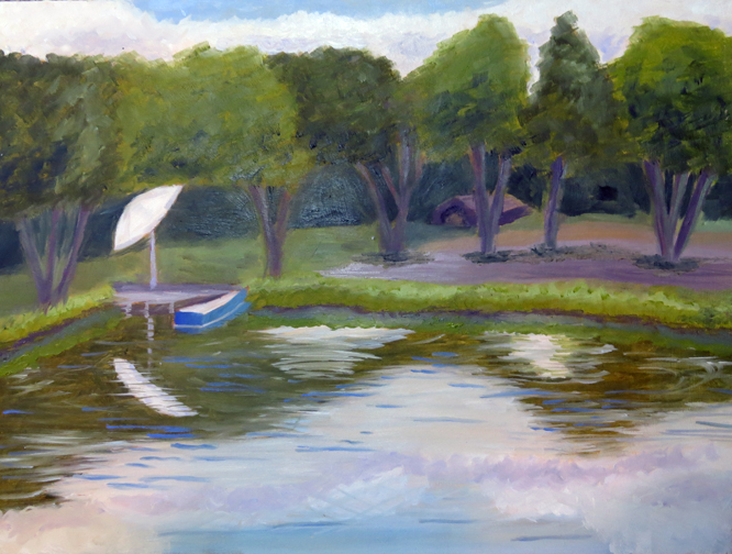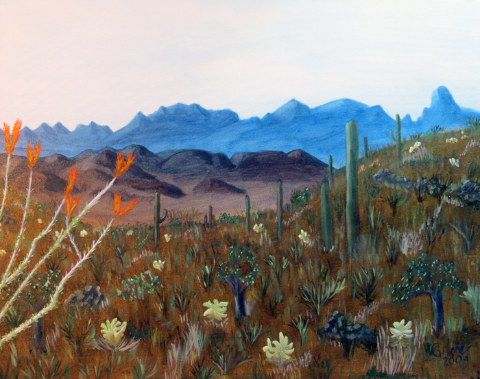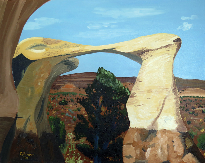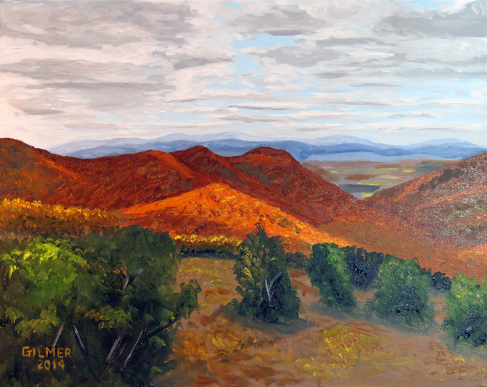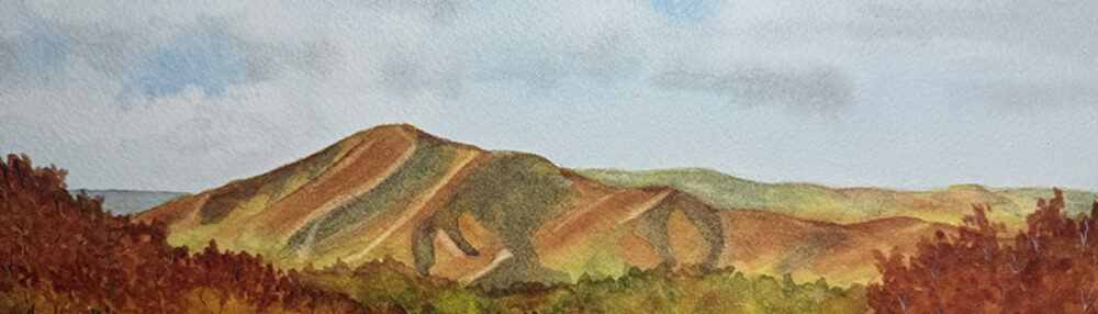
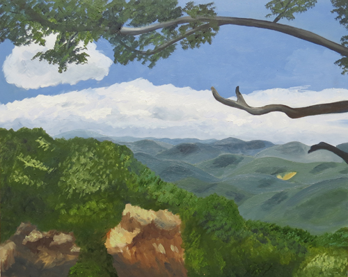
One challenge I have when I’m painting is getting my engineer’s brain to see color rather than seeing what color I think something should be. For example, mountains are green in the summer, right? Of course that’s true when you are standing next to them, but as they retreat into the distance and are subject to viewing through more atmosphere they fade to blue. Getting the right color of blue is a challenge for me. I never could get this right in the picture below although I painted over the mountains at least three times. I love the scene and may try it again, but I decided I’d need to start from scratch.
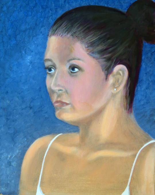
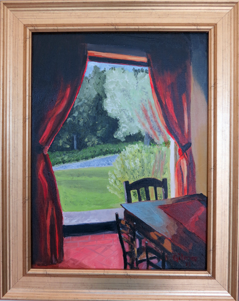
The first example where I really realized that I wasn’t seeing color was in my class with Jean Barrett (which I wrote about in an earlier post). When I was painting the scene looking out the dining room window of Il Casale di Mele there was a splash of light on the dining room table. My engineer’s brain wanted to see this as a lighter color of brown than the table. That made perfect sense to me since if you shine a light on a color you just get a lighter version of that same color – shadow and light. Jean looks at me and looks at the photograph and says that splash of light is bright blue. After a period of denial, careful consideration, and eventually acceptance I finally agreed that it was indeed blue. I adjusted my painting but Jean and I never agreed that my version was blue enough. Below I have included the painting and the original photo.

Then, in my class with Andras Bality at Nimrod Hall we spent a lot of time analyzing the color of the sky and the clouds. My engineer’s brain thinks the sky is blue and clouds are gray and white. In fact, the sky is not pure blue especially depending on what time of day it is, and clouds include white, gray, pink, purple, blue and often other colors.
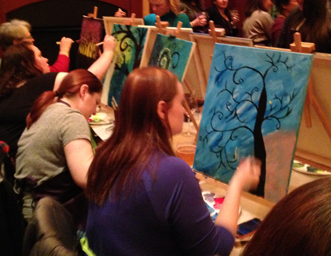
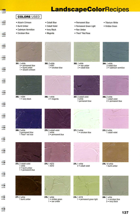
I found a book that has helped me get past the color blindness of my engineer’s brain. It’s called “1500 Color Mixing Recipes for oil, acrylic & watercolor” by William F. Powell. Actually this book is a compilation of several color mixing recipe books he’s done. I use the landscape section the most (of course) but there is a section for portraits, which I can see would be very useful. There is also a special section for watercolors. I will probably use that more after I take my next class at Nimrod this summer.
The way it works is that the book has pages of recipes. It shows you different color swatches, and what combinations are used to make them. I have found that it helps me see colors better, including the subtle differences, by comparing the swatches with the photograph I am painting. It also helps me mix more vibrant colors. Before, my colors would get “muddy” because I would mix too many colors together trying to get subtle differences. Now I plan and mix my pallet with the aid of the recipes before I start the painting. I’m very happy with the results so far. Below is an example of a page from the book that I hope will help better show what I mean.
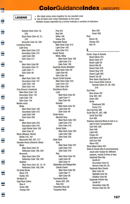
One last note, the index of this book is amazing. You can look up a color based on a detailed list of items including different kinds of trees at different times of year, skies at different times of day, different kinds of rocks, etc. It’s really amazing. I have included an example page below.